by Gene Crawford | Mar 21, 2014 | Gallery
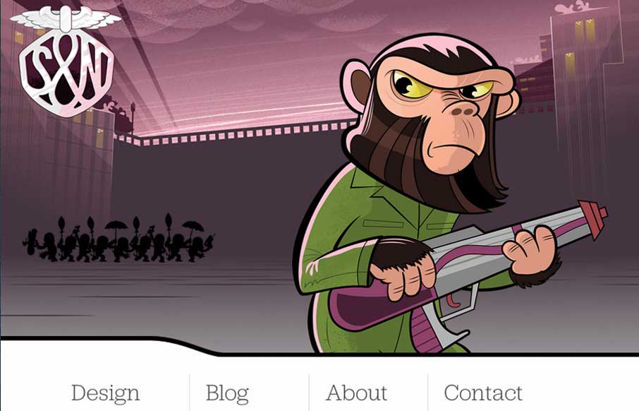
It isn’t that “new” of a re-launch now but the new Stuff & Nonsense website is as always wonderful. I love the responsive header illustrations. Both informing and entertaining – which is how Mr. Clarke always is.

by Giovanni DiFeterici | Mar 20, 2014 | Gallery
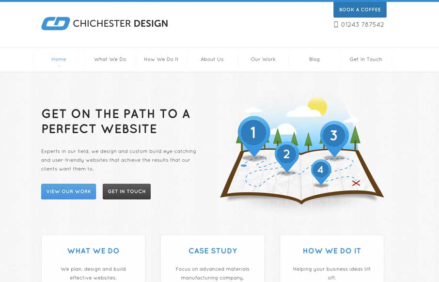
The Chichester Design website is deeply invested in it’s content. Every page has a custom structure and the content is coupled with a variety of illustration to convey a message clearly. The tight design and friendly aesthetic are engaging and easy to read....

by Giovanni DiFeterici | Mar 20, 2014 | Gallery
Parkeriain.com is a portfolio site with a simple, but well conceived structure. I like how the footer has been strategically used to create a call to action on every page. It’s a small detail, but effective when flipping through the portfolio detail pages. Solid...

by Giovanni DiFeterici | Mar 20, 2014 | Food and Beverage, Gallery
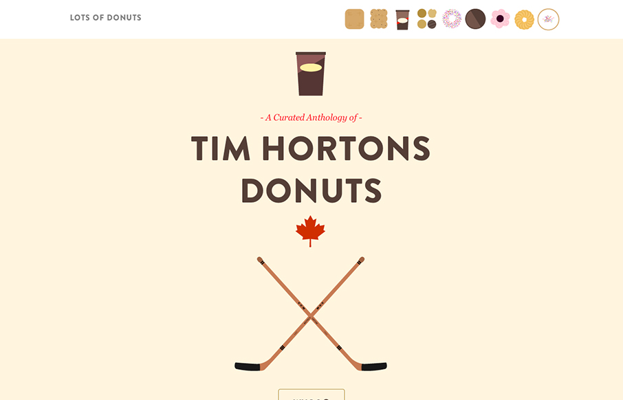
Lots of Donuts is fun as hell. It’s beautiful and simple, which I love. The parallax effect has gotten a lot of play in the last few years, but it’s cool and fits the tone of the site. The art is great, too. Now, I just want donuts…

by Giovanni DiFeterici | Mar 19, 2014 | Gallery
The Pushpa Project is a narrative site that seems to draw strongly from print design. The minimal color does a great job of focusing the reader’s attention on the text. I really enjoy the site’s primary navigation, which does a great job of reenforcing the...
