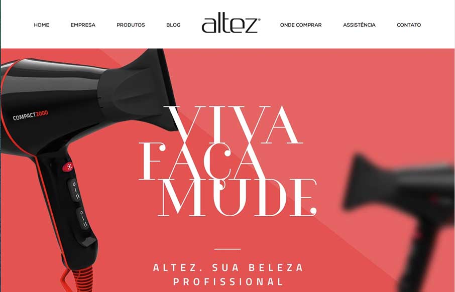
by Aaron Griswold | Oct 2, 2014 | Gallery
I like the trend that Altez follows – sites associated with the beauty industry have the hi-fidelity of slick industry magazines. It plays well for this site. My only suggestion is on the map – since the site is full-width (which adds to it’s...
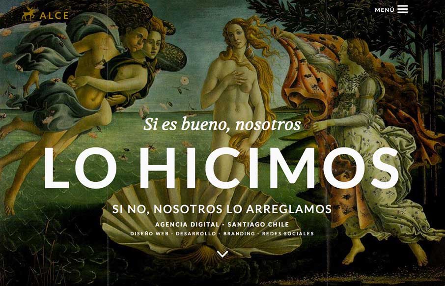
by Gene Crawford | Oct 2, 2014 | Gallery
Super rich visual design. I love the slight movement on each section as you get to it based on how you’re scrolling. The nice big services list and descriptions is nice. You don’t typically see that and I like it here, it’ll help educate new people...
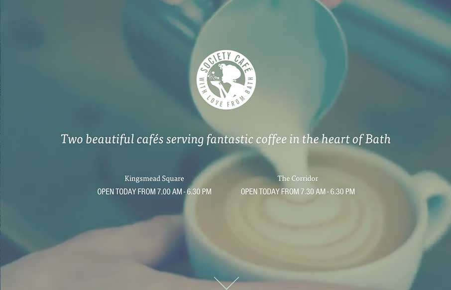
by Gene Crawford | Oct 1, 2014 | Food and Beverage, Gallery
What a beautiful and soft feeling site design for Society Cafe. I love the soft colors and thin line work used across the page. The video in the background is a good touch to keep a kinetic vibe going as you scroll down the page too.
by Gene Crawford | Sep 30, 2014 | Gallery
Neat layout and approach. Show some work, show what’s next, boom. I like it.

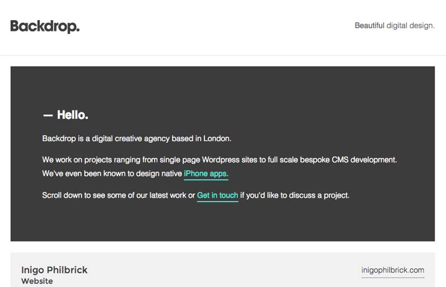
by Gene Crawford | Sep 30, 2014 | Gallery
I love this site design. I like the simple and clean nature of it. I like the hero graphics and the way the other sections are displayed. I can’t understand why the initial load of the page would hide the main nav under the hamburger icon though. Is it mainly to...