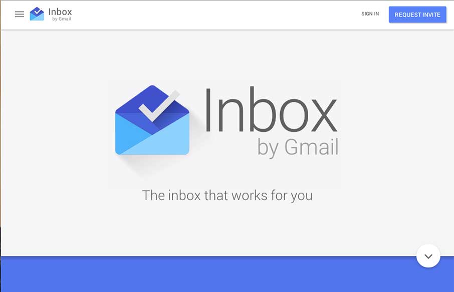
by Gene Crawford | Oct 31, 2014 | Gallery
Pretty cool page for Google Inbox. I dig the intro animation that smooths into the main page layout. Interesting approach to the page navigation, working mostly like a slideshow but scrolling down instead of left to right. Not exactly responsive all the way, maybe...
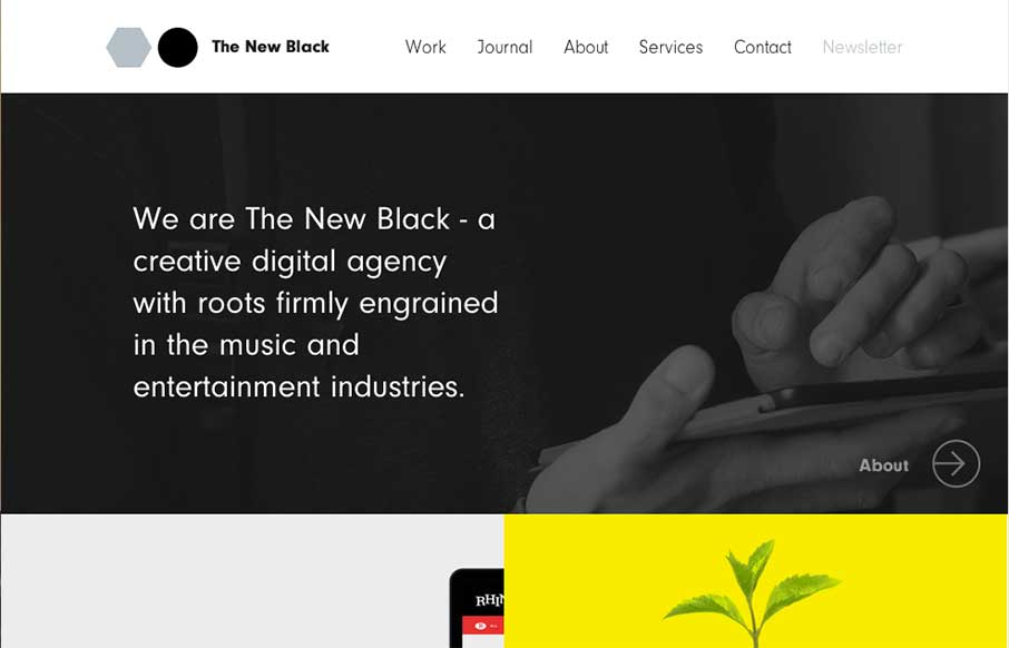
by Gene Crawford | Oct 30, 2014 | Gallery
I love the design for The New Black a lot. It’s traditional in the way it uses the horizontal header bar, but very much not so in the way it’s blocked out and uses interaction to get you involved in mousing around the page. Awesome stuff, done simply....
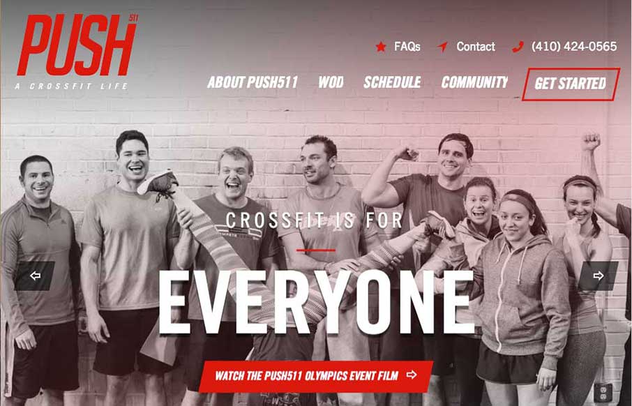
by Gene Crawford | Oct 30, 2014 | Gallery, Sports/Recreation
Nicely designed gym website for Push511 – most of the time websites in this category are just awful. This one however is one of nicest i’ve seen across many categories. Great work on almost all of the elements that make up a top-notch site here.
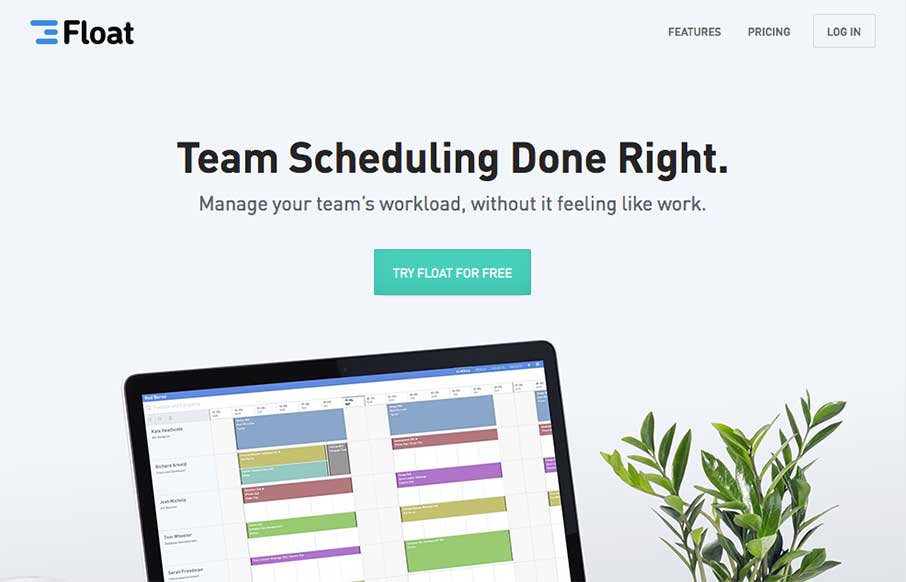
by Gene Crawford | Oct 29, 2014 | Gallery
Beautifully simple. I love it when something so simple can make a site be one of the best i’ve seen like the Float site. Smart image manipulation and a little narrative goes a long way. Beautiful new design for https://t.co/4ltwO0yAgr from @Yarcom — Matthew...

by Gene Crawford | Oct 29, 2014 | Gallery
Wonderfully simple but elegant layout. Tight spacing between elements and good vertical rhythm really makes this site feel like it was crafted with love. Also – check out the map on the contact page – same Google map – different look though.