by Aaron Griswold | Nov 5, 2014 | Design Firm, Gallery
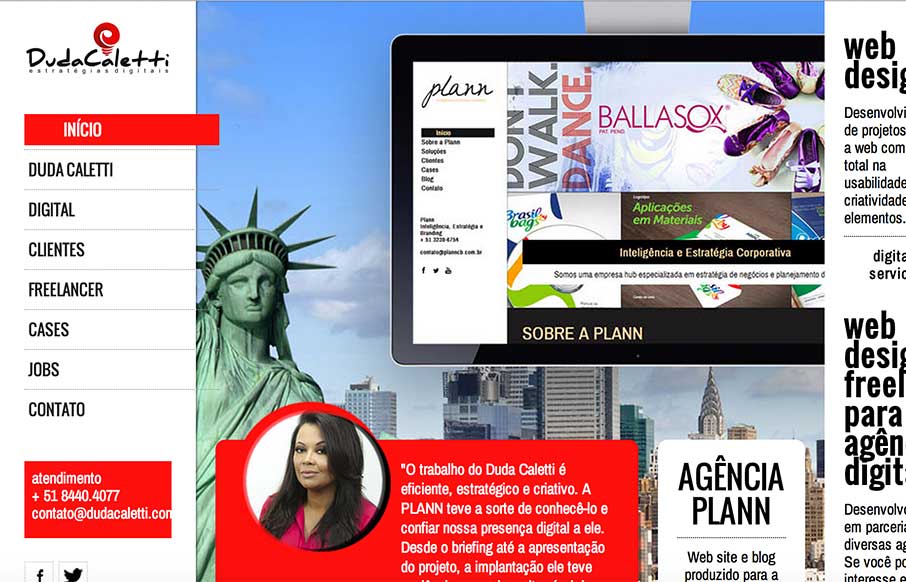
Good portfolio site from Duda Caletti out of Brazil. Like the flat illustrations throughout. I don’t think the links are working to her work / jobs, so would like to see them to see her work. Submitted by: Duda Caletti Role: Designer & Developer...

by Aaron Griswold | Nov 4, 2014 | Gallery, Portfolio
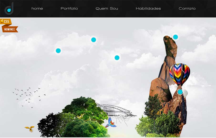
What the freak>?! If you’re going to do a portfolio site – make it different. Daniel Snows has accomplished that. I wanted to take a screenshot of the entire site… but you’ll just have to have fun for your self!

by Gene Crawford | Nov 3, 2014 | Gallery, Travel
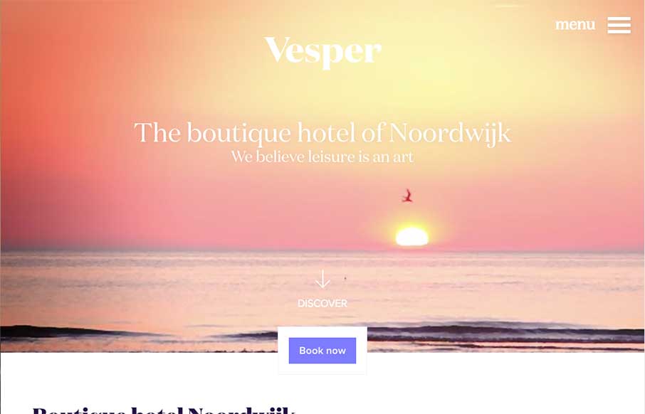
I really like the way the “departure” and “arrival” search is placed. It’s front and center, very good UI. I also dig the way the images reveal as you scroll down, normally I don’t like that kind of treatment too much but it works...

by Gene Crawford | Oct 31, 2014 | Gallery
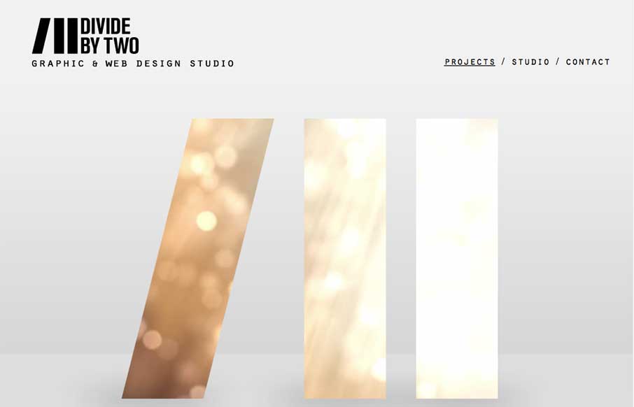
Nice simple layout. I like the logo treatment in the hero image space with the animation/video in the background of the letter forms. Nice touch there. Submitted by: Joana Carvalho Role: Designer & Developer This is my own studio’s website. We tried to...

by Gene Crawford | Oct 31, 2014 | Gallery
The 2015 Webstock site is gorgeous. I love the typography and responsive treatment across the board on it.
