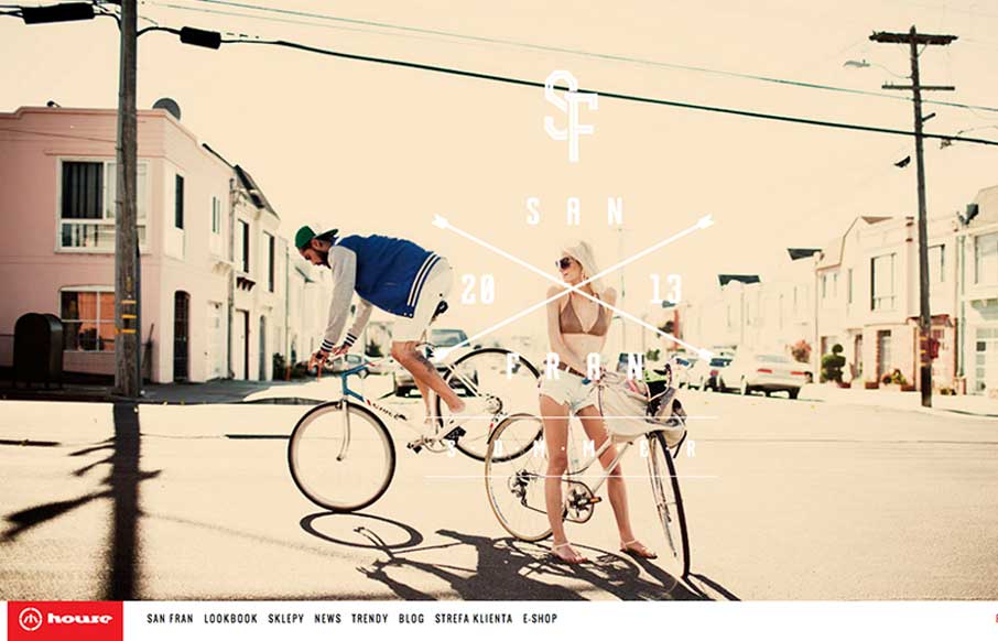
by Giovanni DiFeterici | Jun 20, 2013 | Gallery
House is strongly structured, albe it a little noisy design. The strong use of bold red and imposing lines is wonderfully graphic and paires well with the style of photography. The site is adaptive, which seems to work well enough in this case. Dig it.
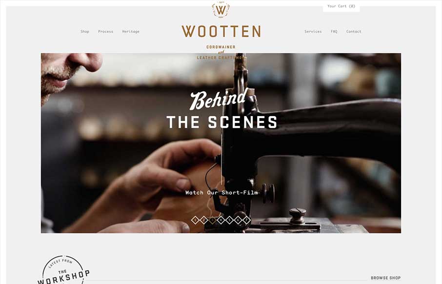
by Giovanni DiFeterici | Jun 19, 2013 | Gallery
Man this is a beautiful site. The photography really sells it. Just check out the heritage page. The mix of fixed imagery and scrolling text is beautiful and the transition between content blocks is perfect. The site has a handcrafted feel that perfectly compliments...

by Giovanni DiFeterici | Jun 18, 2013 | Gallery, Shopping
I really like how carreraworld has broken the grid. The site is well structured, but has loosened the hard lines of the grid it uses to create a more free flowing and energetic design. Nothing feels static. Even thought the design is wildly varies throughout the...
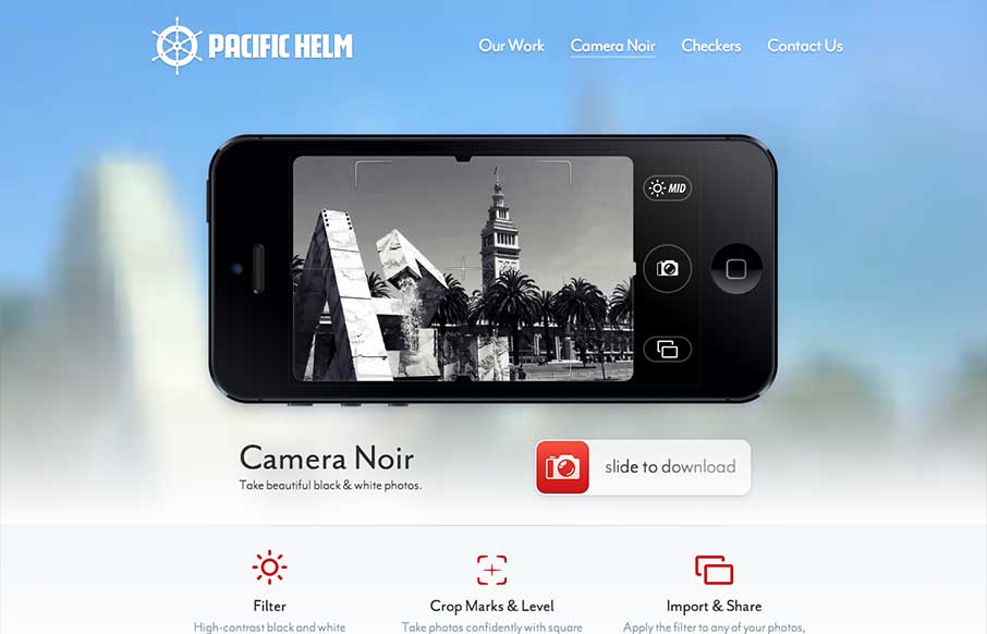
by Gene Crawford | Jun 12, 2013 | Gallery, Screencast Review
Great touch here… The background and the shot in the camera are the same: pacifichelm.com/cameranoir (via @uptonic)— Jason Fried (@jasonfried) June 4, 2013 I like the idea of this page design, use elements of the photos from the iPhone display of the app in the...
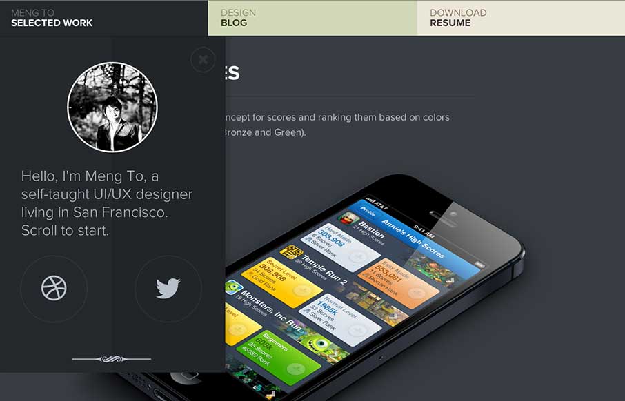
by Giovanni DiFeterici | Jun 11, 2013 | Gallery
Mengto is a study is awesome transitions. The work is clearly beautiful and conceptual. I love the texture and open design. Designers often talk about creating ‘delight’. The animations that slide every element into place upon page load creates that for...