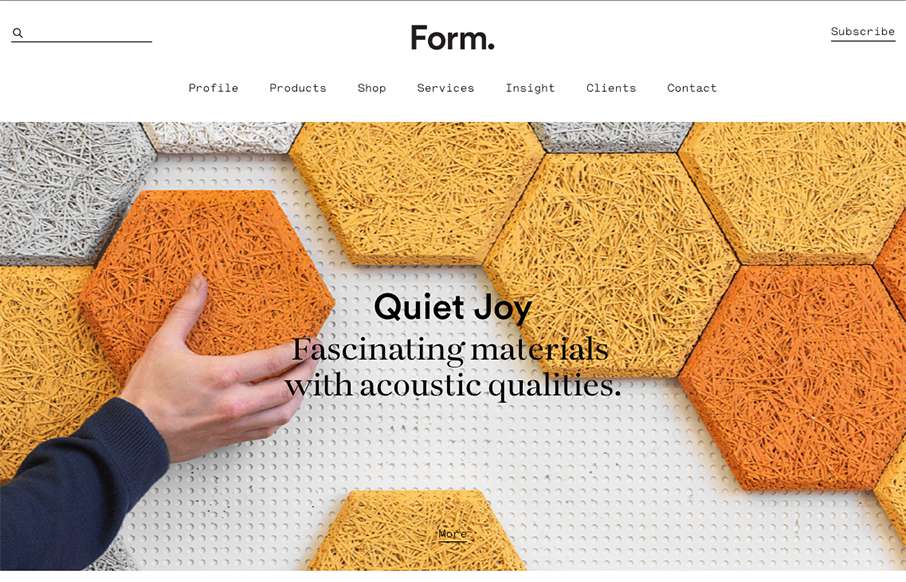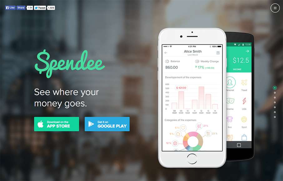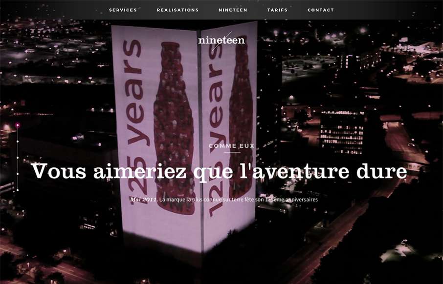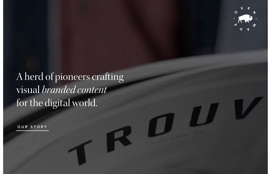
Pretty nifty single page style portfolio website. The tightness of the details all work well together visually and I really like the interaction design on the main project images. Good work! Submitted by: Mahmoud Kida Twitter: @mahmoudkida Role: Designer Country:...
Build Focus
I really like the simple approach of just centering the design here. The illustration is spot on and makes me want to see what this app will look like. Solid construction. From the Designer: This is the pre-launch landing page for a new productivity startup: Build...
Blackbeltmonkey
I dig the oversized image scroll and large text. I also like the navigation fly-out design too. Pretty nifty looking work to boot.
Tinybigstudio
Really nice layout, it immediately draws me in with the animated illustration and the nav being in the lower left corner(ish). I also like the soft color palette and a lot of the asymmetric layout decisions. Beautiful work. From the Designer: New iteration on my...
Studio Rufus
Seriously good minimal layout here. I extra love the selection choice to display the work links in line or with images. The bold typography displayed next to simple project images is always a good choice and it's worked to perfection here. From the Designer: Studio...
Maxxit Systems
It's a pretty standard looking layout, I like most things about it too. What I like most is the 2nd section, the card/block design of the individual project focused part. Strong. The bold read color really helps give things weight too. Submitted by: Jonathan Ryan...
Der Keim
I love the off balance feeling of this layout. The header area is very light visually then below is a heavy image and colorful work section. This immediately draws my attention where it needs to go. Solid looking work too. From the Designer: Clean and colorful...
PhoneGap Day
Really solid yet simple conference website layout. I really like the big header area with the mobile device illustrations that scroll through/over the PG logo. Then I notice that the entire page scrolls over the logo. Neato! There's clearly some love and care put into...
Radar 128
Each week, we do a round up of curated "stuff from the interwebs" that we call Radar. In this week's 128th Radar: A new mobile navigation menu Converting the desktop dropdown nav – From desktop to mobile ConvergeSE 2016 – First Round of Speakers The quality of an...
Mammut – Project 360
Whoa - just when you think you did well with your video background, then you see the Project360 site from Mammut. Then... the 360 image work all the way up the different mountain routes and the interactive work - incredibly nice.
Uber
Well - we already love the design of the Uber app - so it goes to say that their website is just as well designed. Love the sleekness of the whole site - and UX-wise, very easy to get around and get what you need.
GID
Pretty cool background going on for the GID website. I also really like the interactions on the project images too. There's definitely a non-standard approach to the design of this site and it's what makes it memorable to me.
I Love Creatives
I'm not sure about the service but the design is pretty legit. I like that it's largely text based in the layout and there are some nifty design details as a result. The slight parallax on the text and image is quite nice and well placed. I also really dig the...
You Tube 10
Apparently, I am a You Tube expert... I'm not sure if that's a good thing or not - but you can test yourself to see if you are via YouTube's 10th anniversary. Love the canvas work they did - and it's just fun. Enjoy!
VO2 Group
This website for the VO2 Group is pretty powerful in it's imagery and overall interactions. It harkens me back to the days of flash sites pretty hardcore, but I still love it. The interplay from the home page to the longer scrolling project pages are pretty cool. It...
Hawk & Hen
Pretty cool website for this restaurant. I dig the name and branding too. Pretty straight forward but very openly usable by people. Love it.
Gather Table Co.
Beautiful website for the Gather Table Company here. I love the typography and basic layout details. The soft colors really match well with the sharp lines of the images and boxes used for the layout.
SkiBoutique
Today where I am - it is finally cold - after it was 75°F on Christmas Day... so I'm ready for snow - and skiing / snowboarding - so was it a sign that the Ski Boutique peeps out of Switzerland submitted their site? Maybe. Good clean travel site that is easy to...
David Tutera Maternity
Not our normal type of website to review - but good example of a good WooCommerce built site, for a bigger name in fashion / celebrityship. The home page is well done, well organized. Would like to see more in the shopping area - it is clean, but would like to see...
David Taylor Design
I like digital marketing companies that can have a fun time with their own site - David Taylor Design out of New Jersey looks like that. The core of the site is solid (like the section under the Our Services - left/right copy/images - as is the portfolio area - and...
Golden Thread Tarot
This is a cool app product page for Golden Threat Tarot by Tina Gong out of New York. Fun use of animated gifs with flat illustration to show the different views of the app. Since we've made tarot cards for one of our conferences a few years back, we know a lot of...
Radar 127
Each week, we do a round up of curated "stuff from the interwebs" that we call Radar. In this week's 127th Radar: Interface Animation. The Force of Motion Even in the ancient times people knew about the great power of motion. Literature, art, folklore, technologies...
Junko’s Story
Love this one-pager by SBS out of Australia about Junko Morimoto, a Hiroshima atomic bomb survivor. Great mix of illustrations and real, with slight interactions to learn more on the side stories. And just an interesting design altogether.
Bryant Hughes
Really brilliant layout for Bryant Hughes blog. It's subtle and easy to get into. I love the subtle animation/movie of the birds in the background. Plus it's all it needs to be and no more. Superbly done sir.
sublime.fyi
Pretty cool interview website here sublime.fyi. I really dig the layout, it's pretty easy to scroll and see stuff and on the desktop there's a nifty parallax like effect on each section that makes you look at it deeper. Solid design here.
BEOPLAY
This is a great page (and site) from BEOPLAY - beautiful products on a beautiful site. The video and audio, and the way it interacts with scrolling is pretty special.
Maaemo
Love the background video for Maaemo out of Norway - great intro. This site is for a restaurant, so also like that they don't let you miss that point - booking a table is a must for this place. The rest of the site has great photography on a simple background - very...
Colonel Sanders
Aside from being just extremely weird, this is a pretty fun delivery for the content. It has one aim, to better the KFC brand, It's funny i'll give 'em that.
Elite Model Paris
Classic beauty, with great utility is the look Elite Model in France is going for - it's a beholder thing obviously, but I like it. Love the A/B navigation using the content to get the info you want: Male / Female - pick one - Mainboard / Development (I'm assuming the...
UX Pin – Knowledge
So I was doing a little reading this weekend, and I stumbled back on to UXPin. They have an e-book of "The Best Web Designs of 2015-2016" which is excellent work. We're actually going to use some of their suggested sites in the future, since between all the...