
by Aaron Griswold | Dec 15, 2015 | Gallery
Ahhh – our friends at MailChimp have put our their 2015 Year in Review – and it’s pretty sweet! I love how it starts with the mariachi band cover of the Star Wars theme – and even though it’s a simple site, the color and vibe really...
by Gene Crawford | Dec 10, 2015 | Gallery
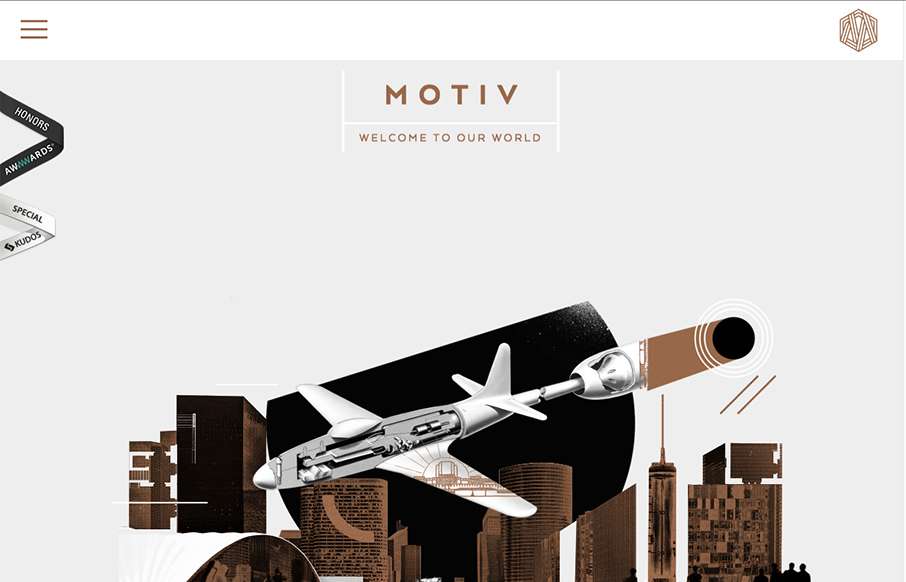
Sometimes architect’s websites can be crazy and very “flash” like. Remember that? I’m still seeing things like that, particularly in this industry for some reason… The Motive site skirts the line with the page loader on each section and...

by Gene Crawford | Dec 9, 2015 | Gallery
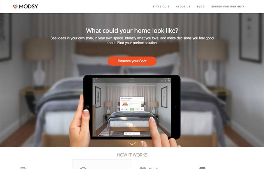
Pretty standard approach but made interesting by doing things a little bit different. I love the way the hero image/area slides up in an animated manner as you scroll, that was surprising and I liked it. I also really like the way they are displaying the work images,...
by Gene Crawford | Dec 8, 2015 | Gallery
The product looks pretty stellar and the website matches it quite well. I dig the simplified lines and approach to the layout. The slider being place down lower on the page scroll is well placed and timed too.
by Gene Crawford | Dec 3, 2015 | Food and Beverage, Gallery
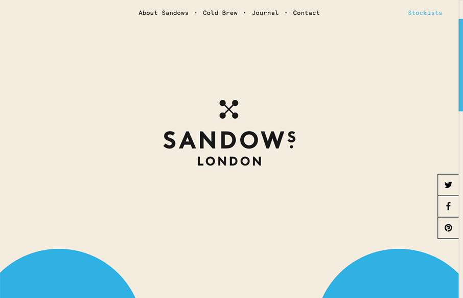
Super cool scrolling image in the background of the site, turns out it’s the logo too. Pretty solid. I love the minimal yet engrossing vibe of the site. If only I could try this coldbrew!