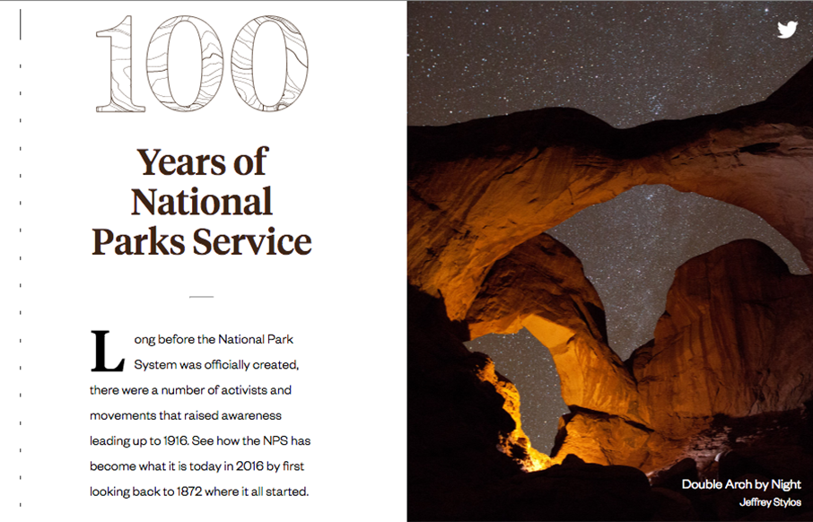
by Gene Crawford | Jul 26, 2016 | Gallery, Travel
Beautiful website for a really beautiful thing. Love this sooo much.
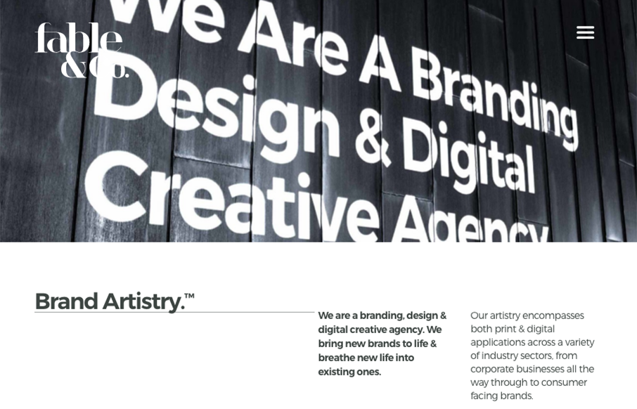
by Gene Crawford | Jul 20, 2016 | Design Firm, Gallery
The first thing I see when I check this site out is the use of typography within the imagery. Very cool. I also love the use of color being minimal and only on instances where work is being shown off. Good stuff, subtle design. Bravo.

by Gene Crawford | Jul 18, 2016 | Gallery
I love, love, love this layout. I love the way the images load and the way they are spaced, etc… brilliant site design harbr!
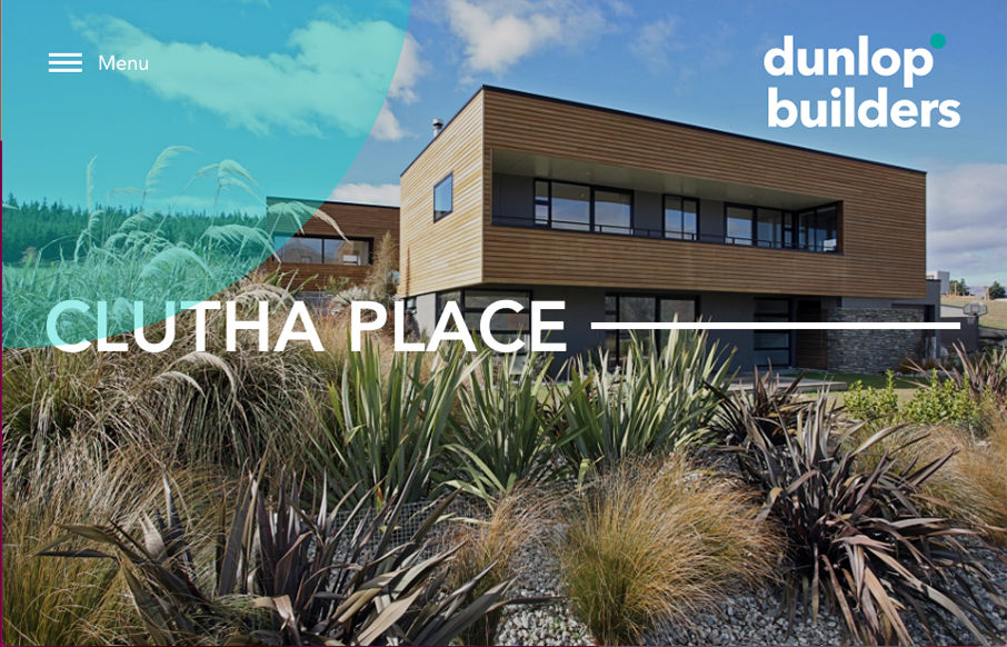
by Gene Crawford | Jul 15, 2016 | Design Firm, Gallery
Beautiful photos for dunlop builders. I really like that hamburger nav and placement, especially with the blue circle that helps draw your eye to it. Then when you click it it enlarges, pretty cool.
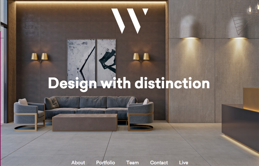
by Gene Crawford | Jul 14, 2016 | Design Firm, Gallery
I like the 1/2 way corporate and 1/2 way trendy feel to the site for WhiteHall. Great typography and some good photography make the site shine to me.