by Aaron Griswold | Mar 13, 2015 | Gallery, In-Depth Review, Photography, Portfolio
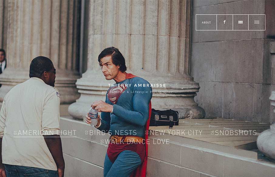
I found this site from a photographer and art director from Paris, Thierry Ambraisse, a little while back – and for some reason didn’t review it. I found it again this week, and something resonated with me, and really paid attention to the photos, the...

by Aaron Griswold | Mar 10, 2015 | Gallery
I’m not sure if the name Flat Cow is a play on an oxymoron, but design-wise, I like the contrast between the flat design, coupled with robust design – it plays well on this site. Also, the full-width design on the Work page is also pretty cool – and...
by Aaron Griswold | Mar 9, 2015 | Gallery, Gaming
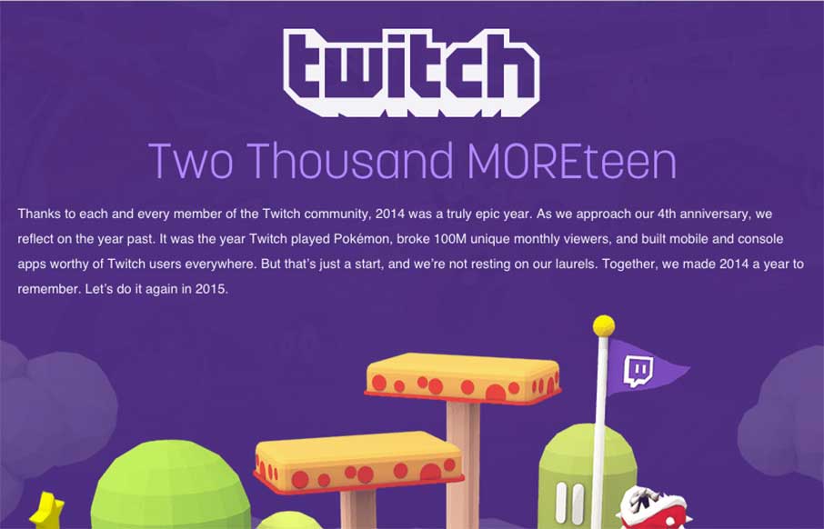
I’ve said before that we really like these year-end summary sites for different companies – and Twitch’s is a good one too! Pretty cool that you can have a multi-million dollar company based on watching other people play video games – but aside...

by Aaron Griswold | Mar 6, 2015 | Gallery, In-Depth Review, Sports/Recreation
My 9yo son has his second baseball game of the season tonight. I showed him the St. Louis Browns website last night at 8:30pm (his bedtime) – and I found myself explaining the site and the team to him until 9pm (my bedtime) – Satchel Paige,...
by Gene Crawford | Mar 4, 2015 | Gallery
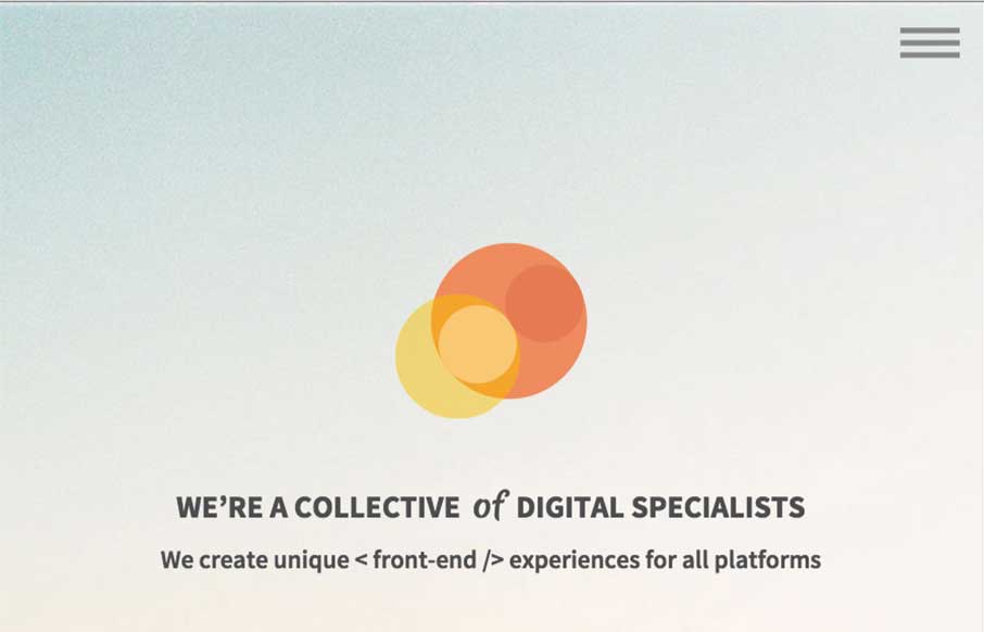
This Prollective site is a theme, that they made – they note it at the bottom of the page. It’s a pretty dang good looking site and template too, just thought you would enjoy checking out what these guys do with it. We’re a collective of handpicked web...