
by Gene Crawford | Sep 30, 2015 | Gallery
The Loppist is a great example of a website with a “mega” drop-down navigation design. I really like this and how it shows more info before you drill down into the site. It’ll help that pogo-sticking thing that people get into on a product site.
by Gene Crawford | Sep 29, 2015 | Gallery
I love minimal and clean design. This site pushes it to the limit. It’s doing everything right on that side of the house. I do think it falls short a little with the nav items being set in white text, they can get lost based on the background images. However...

by Aaron Griswold | Sep 29, 2015 | Gallery
Good, clean site from Spendee – a product page for a finance app. Good movement on the on-scroll / scroll-jacking actions – and especially like the hamburger menu that opens up simple horizontal nav on the header – it’s actually different than...
by Gene Crawford | Sep 28, 2015 | Design Firm, Gallery
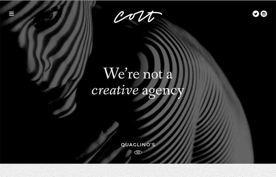
This site design hits all the “now” standard things design and interaction wise. But sometimes you get it just right, I love the smooth feeling vibe to this site and the imagery is quite nice. The way the case study images load as you scroll for the first...
by Gene Crawford | Sep 24, 2015 | Gallery
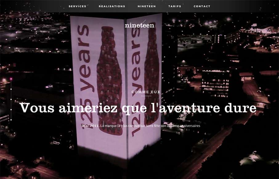
I like the overall vibe of this site design. The black and white setup is nice and gives it a sense of class. The photos are pretty rad too. Smooth experience as well as you make your way down the page(s). Submitted by: Swann Mayor Twitter: @swann_nineteen Role:...
