by Gene Crawford | Nov 25, 2015 | Gallery, Medical
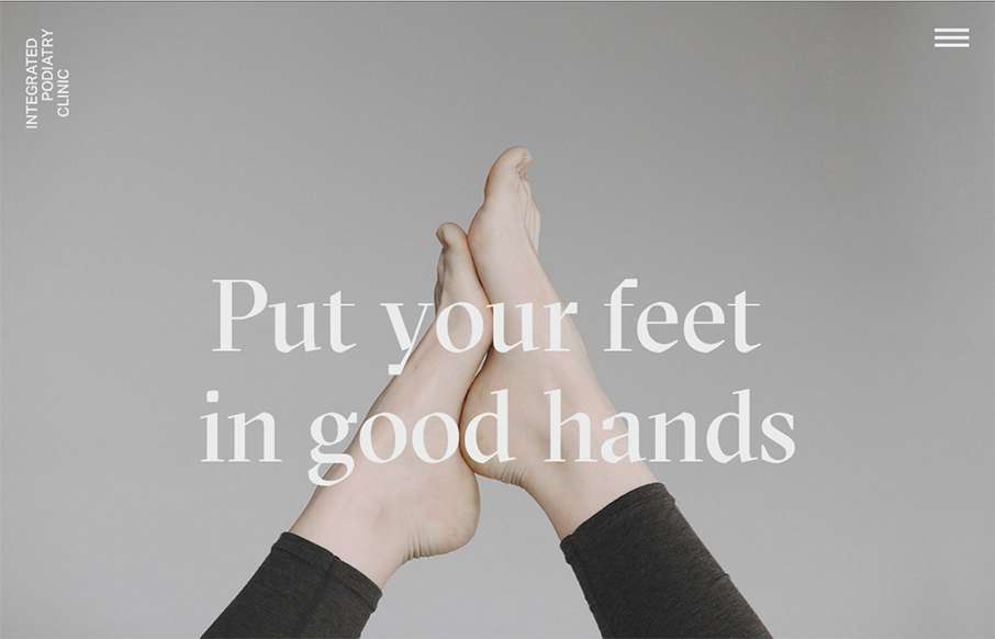
Super rad website for a Podiatry clinic. You just don’t see this type of design being brought to client’s like these. Superb work on making something mundane feel really hip and new.

by Gene Crawford | Nov 24, 2015 | Design Firm, Gallery
Nice grid based layout for Firmalt. I like the Masonry like treatment of the main image blocks as you scroll down the page and shift screen sizes. Nice solid simple layout always wins!

by Gene Crawford | Nov 24, 2015 | Gallery
Holy hell I love this site design. The way the main hero area/image merges into the main site is brilliantly done. Then the rest of the layout is invigorating. Do me a favor, just spend some time on this site and tell me what you think!

by Gene Crawford | Nov 17, 2015 | Gallery
Beautiful design, I love the typography especially. It’s a super long page but the different sections’ design makes you keep scrolling, which is the brilliant part to this design. Then the detail work, like the “time to read” mouse over is so...

by Gene Crawford | Nov 12, 2015 | Gallery
Very thoroughly done website design for this portfolio site. I love the look and feel from top to bottom. The subnav flyaway is pretty cool and I love the “card” part for the work section. Brilliant work.
