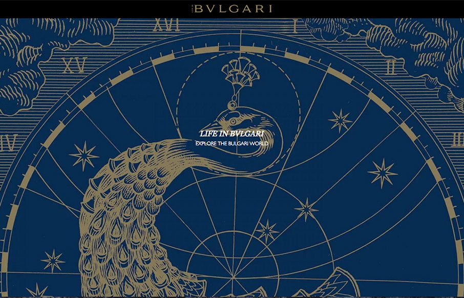
by Aaron Griswold | Feb 15, 2016 | Gallery
Now this is a great looking magazine from Bulgari out of Italy. There’s very little explanation on the site, but it looks like this is a supplementary site for the Bulgari site, that shows the lifestyle of / aspire, of the brand’s clientele. It’s...

by Gene Crawford | Feb 10, 2016 | Gallery
Pretty neat approach with the 8th Sphere website. No real images of anything, just line graphics and a dark background with white text. You don’t see that often anymore. I dig this approach. I like the main graphic a great deal, the process/machine one. Pretty...
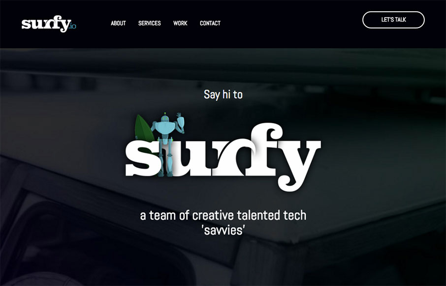
by Gene Crawford | Feb 10, 2016 | Gallery
Some real nice interactions worked into the Surfy website. I love how the main navbar isn’t visible until you scroll a bit, then sticks. Then you’re presented with a stack of work samples with a slight zoom effect when you mouse over each one. Clever and...
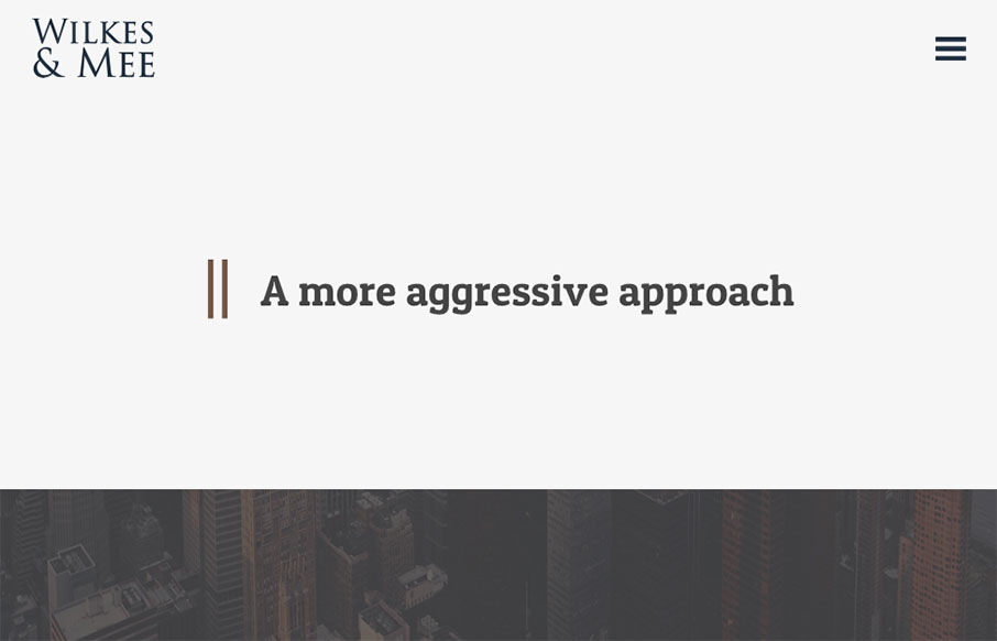
by Gene Crawford | Feb 4, 2016 | Gallery
I love minimal design, especially when I see it utilized for a client like this. It’s hard to convince them (typically) of the approach. This site is a great example of how it can work well in a real world scenario. Bravo Garrett. From the Designer: Modern and...

by Gene Crawford | Feb 3, 2016 | Gallery
Really solid, well designed client website for Hutch Law. Does just about everything right. I like the bold colors and placement of certain useful elements for the company on the page. From the Designer: New Media Campaigns recently redesigned the website for Hutch...
