by Gene Crawford | Dec 4, 2012 | Gallery, Portfolio
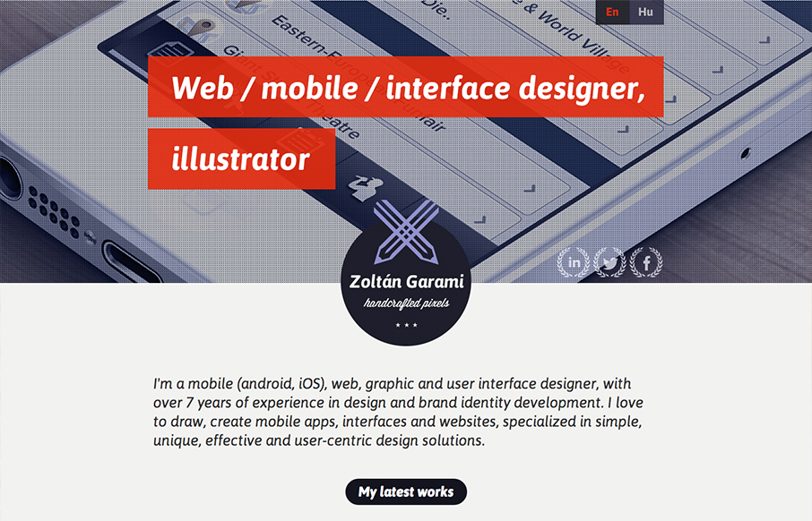
Submitted by: Zoltan Garami @garamiz Role: Designer I like the placement of the red behind the white text that’s over the monochromatic image. I know it’s simple and been done before but it’s nicely done here and I just like it. The logo is nicely...
by Gene Crawford | Dec 3, 2012 | Gallery, Portfolio
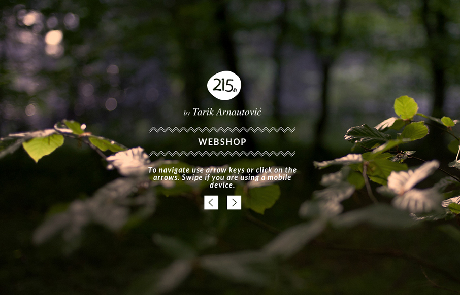
I love subtle design and this site is a perfect example of that. The left right arrows that match up with the keypad, then the simple placement of interactions/controls. Like when you click on menu and the big X is over the content of the previous page/view. Love it....
by Gene Crawford | Nov 29, 2012 | Gallery
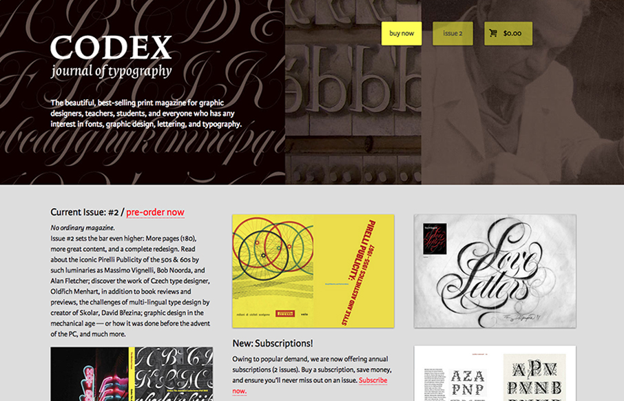
The Codex Magazine website is beautiful. I love the blocks of content on the home page, it’s clear and concisely laid out and all so well balanced. It feels a little asymmetrical but completely balanced evenly. It’s also a really nice mobile layout down to...
by Gene Crawford | Nov 29, 2012 | Community / Social Networking, Gallery
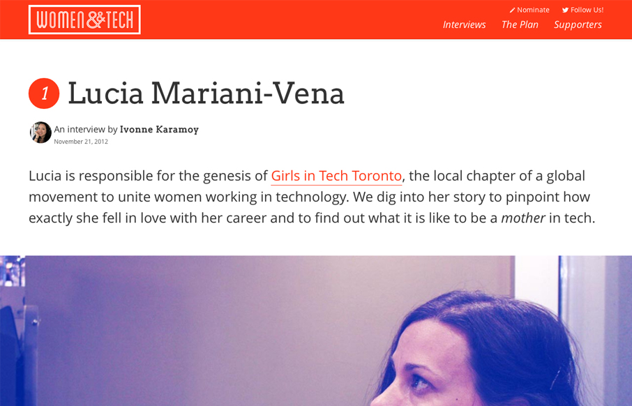
Brilliant layout for the Women & Tech website. It’s a gorgeous long form narrative based content site with a responsive wrapper. I love it. It’s also a really great service for the community at large.
by Gene Crawford | Nov 28, 2012 | Gallery, Music, Screencast Review
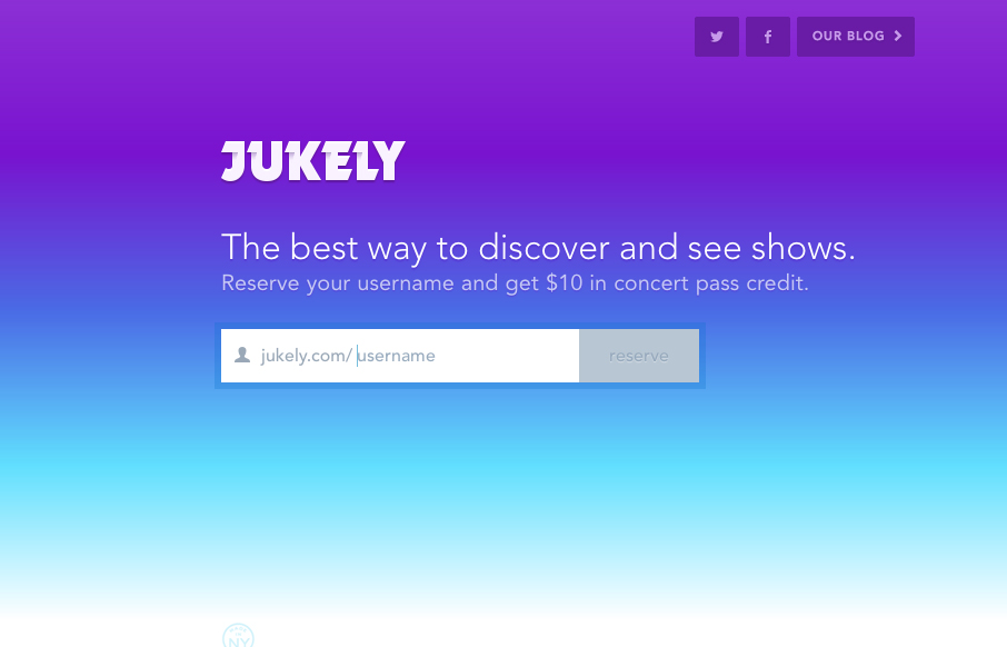
We don’t normally post a lot of coming soon pages or signup form pages like this. However, the Jukely interactions are well done and actually spur on the desire to use the signup form. It’s fun and inviting and creates a nice little moment of delight all...
