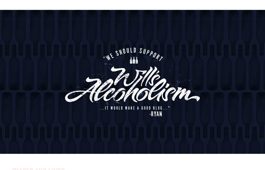
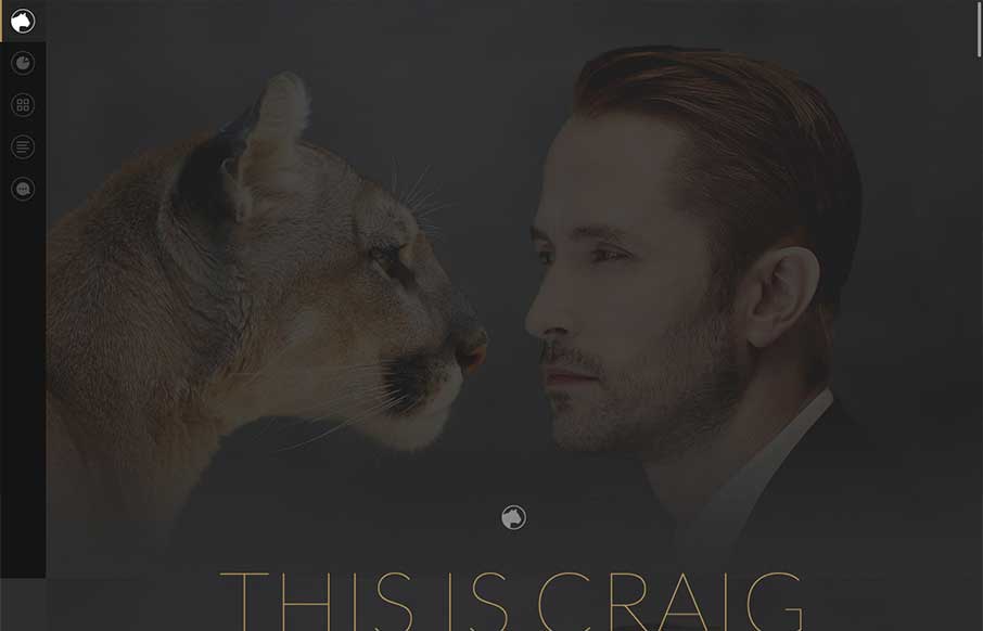
by Gene Crawford | Aug 29, 2014 | Gallery
Fun, it’s that simple. Great visuals and great execution. I just like to sit here and scroll the page. It’s like cats, i’ll watch it again and again.
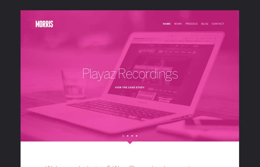
by Gene Crawford | Aug 26, 2014 | Design Firm, Gallery
Cool vibe to this site design for Morris. I like the colors and they way the elements are presented. It feels kind of fresh and has that “mobile” vibe to it visually. Pretty neat.
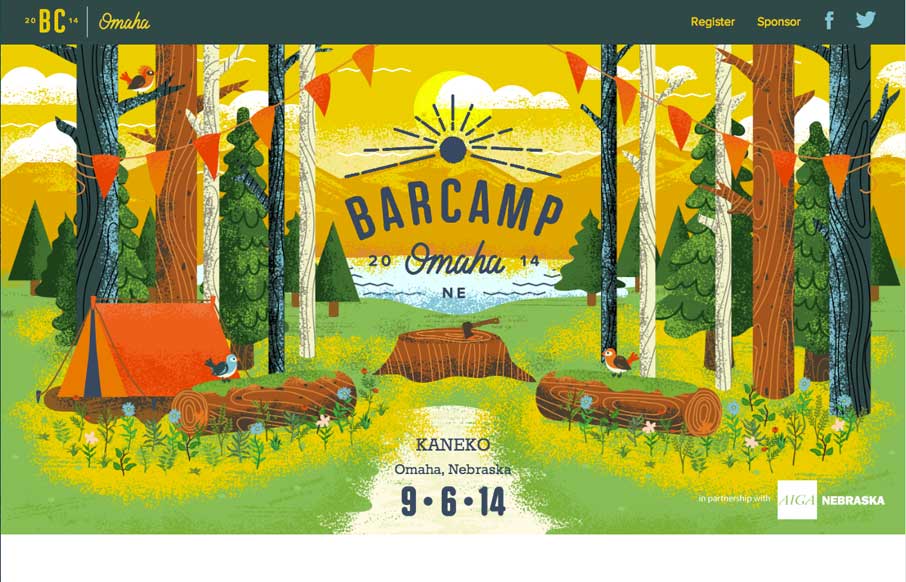
by Gene Crawford | Aug 22, 2014 | Gallery
The Barcamp Omaha website is just beautiful. I love just about every aspect to it, but the thing that I dig most is the illustration work that sets the tone. It promises a pretty well organized Barcamp; quality is driven home via the visual branding. I only wish I...
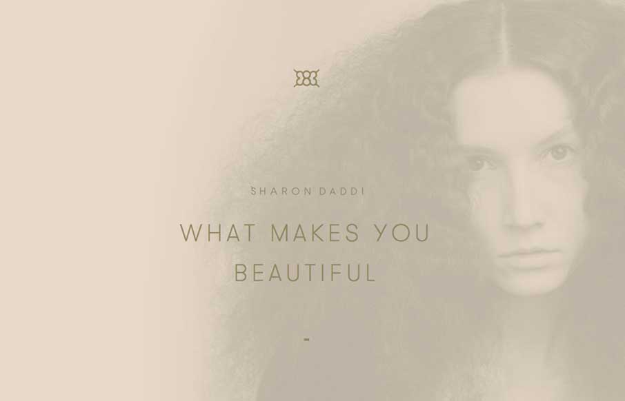
by Gene Crawford | Aug 20, 2014 | Gallery
What a unique design for this salon. I feel like it’s really something different for what most people experience with their salon’s website. It’s subtle and very smooth feeling as you go through it to me.
by Aaron Griswold | Aug 15, 2014 | Gallery
Thank the gods of the interwebs that there is finally a designer portfolio page that has everything you want in a significant other – smart, beautiful, and funny. We joke around here sometimes that we would like to change the message of our client services...