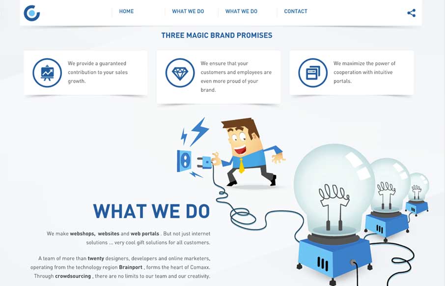
by Aaron Griswold | Apr 4, 2014 | Design Firm, Gallery
I like this nav design. It’s a different idea to include, pretty much, a sitemap as your main nav if you can (if the site is small enough). I also dig how the illustrations are used and interact visually with the copy.
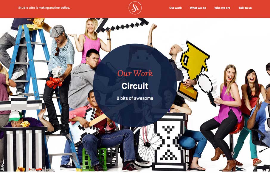
by Aaron Griswold | Apr 3, 2014 | Design Firm, Gallery
Pretty slick movement on the site as you scroll. I like the way the colors flip around too on interaction with the main nav. Clever stuff here.
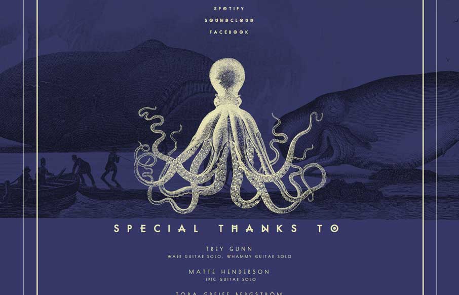
by Aaron Griswold | Apr 3, 2014 | Gallery, Music
Really beautiful single page site for this band. I luurve the illustrations.
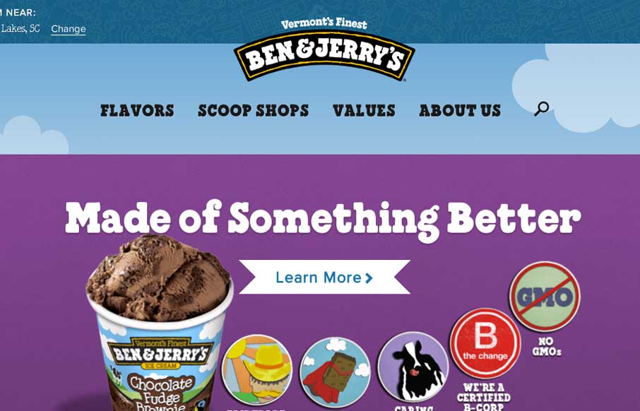
by Gene Crawford | Apr 2, 2014 | Food and Beverage, Gallery
The new Ben & Jerry’s site, done by Happy Cog is super nice. But there’s more here than just a pretty face. There is a ton of strategy behind it and you can feel it as you use the site. Mmmmm Ice Cream…. They have a pretty epic case study and a...
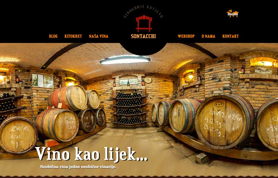
by Gene Crawford | Apr 1, 2014 | Food and Beverage, Gallery
Here’s a fun website. Chock full of compelling imagery and effects. It’s fairly simple and straightforward with it’s single page approach but there is enough here to really entice you. That first image of the casks alone makes me want to give them my...