
by Gene Crawford | Feb 3, 2015 | Gallery
I like the monochromatic approach to the color and the simple line art icons give it a good vibe. I also like the way the header is treated visually as you scroll down a bit.
by Gene Crawford | Feb 3, 2015 | Gallery
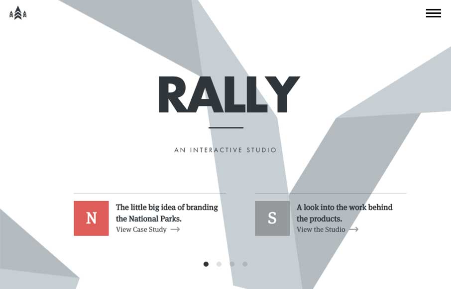
I love just about everything there is about the Rally website. The main “hero” area, not sure what to call this area anymore really, is super dope. The “ribbon” graphic is very nicely executed, even when you scale the screen down the ribbon...
by Aaron Griswold | Feb 2, 2015 | Gallery, Software
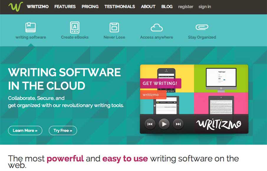
I like how Writizmo went with their main content in the hero area. The marketing messages / feature lists that a lot of web apps use are normally in a long scroll below the fold, or in a rotating barrage / slideshow that no one really looks at…( just...

by Aaron Griswold | Jan 28, 2015 | Gallery
Man that site is shiny, and twinkly. I like how Kurzik, out of the Ukraine has amped up the look and feel of their site with dark backgrounds and bright highlights. And I swear the video background is responding to me / my mouse – I know it’s not.. but...
by Aaron Griswold | Jan 28, 2015 | Gallery
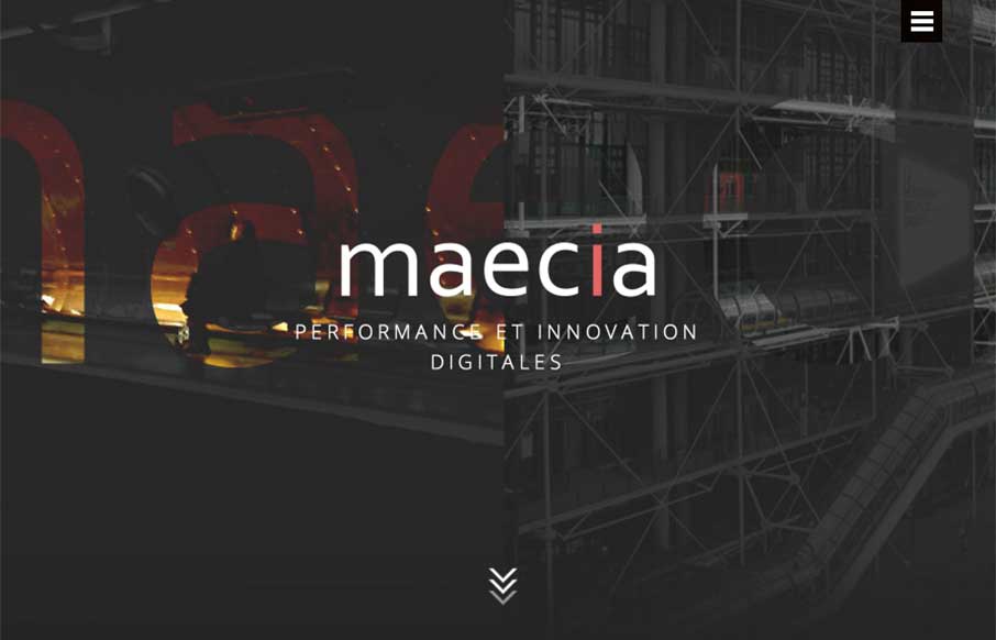
Go ahead – click the hamburger icon… didn’t expect that did you? Maecia, out of Paris has a great site that combines old and new, from the 1800’s industrial line art to the animated svgs and video backgrounds and motion when you’re not...
