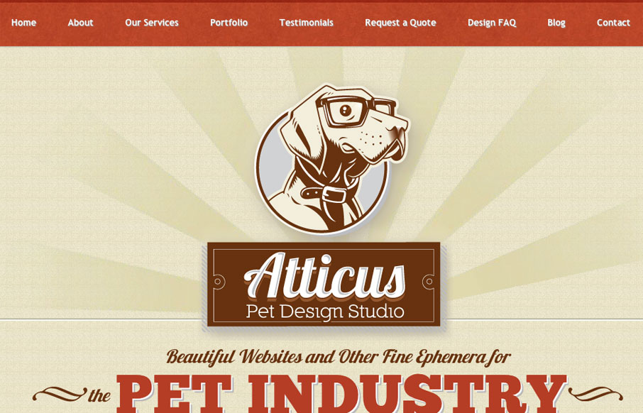
by Gene Crawford | Mar 28, 2012 | Gallery
Very tight design. I like the animated background image around the logo/illustration. I particularly like the effectiveness of the footer area/contact form. The experience of going from page to page and getting the slide down effect is pretty cool, but gets a bit...
by Maria | Mar 26, 2012 | Gallery, Marketing
Soleil Noir’s 2012 wishes is just plain fun to play with. Vertical parallax meets bright happy colors, simple messaging, and some animations to add another slight layer of wow. The nav on the side is neat. Choosing a colored dot is like picking an easter egg not...
by Maria | Mar 9, 2012 | Gallery
Happycog.com is everything you would expect it to be. It’s well designed from code to color and is a solid representation of evolution on the web. What I feel is consistently strong with every new design is the tone and personality the content delivers and how...
by Maria | Mar 8, 2012 | Gallery
The color scheme screams hot dog. And I immediately became hungry. Interesting use of infographic-style for the menu item descriptions. Hot dogs are generally a pretty simple thing to order, but this puts some love and fun into it. The color for hot dog and Heinz...
by Gene Crawford | Mar 6, 2012 | Gallery
Okay, holy crap. Sometimes a site like this comes along and it makes you stop and rethink your design career. I’m done for the day…