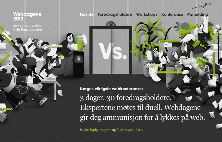
by Gene Crawford | May 16, 2012 | Gallery
Really fun responsive conference website design. I love how the main illustrations interact differently with the other screen sizes. The illustrations are also really fun too. Overall it’s a lovely website for a conference and if the show is as good as the site...
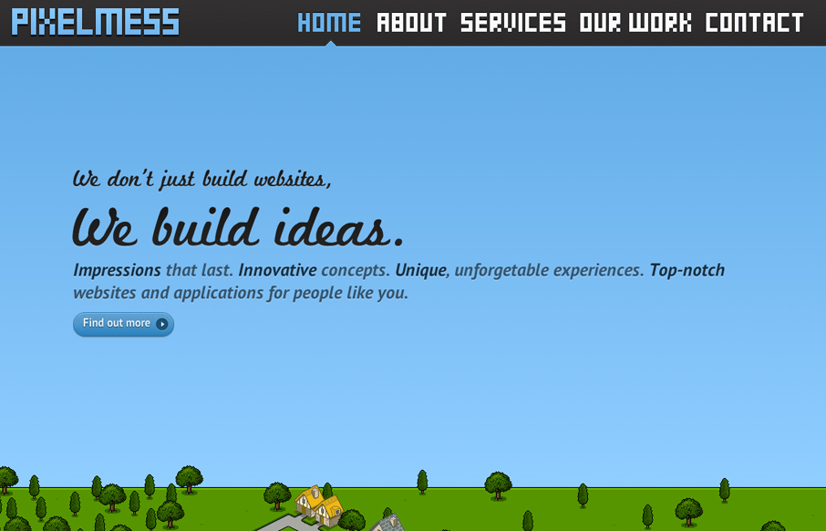
by Gene Crawford | May 15, 2012 | Gallery
Awesome effects, cool scrolling, one page design. Has a very friendly feel about it. Humanizes the studio. Submitted by: Sean Geng @seangeng Role: Designer & Developer Really fun website concept. The sidescroller layout with the illustrations is brilliant. The...
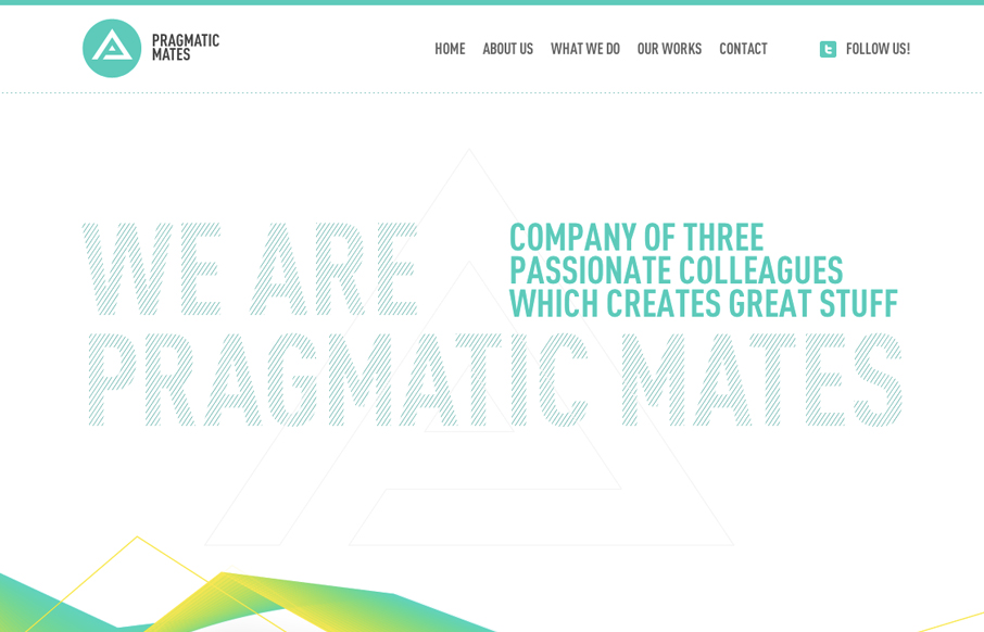
by Gene Crawford | May 14, 2012 | Gallery
Submitted by: Lukas Vinclav Role: Developer What a great scrolling site design. I really like the interaction of the main navigation and the targeting of the content section on the page. The slight movement and readjustment is a very nice touch. The colors are really...
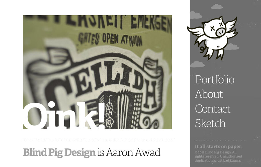
by Gene Crawford | May 11, 2012 | Gallery
I love websites like this one. It’s simple but the work and details speak for themselves. The mouseover on the pig/logo is brilliant. For such a minimal design I spent a lot of time looking over this site. You win!
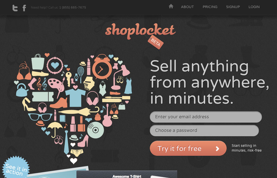
by Gene Crawford | May 10, 2012 | Gallery
The ShopLocket site is a visual feast of illustration work and crisp graphics. I love the color usage and the overall vibe of the site. There are some cool little interaction pieces to get into on the home page too that make for nice surprises. Though I want the big...