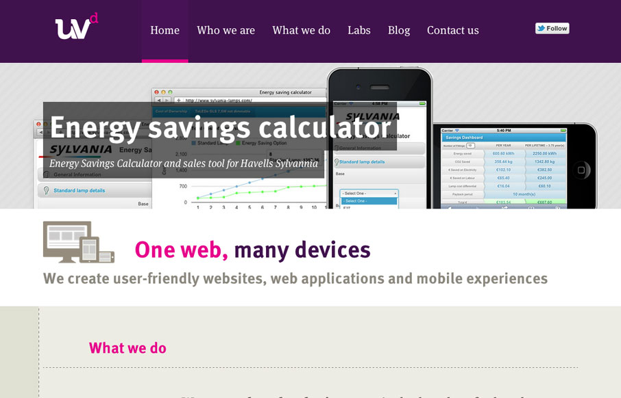
by Luke Williams | May 29, 2012 | Gallery
Fantastic new website by the awesome guys at Ultraviolet Design, the awesome responsive approach is matched by astute attention to providing a great UX and great typography, awesome work. ASCII FTW!
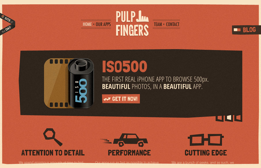
by Gene Crawford | May 22, 2012 | Gallery
The pulpfingers.com site is simple gorgeous. I love the orange/red and brown/black coloring, it’s unique looking and along with the stark graphic illustrations gives it a nice sense of rememberability. There are some neat little visuals here and there on this...
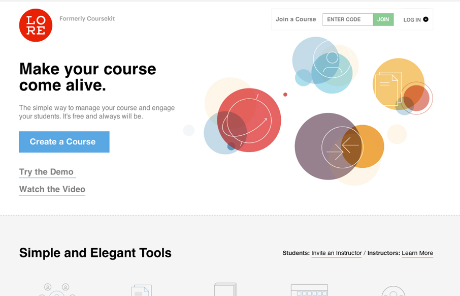
by Gene Crawford | May 22, 2012 | Education, Gallery
Lore previously known as coursekit (this subsite is a beautiful experience in it’s own right – check it.) is a simple looking layout, but is very well balanced and packs a punch impact wise. It’s both subtle and complex at the same time wich just...
by Gene Crawford | May 21, 2012 | Gallery, Photography
Submitted by: Paul Mosig @r_a_c_k_e_t Role: Designer & Developer Very simple website execution, the fixed header/navigation bar does give it a level of interest interaction wise, as well does the FAQ section. It’s the illustration work that sets this site...

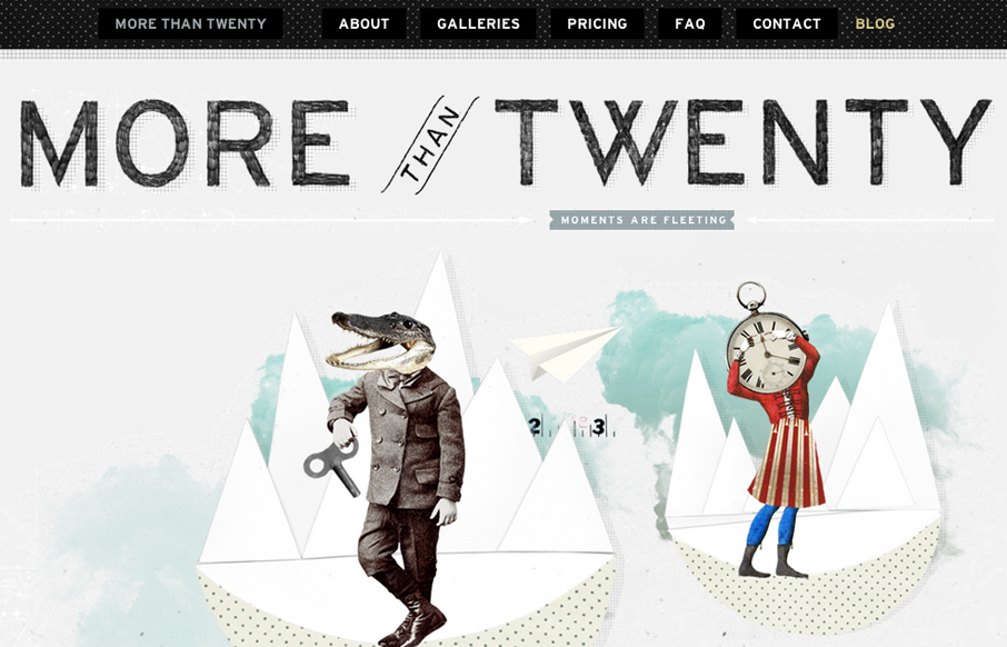
by Gene Crawford | May 18, 2012 | Gallery
A one-pager with loads of subtle texture and a gentle worn vintage look. The landing page utilizes HTML5/CSS3 and a bit of javascript to engage users and showcase the interface design work. Really wonderful design, with some super nice details. I love the fixed header...