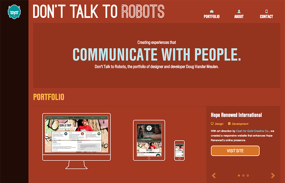
by Gene Crawford | Dec 10, 2012 | Gallery, Portfolio, Screencast Review
Submitted by: Doug Vander Meulen @dt2r Role: Designer & Devleoper Don’t Talk to Robots is the portfolio of designer and developer Doug Vander Meulen. The responsive design highlights various web design and print projects via re-sizable slideshows. The site...
by Gene Crawford | Dec 10, 2012 | Gallery
The distinct navigation layout change going from the desktop to smaller screen widths is a very nice difference from most other responsive sites’s i’ve been seeing. There’s also a lot of interaction built in as you mouse over and click on the various...
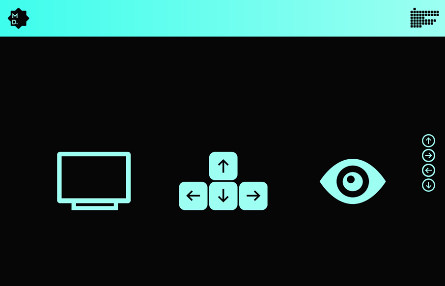
by Gene Crawford | Dec 7, 2012 | Gallery, Portfolio
Marked by some really fun interactions with they keyboard, this portfolio site for Michel Doudin is well done. It’s an interesting way for sure to serve up your work visually to others.

by Gene Crawford | Dec 7, 2012 | Gallery
Talk about a narrative driven website. This one is very nicely crafted with the animated illustrations and the timeline that slides in from the left and right telling the story of the wedding party. Lovely lovely website here.
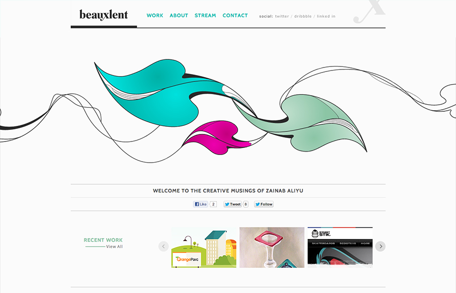
by Gene Crawford | Dec 6, 2012 | Gallery, Portfolio
It’s a pretty standard and simple layout but accentuated by that nice leaf illustration. That illustration is the central focus of the design and makes you really start your visual journey around the page there in the center of the page almost.