
by Gene Crawford | Apr 7, 2014 | Gallery
Love the minimal color palette. Smooth transition between the topmost section and the main nav load too. Then plenty of little visual interaction pieces across the page as you scroll to keep things interesting. Lovely site.
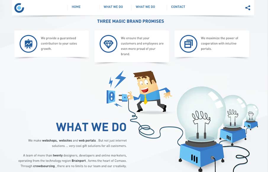
by Aaron Griswold | Apr 4, 2014 | Design Firm, Gallery
I like this nav design. It’s a different idea to include, pretty much, a sitemap as your main nav if you can (if the site is small enough). I also dig how the illustrations are used and interact visually with the copy.

by Gene Crawford | Apr 1, 2014 | Gallery
Nice effect with the background video and how it stays in place as you scroll down. I really like the contact form and how the field labels are handled – very nice.
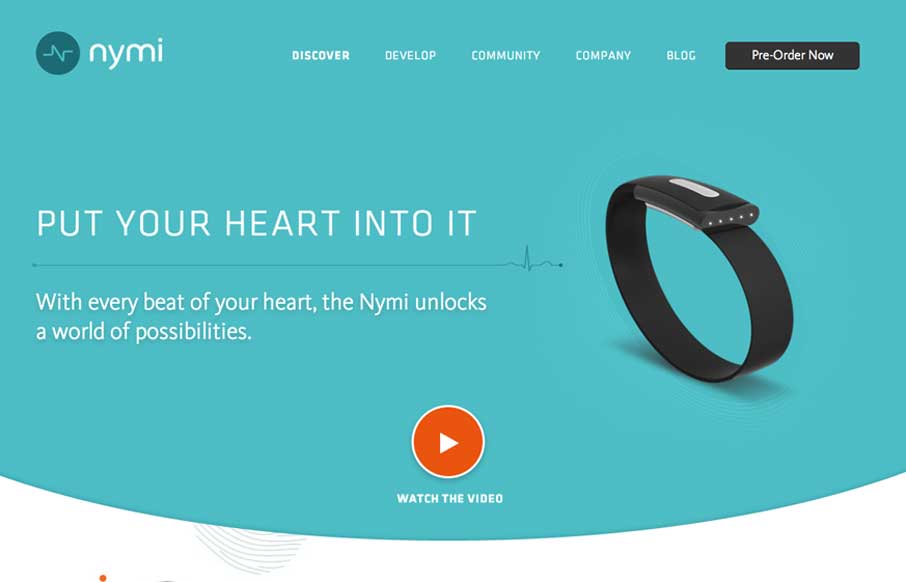
by Gene Crawford | Mar 28, 2014 | Gallery
Nice product site design here with nymi. I really like the main featured area and the focus put into designing for different screen widths for it. The little radiating lines animation is a nice subtle touch too.
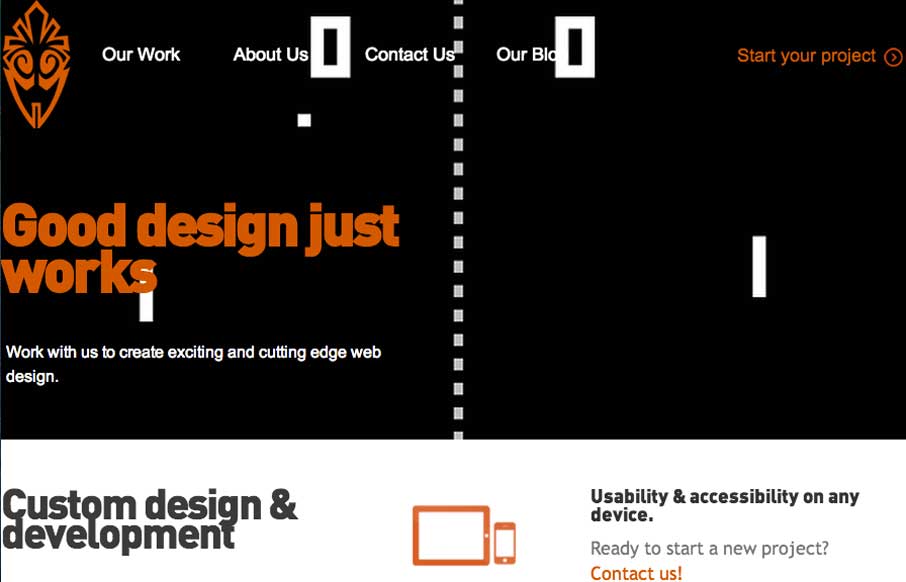
by Gene Crawford | Mar 27, 2014 | Gallery
Overall the layout of 3 One Seven is intense visually. There’s blocks of imagery competing for your attention – which as I review this site appears to be the point of the design. It’s successful in that the images are actually compelling visually and...