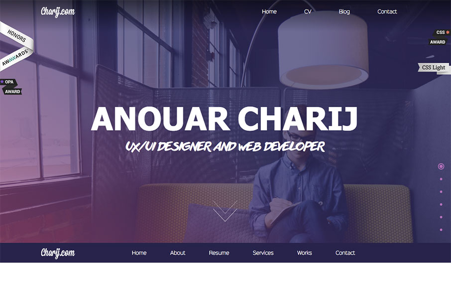
by Gene Crawford | Apr 25, 2016 | Gallery
Pretty standard fare from a layout perspective but what i’d like to point out is the animation load for the timeline. That’s pretty rad, I think it kind of makes the site for me. Good stuff.
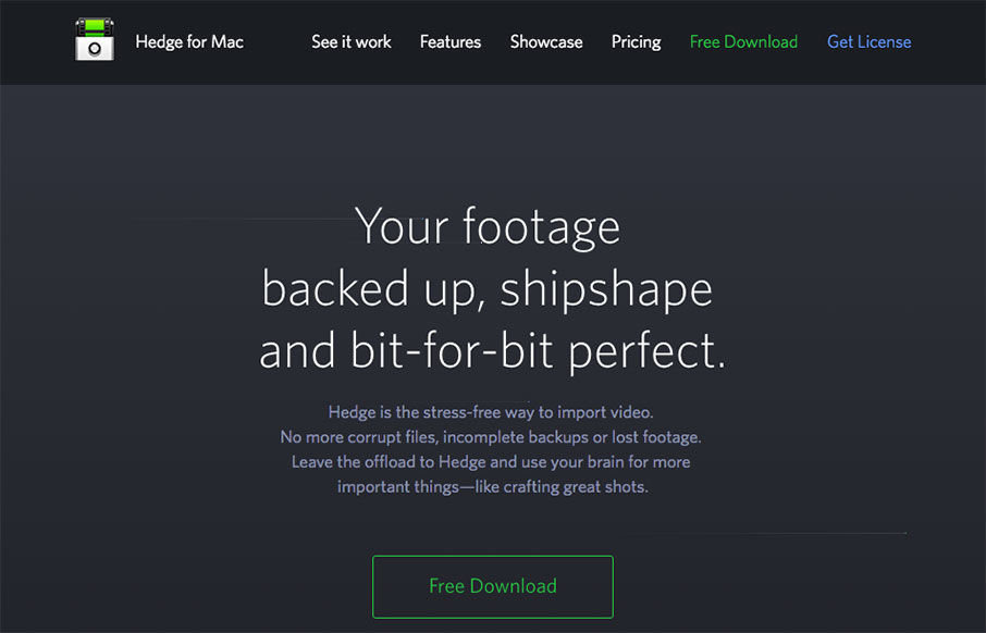
by Gene Crawford | Apr 21, 2016 | Gallery
Pretty nifty app/product website. I dig the animated piece that explains what the app does and how it works. Also nifty that it’s largely a dark background site. Wanting to showcase Hedge’s main features we chose to feature an animation combined with a a...
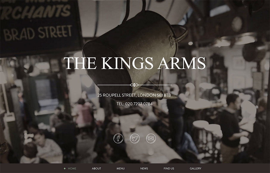
by Aaron Griswold | Feb 29, 2016 | Food and Beverage, Gallery
Great, tight one-pager from The Kings Arms pub out of London. Subtle grays and greens to give the site a warm aesthetic, which I’m assuming is the same for the pub itself (will have to find out next time in London).
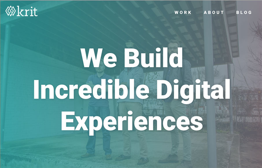
by Aaron Griswold | Feb 22, 2016 | Gallery
Full disclosure – the boys at Krit are friends of ours – they actually sit, um, right there 10 feet away from us in the co-work we run – and they have a lot to offer. We were building our new “agency” site at the same time, so it’s...

by Gene Crawford | Feb 10, 2016 | Gallery
Pretty neat approach with the 8th Sphere website. No real images of anything, just line graphics and a dark background with white text. You don’t see that often anymore. I dig this approach. I like the main graphic a great deal, the process/machine one. Pretty...