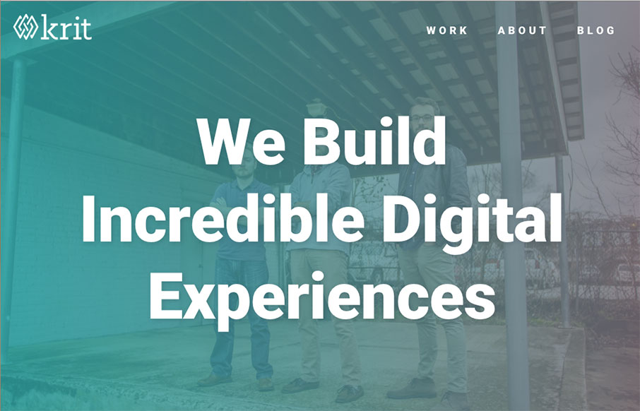
Full disclosure – the boys at Krit are friends of ours – they actually sit, um, right there 10 feet away from us in the co-work we run – and they have a lot to offer. We were building our new “agency” site at the same time, so it’s been fun to watch each other’s work grow and get launched.
Without being biased – I like the overall design of the site – clean, crisp – always a good start. The movement on the site is good – I like how on-scroll, text comes in from different places, without being distracting. And also really like the sidebar work – in the blog with the trapezoids – and on the home page with the H2’s (“How We Can Help” example) – smart way of doing section titles. Good – solid – work.
From the Designer: We recently rebranded and launched this site to be the center of that new brand. We really wanted to get across how we can help companies through our services rather than just focus on what those services were.
To go along with the brand, we wanted to show that we do high-quality work but we also like to have fun and are a little goofy.
A big section on the site is the blog, called Ten Thousand Hours. The concept behind it was inspired by Groove’s Startup Journey blog and it will basically follow what we’re learning during our first 10,000 hours as a client shop. We’re planning on adding quality content regularly and building up an audience around it.
Submitted by: Austin Price
Twitter: @austinwprice
Role: Designer & Developer


0 Comments