by Gene Crawford | Oct 28, 2014 | Gallery
Pretty crazy navigation interactions on the Komunigrafik site. I’m not sure how I feel about it, what about you guys?

by Gene Crawford | Oct 27, 2014 | Gallery
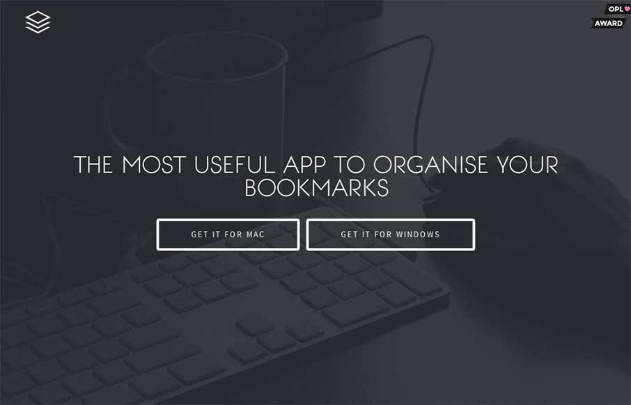
Nice dark design. You don’t see too many sites done using dark background this well. I also really like the main/hero image of the app screenshot and how it lifts up and loads more into view when you mouse over it.

by Gene Crawford | Oct 27, 2014 | Gallery
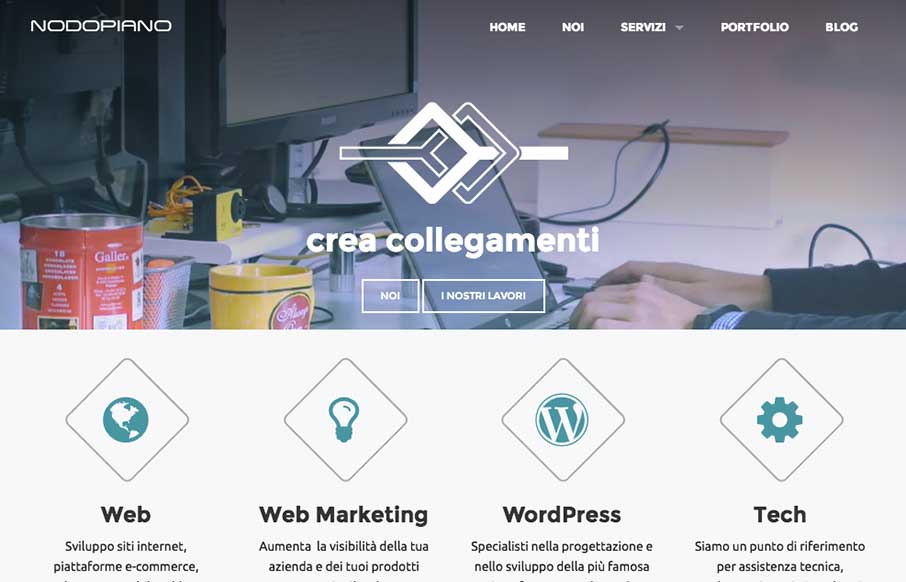
It’s always nice when there’s a strong base to a design and always awesome when you layer good detail work on top of that strong base. That’s what the Nodopiano site design does so well. This is my last work,the website for an italian web agency....

by Gene Crawford | Oct 24, 2014 | Gallery, Marketing Company
Great look to this site. I dig the transitions from desktop to mobile on the responsive approach here. Also generally speaking the design utilizes some blocks or chunks of content which works well for scanning and adapting to different screen widths.

by Aaron Griswold | Oct 24, 2014 | Gallery
As you may have guessed by now, we see a ton of websites – good, bad, spam (ugly). We also have seen every “app product page”, that most have never deviated from the structure of the Square Reader product page from 3 years ago… Pixate could...
