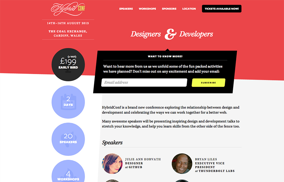
by Gene Crawford | Mar 12, 2013 | Gallery
Beautiful asymmetrical design here for the Hybrid Conf website. I love it when simple design solutions wind up having such great dynamic results. The offset sidebar with the rounded profile pics just set the whole thing off right. I like the big subscribe box and the...
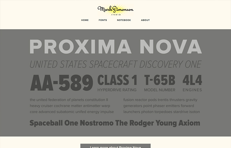
by Gene Crawford | Mar 12, 2013 | Gallery
The site’s layout was planned from scratch to be fully-flexible and responsive. Users can easily browse Mark’s typefaces and read his articles from any modern device. We’re particularly fond of how the fonts page turned out. – From Parvel’s Post on the...
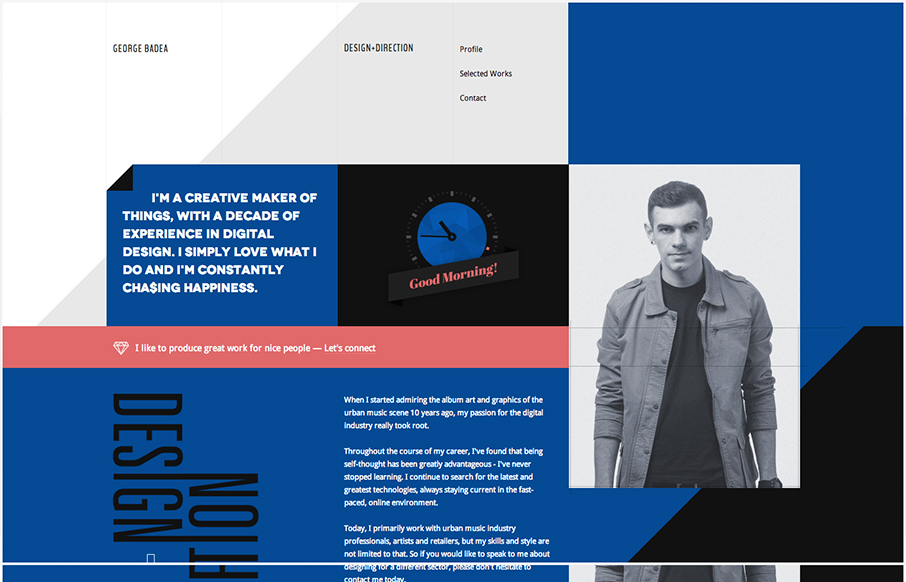
by Gene Crawford | Mar 12, 2013 | Gallery
Lots of interesting interactions in this website. with some neat easter egg(ish) things, like the skeleton face as you scroll down. Everything seems smooth as you use it and pretty natural in terms of the transitions.
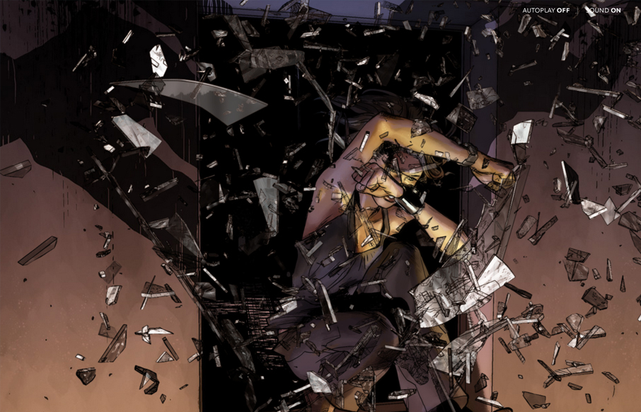
by Giovanni DiFeterici | Mar 11, 2013 | Entertainment, Gallery
I’ve always been a fan of comic books and graphic novels. I’m also a huge fan of experimental projects that push the boundaries of what we think is possible with websites. Peugeot Hybrid4 is a perfect example of one of these sites. The artwork is gorgeous...
by Gene Crawford | Mar 11, 2013 | Education, Gallery
This is a well structured website. The grid is clear and easy to visually track the different sections of links. College websites are traditionally over-packed with links, this one is no exception but it’s designed in visual chunks so you can take it all in. I...