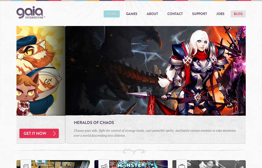
by Gene Crawford | Apr 3, 2013 | Gallery, Gaming
A very colorful and clean design for gia interactive. It’s a perfect fit and seems to provide perfect function for the gaming company. It’s the right amount of stuff and balanced design elements across the breadth of this site. Lovely work. Case study on...
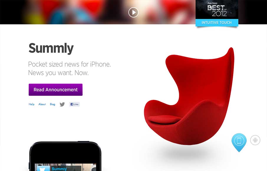
by Jay Barry | Apr 3, 2013 | Gallery
Summly has been in the news lately because the creator, Nick D’Aloisio, has just sold it for $30m to Yahoo. And he’s only 17. I haven’t used the app itself (it’s not available in the US), but it looks very cool and smart. The video is...
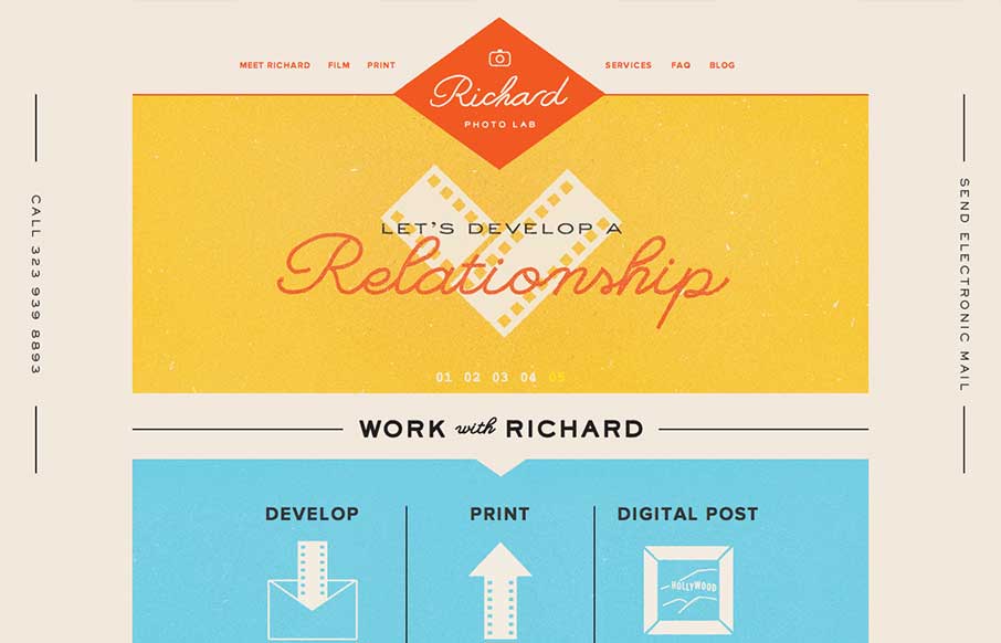
by Gene Crawford | Apr 2, 2013 | Gallery
Lovely website design. I particularly love the way the logo changes to a smaller mark as you scroll down the page. Overall the feeling of the design is very comforting and fresh. It’s a responsive solution as well which is a nice finishing touch.
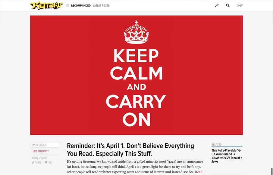
by Jay Barry | Apr 2, 2013 | Blog, Gallery
The new Kotaku site is part of a rollout of a new platform from Gawker. Other sites using the same platform so far include Jalopnik and Deadspin. It’s helpful that they’ve linked to a post about the new look, but it doesn’t give us much insight into...
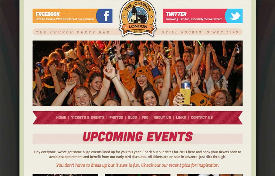
by Gene Crawford | Apr 2, 2013 | Food and Beverage, Gallery
Overall a pretty simple design but it works great here. The mobile approach is a great choice, generally speaking, but for this party bar specifically it’s done right. I like the big twitter and facebook icons across the top of the page, those are going to be...