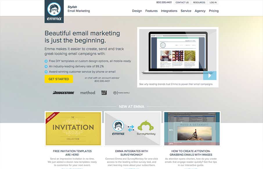
by Gene Crawford | May 8, 2013 | Gallery
There’s a lot going on with this website design. There are so many different nav items and little things that you can click on, in a lot of ways it suffers the same issues that most big product websites do: too much stuff. They do a good job with keeping the...
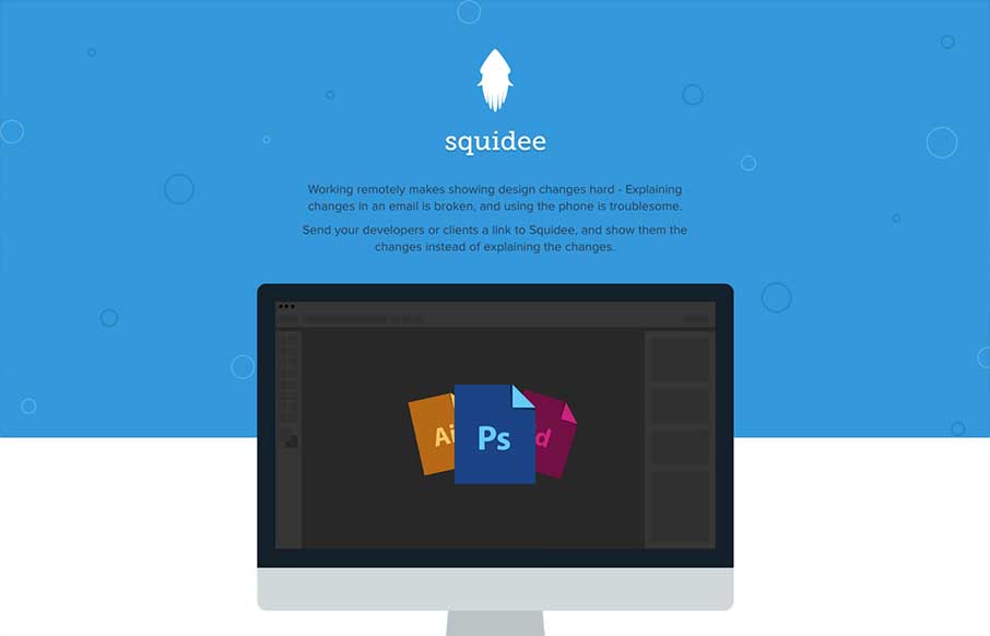
by Maria | May 8, 2013 | Gallery
Squidee helps designers send PSDs to frontend developers. The aesthetic of this site is pretty nice. There’s a very clean use of shape and color which is balanced nicely with the amount and prominence of the type. I like the progression of content, and I dig the...
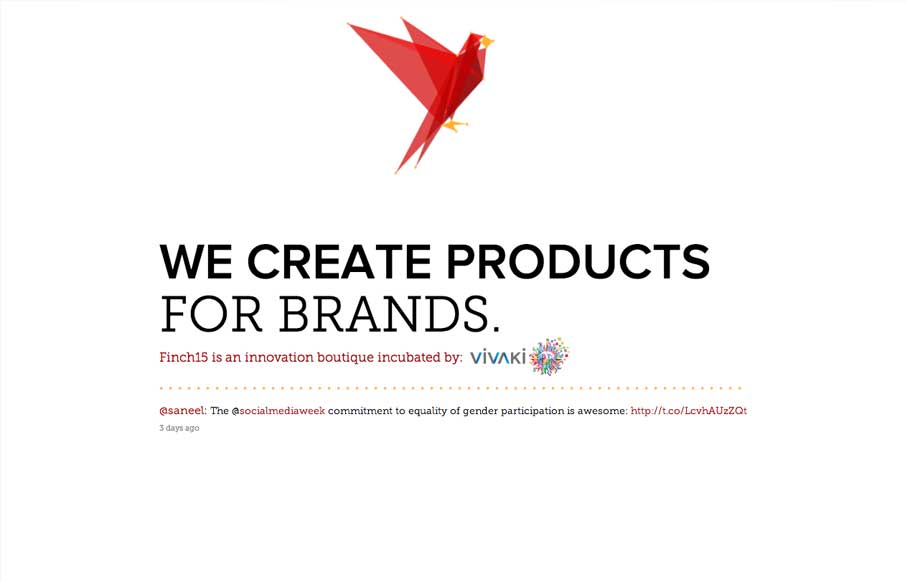
by Giovanni DiFeterici | May 7, 2013 | Gallery
Oooooo, lovely morphing/animating logo on Finch15 finch15.com Make sure ya scroll. (thx @themaninblue) — Daniel Burka (@dburka) April 16, 2013 Okay, so. lovely little site. I like pretty much everything about it (except, maybe, a slight overuse of the word...

by Gene Crawford | May 7, 2013 | Gallery
I like how the site is designed to be deceptively simple. It starts off with what looks like just a big head shot of Nathaniel but then as you click around you notice it’s intricacies and how the side nav is design. Then you start to scroll and notice the load...
by Gene Crawford | May 6, 2013 | Gallery
I really like all the detail work put into this design. It’s well done visually, the visual branding is superb, and it’s also executed well from a build p.o.v. I like the fixed nav and how it fades into view as well as the simple approach to how the site...