by Gene Crawford | Mar 6, 2014 | Gallery
Man I love these illustrations! Super slick and both clean and illustrative at the same time. I like that it’s a single page layout – that works pretty well for this instance. Enough eye candy and simplicity to get the site to work for them.
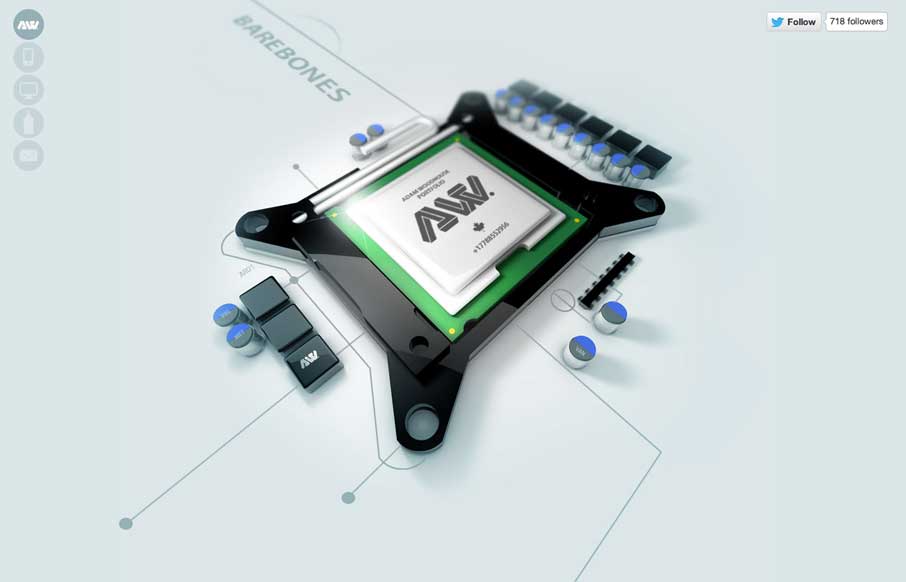
by Giovanni DiFeterici | Mar 6, 2014 | Gallery, Portfolio
The Adam Woodhouse website is clearly a design intended to impress with lush, complex animations and a strong graphical sensibility. Not responsive, but beautiful nonetheless. Plus, Bender.
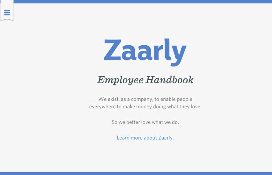
by Gene Crawford | Mar 6, 2014 | Gallery
Nothing super rule breaking about this but it’s become commonplace for companies to put things like their employee handbook or benefits info on a website or resource like that. The Zaarly Employee Handbook is just sexy. Nothing more needed to say about it other...
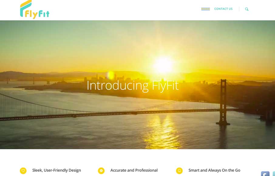
by Aaron Griswold | Mar 5, 2014 | Gallery, Marketing
This is a fast loading video based site that was made for a large screen. It has subtle parallax elements that don’t detract from the main video feature of the site. They could probably go with a cleaner social media linking system, but since it’s a new...
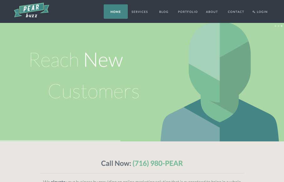
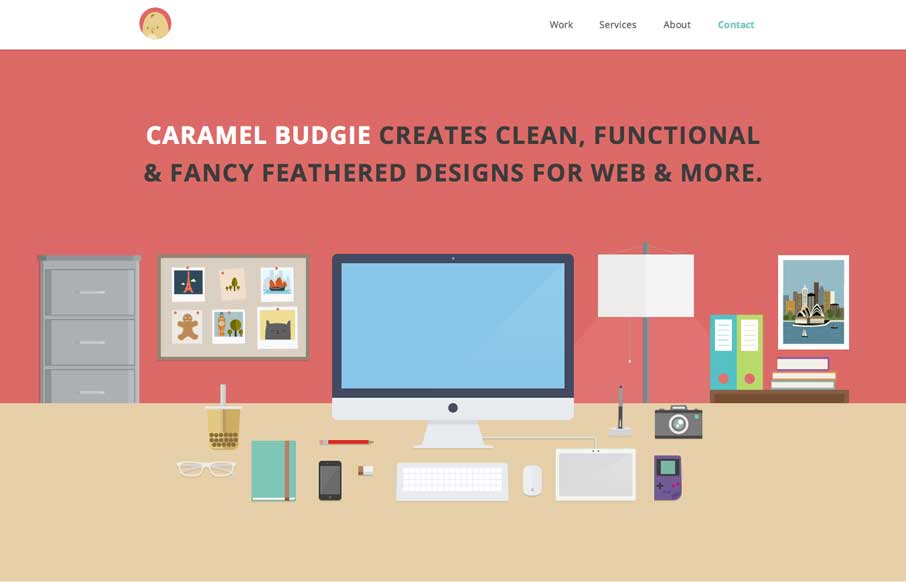
by Gene Crawford | Mar 4, 2014 | Gallery, Marketing
Love the colors and icon/illustration work on this site. The layout is pretty formulaic by design trend standards but sometimes that’s okay and with well designed elements you can really make things sing.