by Gene Crawford | Apr 23, 2014 | Gallery
Neat illustrations down the page. I really dig the rhythm of the page too, there are some sections that are “scroll hijacked” but overall I like it. Neat looking contact form area near the bottom of the site too.
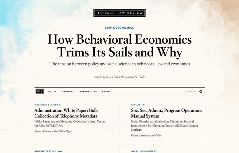
by Maria | Apr 22, 2014 | Gallery
I wasn’t expecting to see something as remotely beautiful as the home page of the new Harvard Law Review site. It’s rich yet lean, and really pushes the limits of typography successfully. The background graphic elements frame the page nicely. It’s curious that...

by Aaron Griswold | Apr 22, 2014 | Gallery
When I first looked at the site, I thought, hmm.. that’s a little too simple – one picture, no scrolling.. what gives. Then I clicked on the navigation and realized it’s a different spin on the single page website that is real trendy lately. Instead...
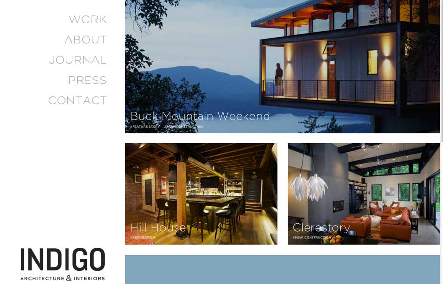
by Gene Crawford | Apr 21, 2014 | Gallery
Clean and straightforward. That’s what I think a lot of the best architecture is all about. These guys website tells that story to me. It’s clean and simple, even in the way the responsive design is approached. Nice work.

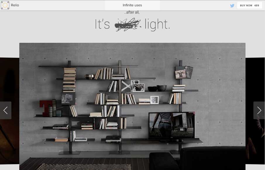
by Gene Crawford | Apr 21, 2014 | Gallery
Well done, highly visual website here for the Web Development Group. I dig their name too. I really like the rich graphics and animations placed across the page. My favorite part is the logo and how it changes around as you scale down the page. Smart stuff.