by Gene Crawford | Feb 11, 2011 | Gallery, Portfolio
I love the detail in this page with the info-graphics. The site flows pretty well as you scroll down both visually and content wise I think. I dig the mono-chromatic color palette and I like the strong angular shapes that the design employs....
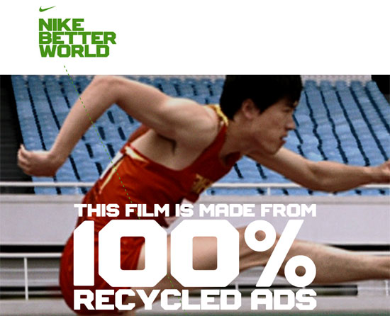
by Gene Crawford | Feb 11, 2011 | Gallery, Marketing
Looks like http://nikebetterworld.com is another Ian Coyle work of art. He is in a league all his own. – @desandro He certainly is! This site is fantastic! From a story telling perspective the site flows so well, it takes you from the home page down the closing...
by Gene Crawford | Feb 10, 2011 | Food and Beverage, Gallery, Screencast Review
Beautiful design elements come together to make a really great looking visual experience here. I really dig the shopping cart status box that follows you down the page as you scroll, I think I’m becoming a little bit of a sucker for that visual effect. Giovanni...
by Gene Crawford | Feb 10, 2011 | Food and Beverage, Gallery
I like the header design, the logo with the navigation being placed in what looks like a speech bubble. Then the largely white background being broken up by a large horizontal section, really stands out strong. I like the sub navigation design too, the mouse over...
by Gene Crawford | Feb 9, 2011 | Gallery
Love this really clean design, very open feeling too. The home page really focuses well on the things that make ordered list stand out, the work and the apps. The home page scans really well and completely tells the story of the company. I like the simplicity of the...