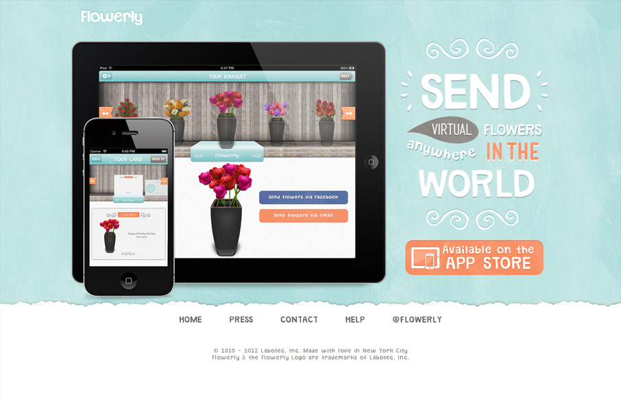
by Gene Crawford | Jul 18, 2012 | Gallery
Great looking single page iPad/iPhone app site. Custom lettering FTW too! I love it, that block of text on the right side is immaculate. Down to the custom lettered “app store” button. I’m not entirely sure why there’s a “home”...
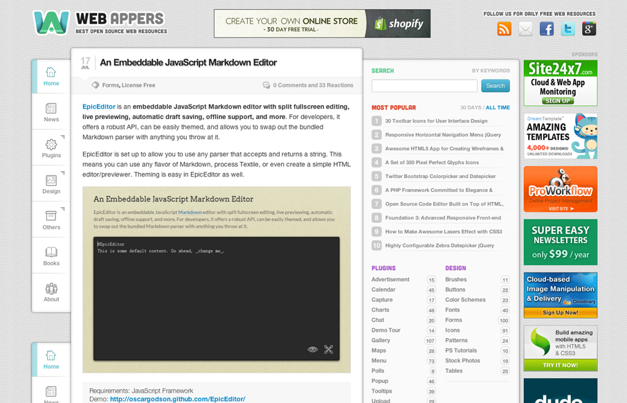
by Gene Crawford | Jul 18, 2012 | Gallery
Aside from being a top-notch resource for web development stuff the design of webappers.com is well done. It’s a nice study to compare how the different screen size designs are treated here vs. how Smashing Magazine has handled theirs. They’ve had to...
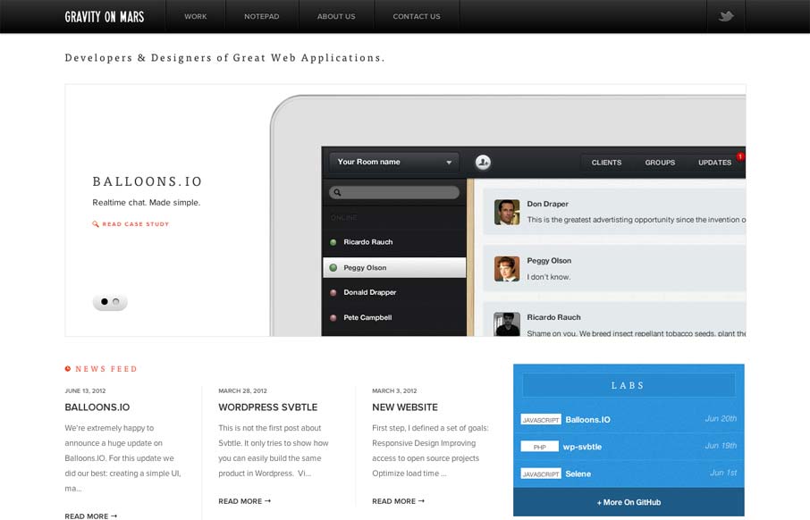
by Gene Crawford | Jul 18, 2012 | Gallery
Sharp looking minimal(ish) site design. I really like the cropping of the main image slideshow a lot. It gives a good sense of the apps and shows them in context on the iPad but it’s not overpoweringly large. The delicate lines and typography are matched up...

by Gene Crawford | Jul 17, 2012 | Conference, Gallery
Super simple yet clean and open looking conference website. I like the green & gray color palette too.

by Gene Crawford | Jul 17, 2012 | Gallery
Really minimal product site design. I think the way they’re showing the product screens off is superb like this. I also like the way they’re treated as you size the screen down too. Super simple signup process too using twitter. I’d love to hear how...