by Aaron Griswold | Jun 26, 2014 | Gallery
Kudos Matthew! With so many flat icons out in the interwebs, you found a way to make an entire site, with narrative, with flat icons – and make it pretty damn cool. Every once in a while, it is a good thing to trash something, and then do something fun with it....

by Aaron Griswold | Jun 26, 2014 | Gallery, Nonprofit
A good use of white (blue) space, in order to highlight what matters (on the site, and in life). I like the liquid background, that continues to enforce the theme of providing clean water for children. The “See how people are taking action to help children...
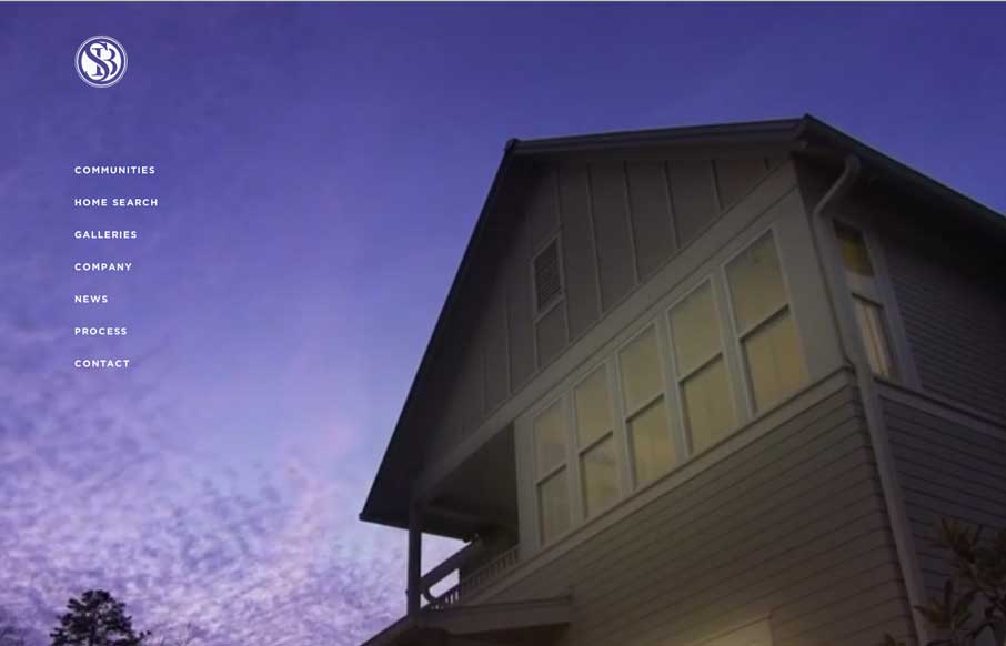
by Maria | Jun 25, 2014 | Gallery
This site is gorgeous. It’s oozing with details that exceed any home builder site that I’ve ever seen. The photography is stunning, the typography is on point, the restraint in use of space feels so right. It’s as distinctive as the neighborhoods and...
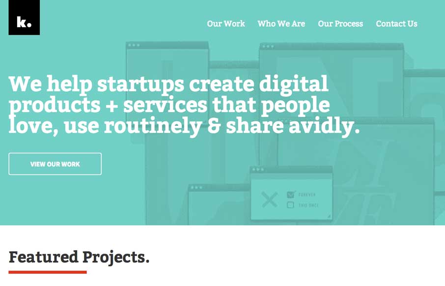
by Gene Crawford | Jun 25, 2014 | Gallery
Clean design and some subtle movement here and there. I like the little animations and fade ins the page has as you scroll or shift browser width around, it’s subtle but has big impact when you’re experiencing it.
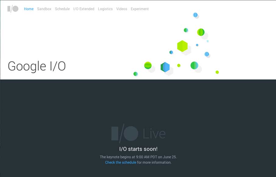
by Aaron Griswold | Jun 25, 2014 | Gallery
It’s kind of funny that we’re reviewing the site the day of (well before) the Google I/O conference. The site will change throughout the conference on June 25 – so right now, we just see a bunch of colored blocks. So check it out as they fill out....