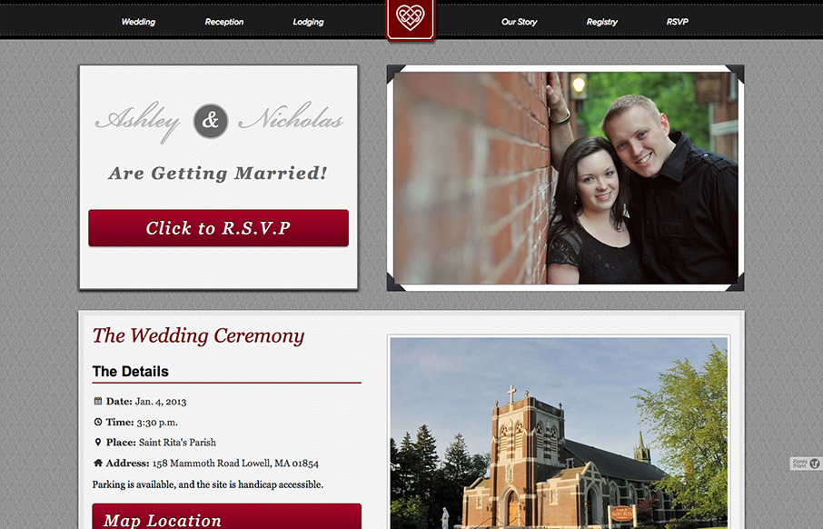
by Gene Crawford | Nov 15, 2012 | Gallery
I like the big bold blocky layout. It reminds me of a wedding photo album but doesn’t go too far over the top with the visual metaphor. I like that a great deal. Nice responsive solution here too.
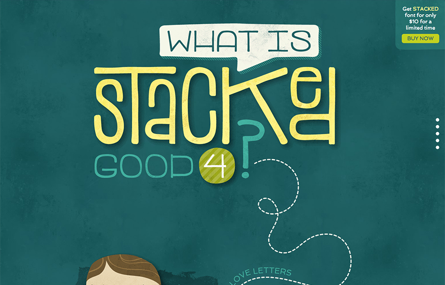
by Gene Crawford | Nov 15, 2012 | Gallery
Great site showing off the font in question. Stacked Font, it’s fun and super easy to take in. I like the long scrolling page format that let’s you explore as you make your way down. Fun!
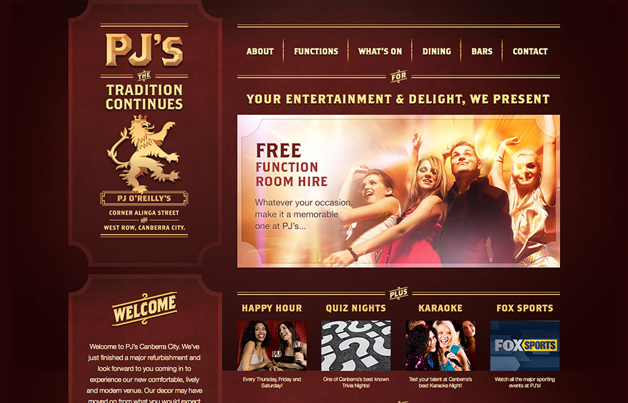
by Gene Crawford | Nov 14, 2012 | Food and Beverage, Gallery
Pretty cool looking design for a restaurant/bar here. It’s responsive which I just super love to see in sites designed for restaurants and bars like this. I dig the dark color palette and blocky type as well, it kinda fits my mental model of what an irish pub...
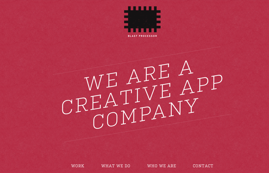
by Gene Crawford | Nov 14, 2012 | Gallery
I love the red color and texture used for the main intro section and header for the Blast Processor site. I also like how the header slides into a fixed position and at the same time the main nav slides to the right. Overall a nice clean layout that works well in most...
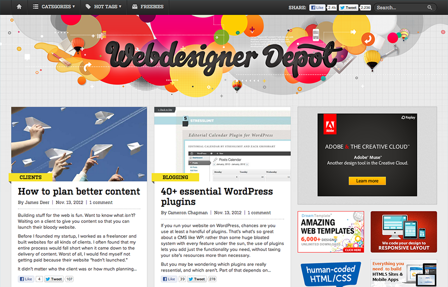
by Gene Crawford | Nov 14, 2012 | Gallery
The latest redesign of Webdesigner Depot is pretty epic. Parallax based art in the header, a stark change in layout and it’s responsive. The site is very much worthy of some in-depth study for sure. My favorite part of this design is the large buttons near the...