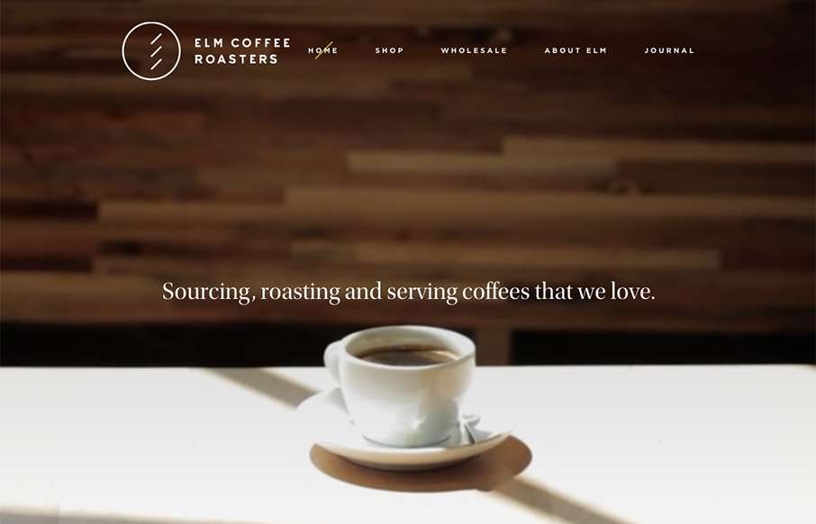
by Gene Crawford | Nov 30, 2015 | Food and Beverage, Gallery
As I was setting up the review for Elm Coffee Roasters out of Seattle – I found myself stopping, and going to get coffee at least twice… I guess the marketing is working. Great design – clean and simple, with video background on top –...
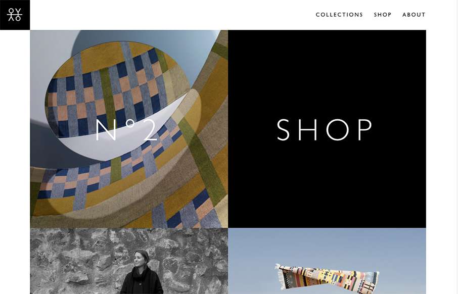
by Gene Crawford | Nov 26, 2015 | Gallery
I love the speed of the Oyyo website out of Stockholm. The transitions are quick, and the site is neat and simple.
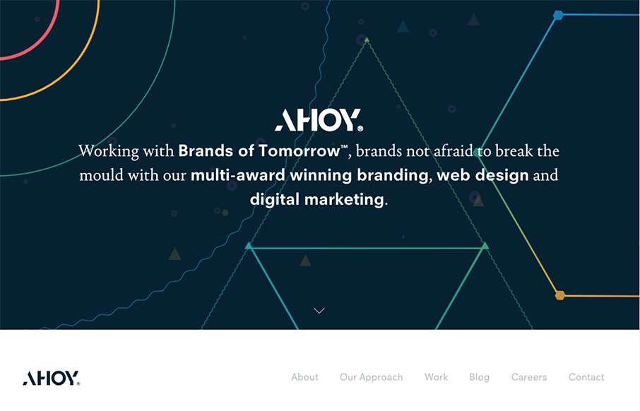
by Gene Crawford | Nov 25, 2015 | Design Firm, Gallery
I love the dark field with the geometric shapes art. Pretty snazzy stuff. I really dig the way the content is blocked out on the home page too. I’ve never seen something like they’re doing with the “call our account director” content block...

by Gene Crawford | Nov 25, 2015 | Design Firm, Gallery
If you like lavish visuals and solid yet simple typography then the DK site is for you. It’s chock full of custom videography and really is a clinic for us all to see how to use it within a web page. Solid work and really solid website for this digital firm....
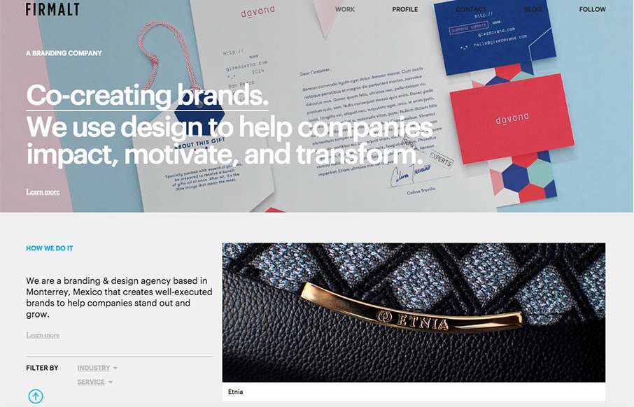
by Gene Crawford | Nov 24, 2015 | Design Firm, Gallery
Nice grid based layout for Firmalt. I like the Masonry like treatment of the main image blocks as you scroll down the page and shift screen sizes. Nice solid simple layout always wins!