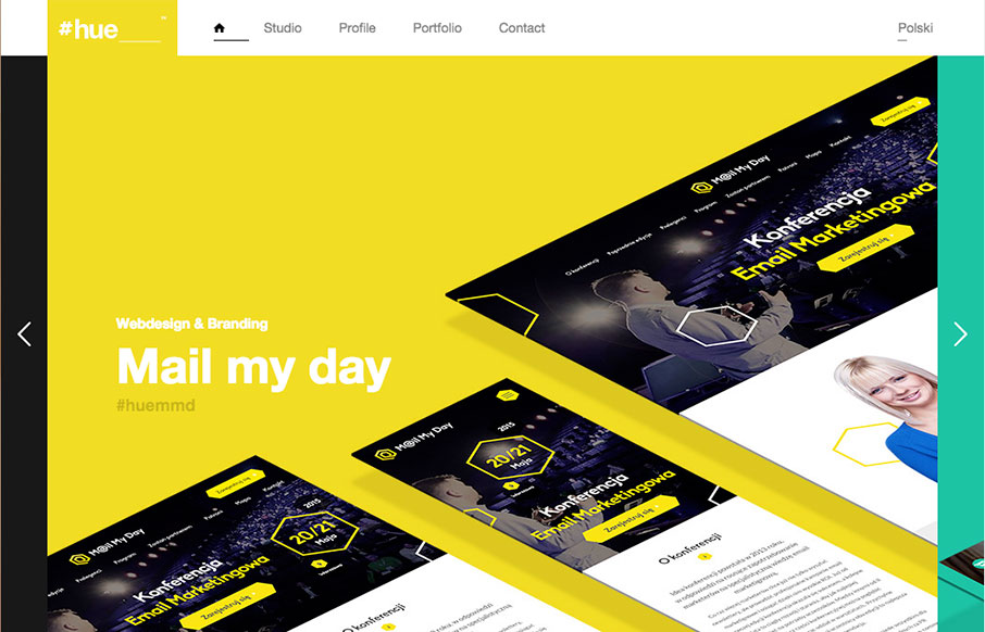
by Gene Crawford | Mar 7, 2016 | Gallery
Pretty cool visual vibe with this design. I like the oversized spaces and blocks of color and even the angled screen shots – they all give it a dynamic feel even though the overall execution is fairly simple and straight forward. Bold colors and typography also...
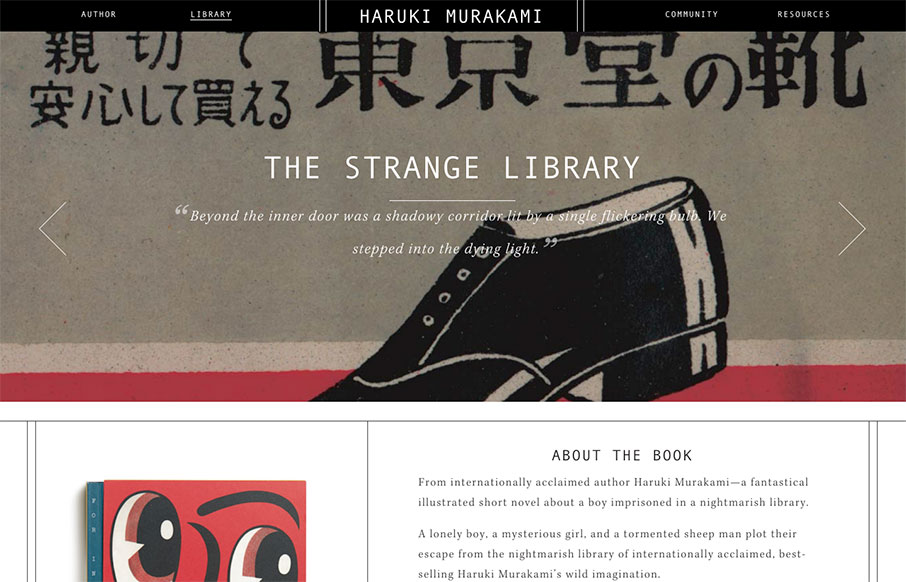
by Aaron Griswold | Mar 2, 2016 | Entertainment, Gallery, Portfolio
I haven’t seen too many author sites (a form of a portfolio site) – however, this one for Haruki Marakami is pretty special. The Library, and specifically the detail work on the book pages – it’s cool and smart.
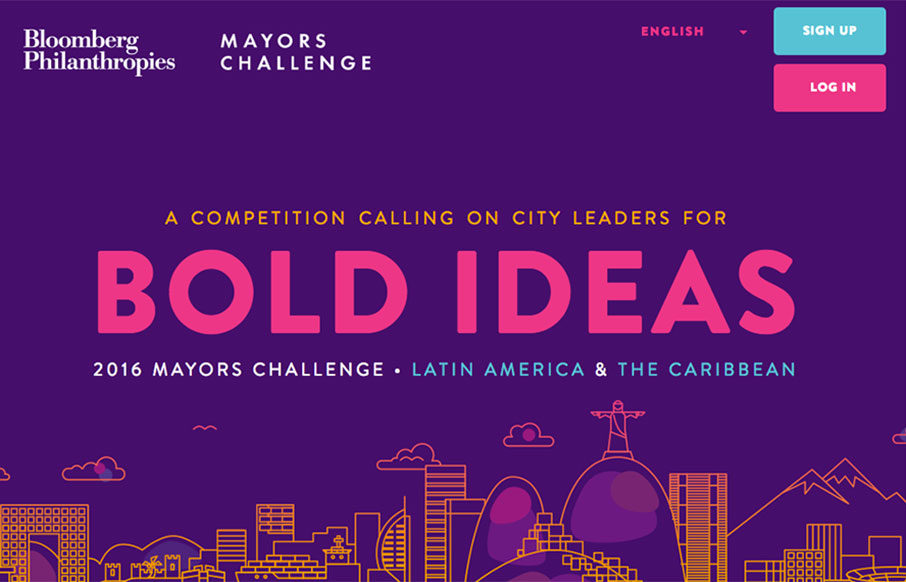
by Aaron Griswold | Mar 1, 2016 | Gallery
Great looking site from Bloomberg Phianthropies – promoting a great initiative called The Mayors Challenge to help solve urban challenges and improve city life (2016 in Latin America). Some sweet flat illustrations and icon work – coupled with bold...
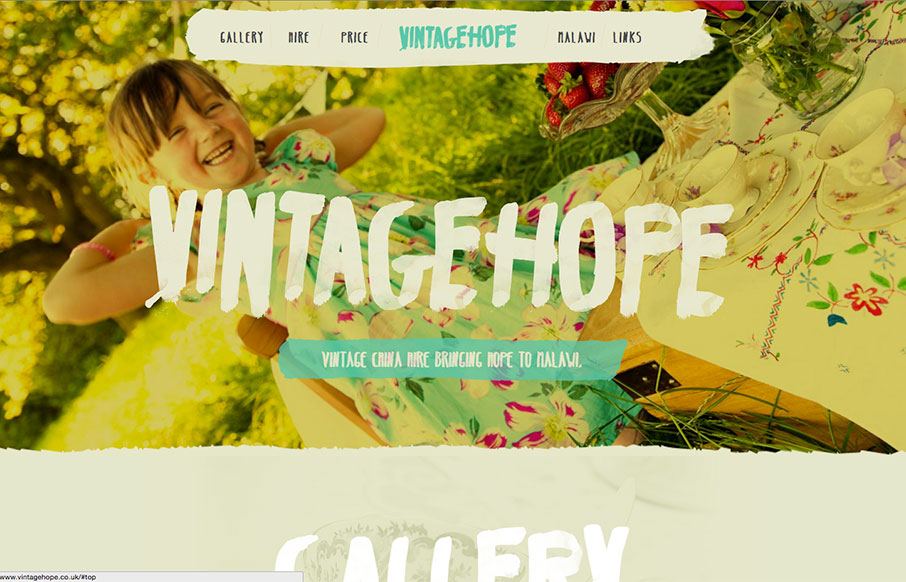
by Aaron Griswold | Mar 1, 2016 | Gallery, Nonprofit
Great typography work on the Vintage Hope site out of the UK. Looks like you rent fine china for different events, and the money goes to a children’s home in Malawi – good social entrepreneurial concept – and a nice looking site.
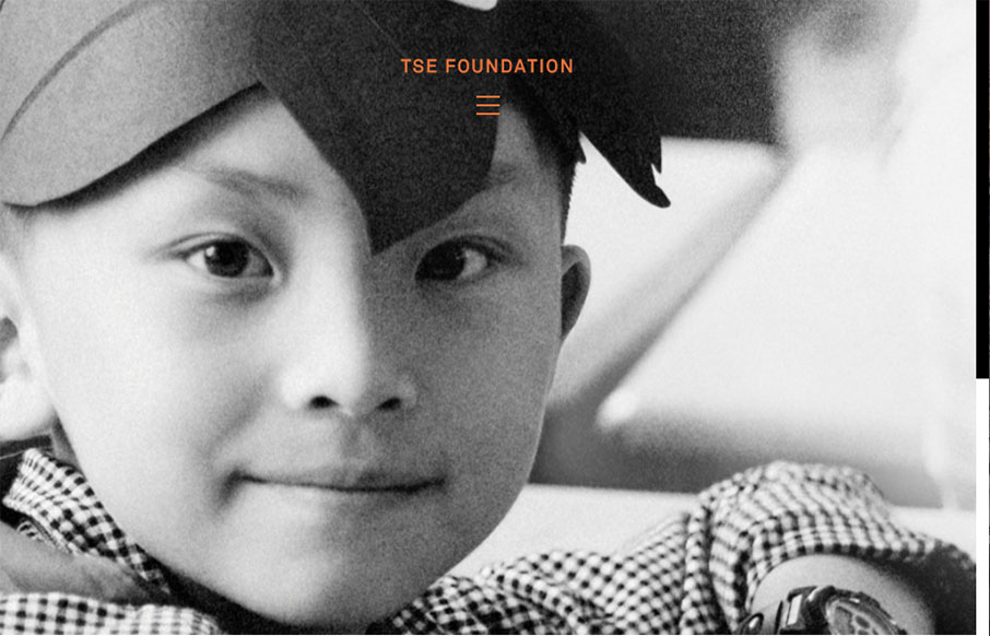
by Gene Crawford | Feb 29, 2016 | Gallery, Nonprofit
Very simple color palette, and good typography from the TSE Foundation out of Hong Kong. I first saw it in a smaller screen – but it really opens up on a desktop and looks great, because it’s simple.