
by Gene Crawford | Aug 25, 2016 | Gallery, Marketing Company
Brilliant graphic design for Delete here. Solid layout on the website with some pretty slick little interaction work here and there. I like the cleverness of their layout and design approach for their site.
by Gene Crawford | Aug 24, 2016 | Design Firm, Gallery
Pretty cool design studio and of course they have a good lookin’ website. I dig it, it’s simple but classy at the same time. Rad work too.

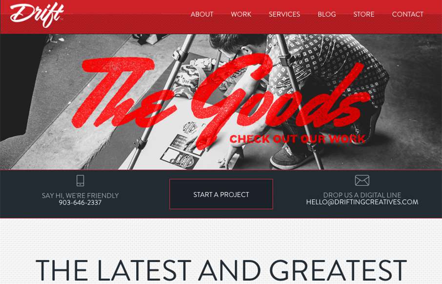
by Gene Crawford | Aug 23, 2016 | Gallery
Nice looking website, that takes a lot of well worn design patterns and uses them in a classic and good looking way. I dig the overall presentation that you get when you give this site a once over. Good work. From the Designer: It’s modern and clean, more...
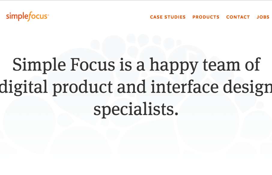
by Gene Crawford | Aug 22, 2016 | Design Firm, Gallery
Pretty cool, minimal vibe, to the Simplefocus website. I’ve been a fan of their work for a good while – even back before they were called Simplefocus. So to see the evolution they’ve gone through over the years has been awesome.

by Gene Crawford | Aug 22, 2016 | Gallery, Nonprofit
Nice effort on the Design Hope website. I dig this simple, easy to read, website design. Good photography and easy copy make it super simple to get the point and get going. I wish these guys well.