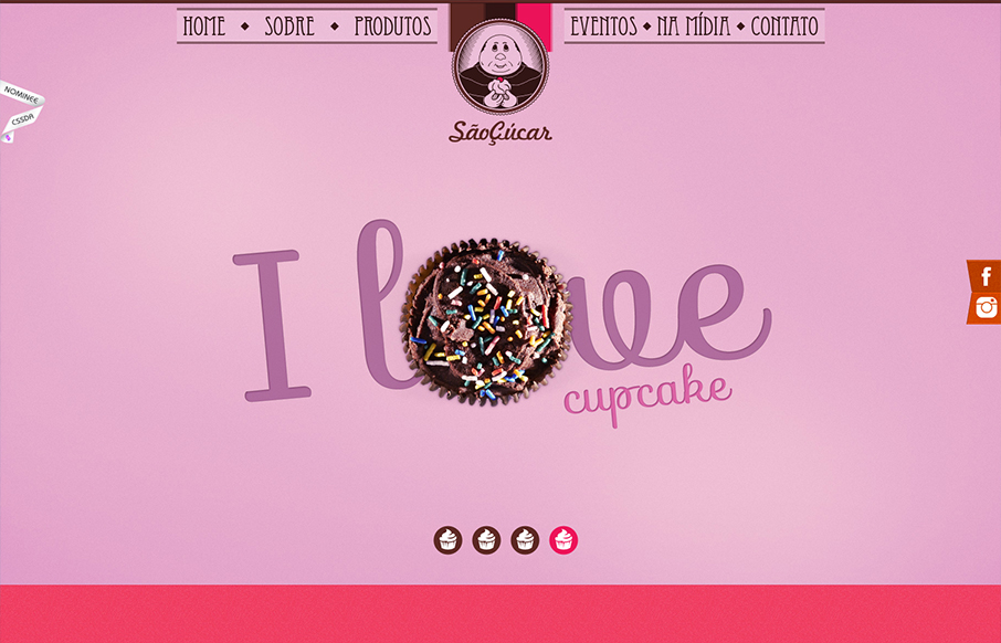
by Gene Crawford | Nov 16, 2012 | Food and Beverage, Gallery
Bold colors and interactions make up this great website for Saocucar. Nice fixed header/nav and bold colors for each section are matched with strong typography to make for a compelling visual treat as you make your way to the bottom of the page.
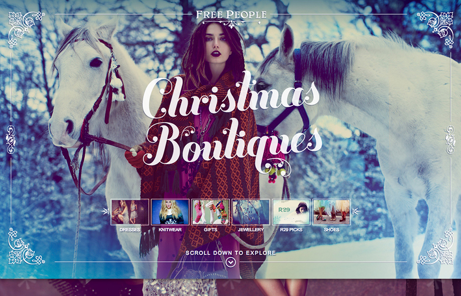
by Gene Crawford | Nov 15, 2012 | Gallery
Using a scrolling page with a parallax design isn’t new but I really love how this page is using those same tools. The little screen shots front and center really help to drive you to a section of the page, you just can’t help but click on them. Then the...
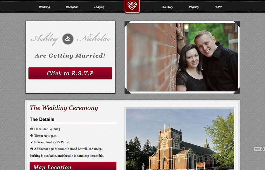
by Gene Crawford | Nov 15, 2012 | Gallery
I like the big bold blocky layout. It reminds me of a wedding photo album but doesn’t go too far over the top with the visual metaphor. I like that a great deal. Nice responsive solution here too.
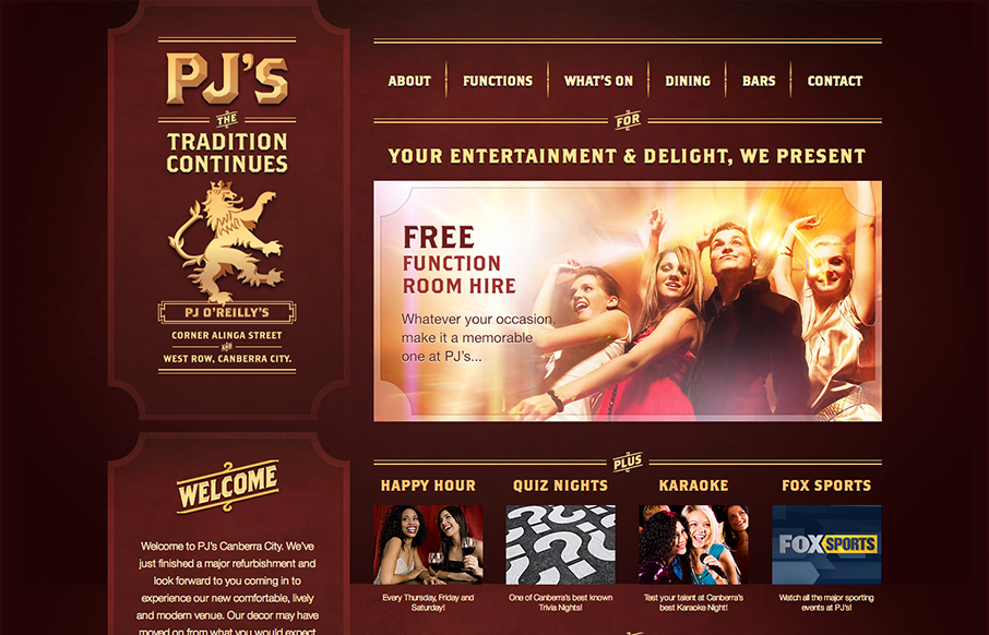
by Gene Crawford | Nov 14, 2012 | Food and Beverage, Gallery
Pretty cool looking design for a restaurant/bar here. It’s responsive which I just super love to see in sites designed for restaurants and bars like this. I dig the dark color palette and blocky type as well, it kinda fits my mental model of what an irish pub...
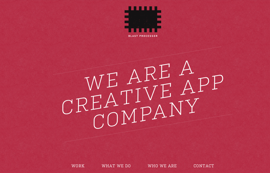
by Gene Crawford | Nov 14, 2012 | Gallery
I love the red color and texture used for the main intro section and header for the Blast Processor site. I also like how the header slides into a fixed position and at the same time the main nav slides to the right. Overall a nice clean layout that works well in most...