by Jay Barry | May 10, 2013 | Gallery
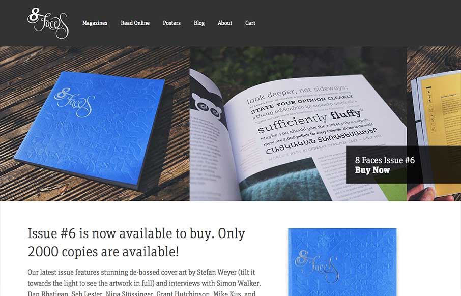
The whole point and appeal of 8 Faces is the tactile, printed objects that they produce, so much so that the website might seem like an afterthought regardless of how well it’s designed. Luckily it’s a great example of simple, effective design. The purpose...
by Gene Crawford | May 8, 2013 | Gallery
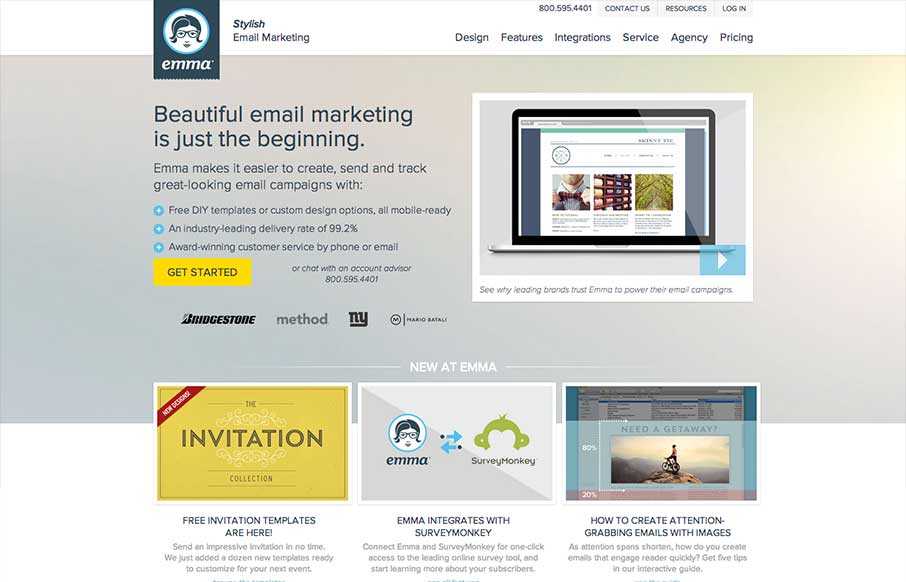
There’s a lot going on with this website design. There are so many different nav items and little things that you can click on, in a lot of ways it suffers the same issues that most big product websites do: too much stuff. They do a good job with keeping the...
by Gene Crawford | May 6, 2013 | Gallery
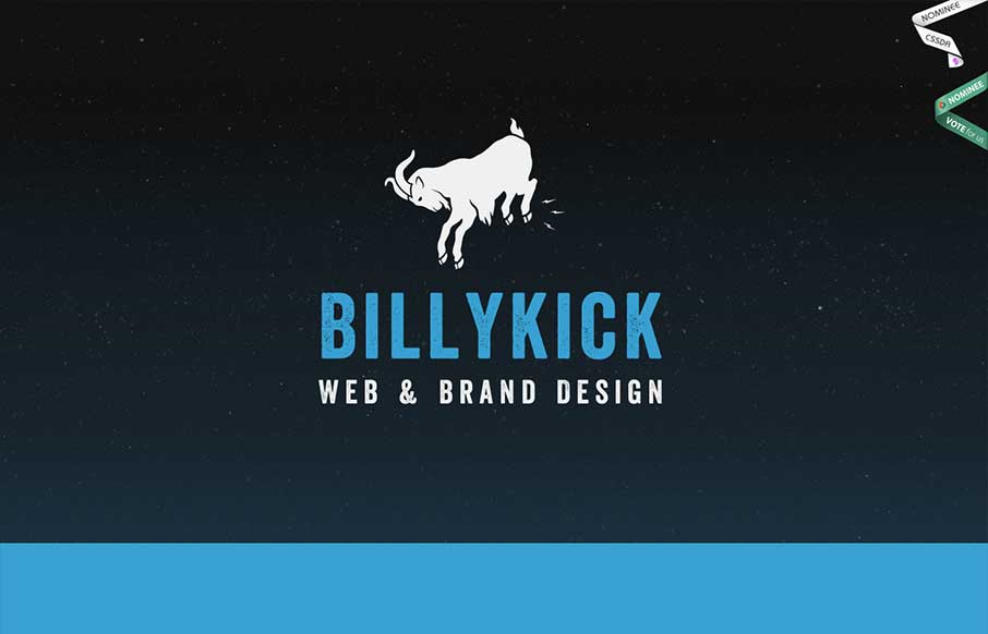
I really like all the detail work put into this design. It’s well done visually, the visual branding is superb, and it’s also executed well from a build p.o.v. I like the fixed nav and how it fades into view as well as the simple approach to how the site...
by Gene Crawford | Apr 22, 2013 | Gallery
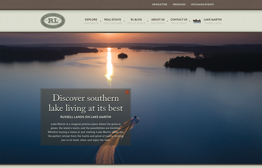
I love a real estate website that’s not afraid to scroll. That’s probably a weird statement to read but do your research and check out some other real estate sites… This design also starts off with an almost oversized set of images/slide show and...

by Gene Crawford | Apr 19, 2013 | Gallery
Really fun and simple layout. The main illustration/animation is funny and worked over well. Dang, it’s got to be awesome to put ‘cut the rope’ on your home page as client work. My favorite part is the post card designed contact form. Also ASCII...
