
by Gene Crawford | Sep 17, 2014 | Gallery, Portfolio
I like how the type and the line work in this layout are all big and bold yet the page feels soft at the same time. Really unique yet familiar feeling at the same time. Smart work. Submitted by: Tony Headrick @tonyheadrick Role: Designer &...

by Gene Crawford | Sep 17, 2014 | Gallery
I dig the look of this design. It’s flat and clean and really feels like a engineering company to me. Only wish it was responsive, but otherwise a really smart looking layout. Steve Semanchik @vitaminisgood Role: Designer The Kibart home page showcases the...
by Gene Crawford | Sep 16, 2014 | Gallery
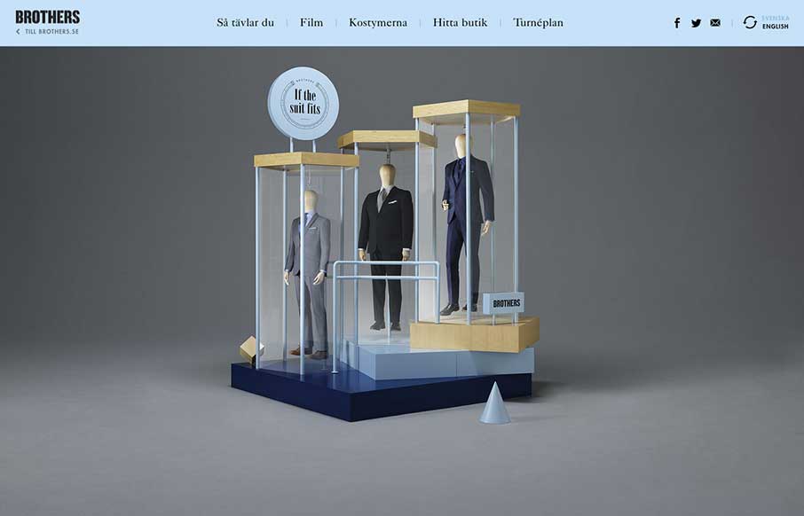
Fun layout and sometimes weird details make this page pretty fantastic to me. Enjoy.

by Gene Crawford | Sep 12, 2014 | Food and Beverage, Gallery
Really nice use of contrast. I’m not just talking about colors, but the way they contrast the photos and real imagery of coffee bags with flat areas of color and blocky bold type and icons. Really gives this page a nice rich visual feel. Love it, now for some...
by Gene Crawford | Sep 12, 2014 | Gallery
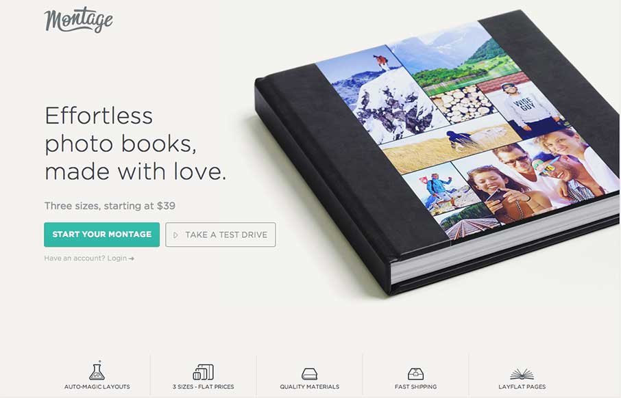
Man, I love just about every aspect of this design. I especially love the way the main nav slides up into the header and “becomes” a top anchored nav. Just go scroll the page around and then come back. See what I mean, cool right?
