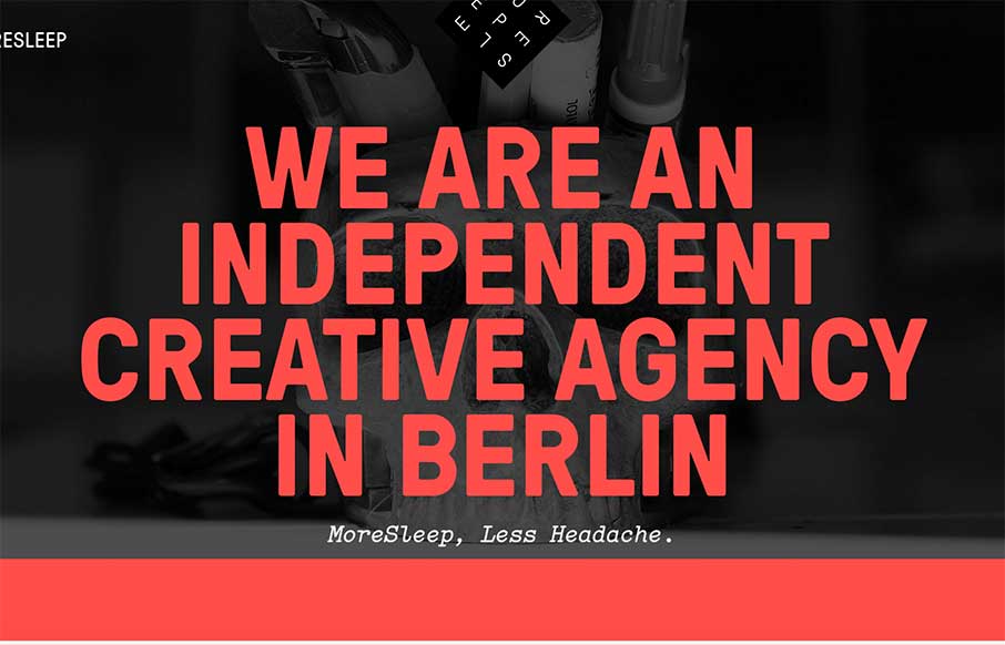
by Aaron Griswold | Dec 19, 2014 | Design Firm, Gallery
“More Sleep, Less Headache” – we should all be so lucky! The MoreSleep web design agency out of Berlin, Germany is promising that. Based on their website and portfolio of work, I would have to say “das ist richtig”. Like the off screen...
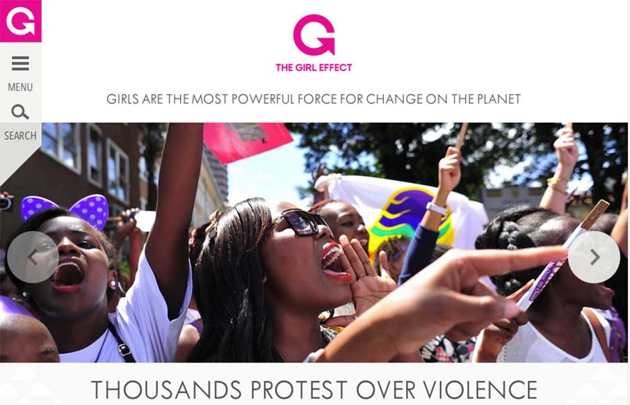
by Aaron Griswold | Dec 19, 2014 | Gallery, Social Cause
I was saving this review for today. I’m glad I did – looks like The Girl Effect website changed over last night (at least I think it did) – and is stunning. I really dig the off-screen navigation on the left, that really allows space to get their...
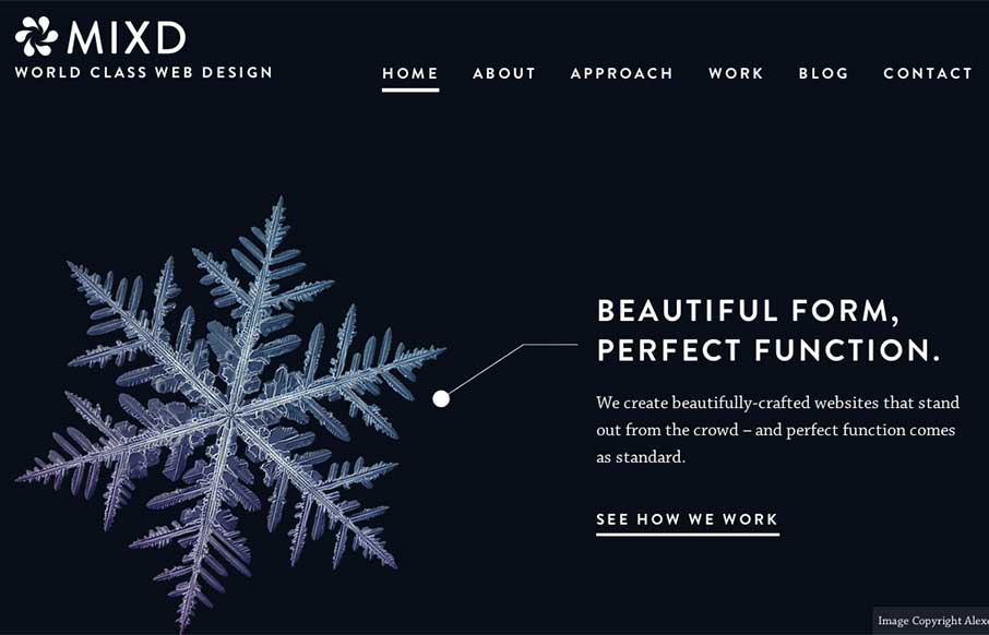
by Aaron Griswold | Dec 18, 2014 | Design Firm, Gallery
This is from the Mixd design house out of North Yorkshire, UK. I like how each page has it’s own initial background color, while still keeping the same aesthetic throughout the site. Also like that they must maintain the site and switch out the home page, that...
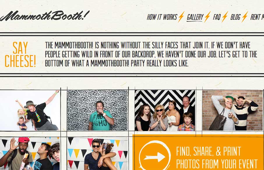
by Aaron Griswold | Dec 18, 2014 | Gallery, Product
Listen… good marketing is this: Do Not Press Button. What’s the first thing you want to do? This is how the Mammoth Booth site starts out – good irreverence coupled with some nifty illustration and CSS animation, and then the pay-off: an explosion of...

by Aaron Griswold | Dec 17, 2014 | Gallery
Listen – we don’t normally do wedding / proposal sites – but this one from Mike Pechardo out of the San Francisco area is really well done. Looks like he spent a lot of time to make everything come together seamlessly on the web side – hope...