by Gene Crawford | Jul 2, 2015 | Gallery
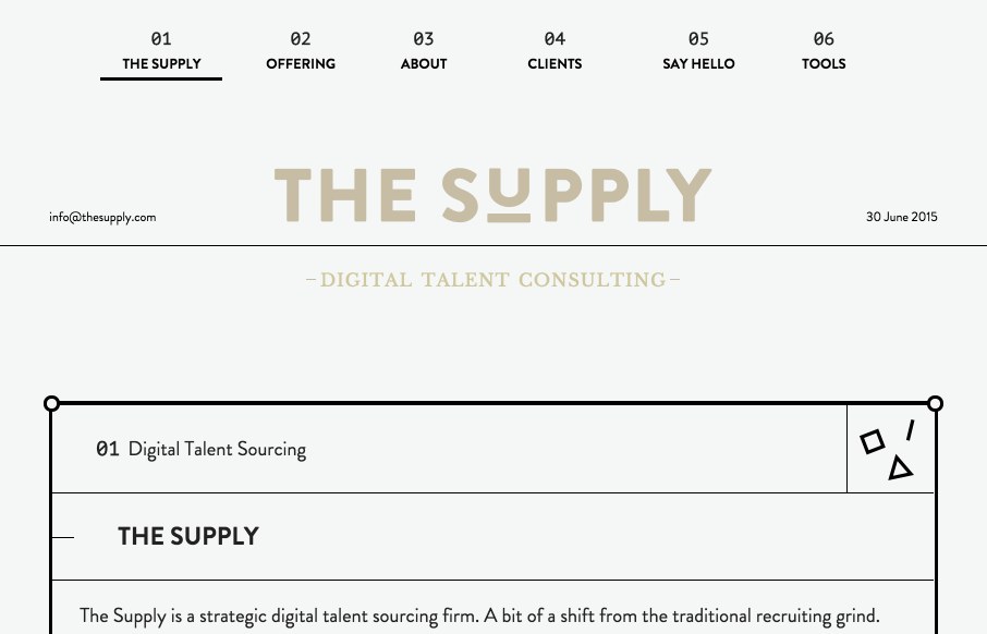
Really, really clever layout for The Supply. It’s a very non-traditional approach to what feels like a very old school business idea of placing talent. I dig it. Submitted by: The Supply Twitter: @thesupply_feed

by Gene Crawford | Jul 2, 2015 | Gallery
Pretty slick design. It’s simple yet compelling in that I never have to leave the home page to really learn about Ascend, but there’s plenty of depth and further content to dig into when desired. Love that. Submitted by: Steven Monetti Twitter:...

by Gene Crawford | Jul 1, 2015 | Gallery
The Comovee site is a great example of a product website that gets the details right. I dig the clean design and mix of large imagery. The screen width differences are nice too, scale it and you’ll see what i’m talking about. Subtle yet solid design. From...
by Gene Crawford | Jun 30, 2015 | Gallery
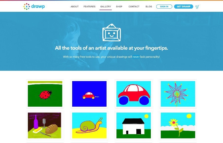
Fairly nice product website. Solid colors and delivers that “kids” vibe without pandering to all the cliches that come with it. Good work. @drawpit
by Gene Crawford | Jun 29, 2015 | Gallery
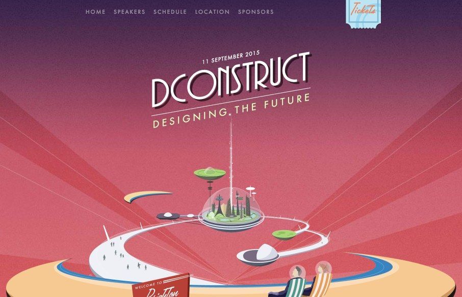
There is a lot to love about the 2015 dConstruct site. Clearleft always does something cool with this site every year, I always enjoy it when they launch it. I really like how it doesn’t take itself too seriously with the layout (mobile vs. desktop). It’s...
