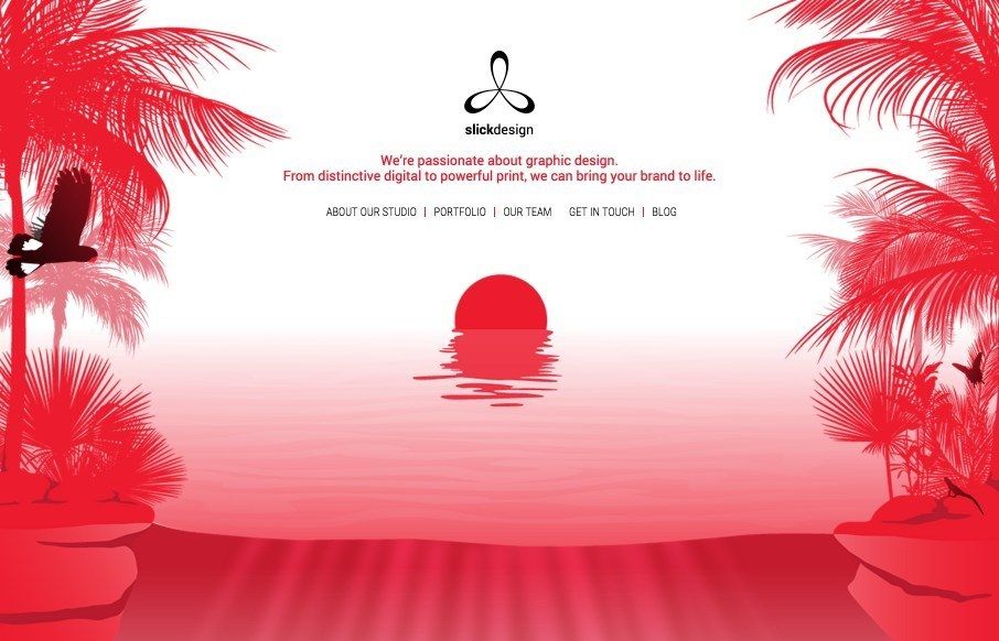
by Aaron Griswold | Jul 8, 2015 | Gallery
Love the opening and closing imagery for Slick Design out of Perth – the movement on the page is pretty cool too (would actually like to see more of it all the way through). From the Designer: This is a beautiful, sleek website that reflects the client’s...
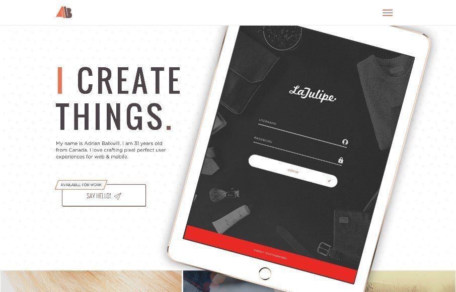
by Aaron Griswold | Jul 7, 2015 | Gallery, Portfolio
Cool portfolio site from Adrian Balkwill out of Ontario – like his work and his call to action at the bottom of the work pages. (also – love the Mario favicon) From the Designer: I have been working on this site and rather like it and I hope you do too....
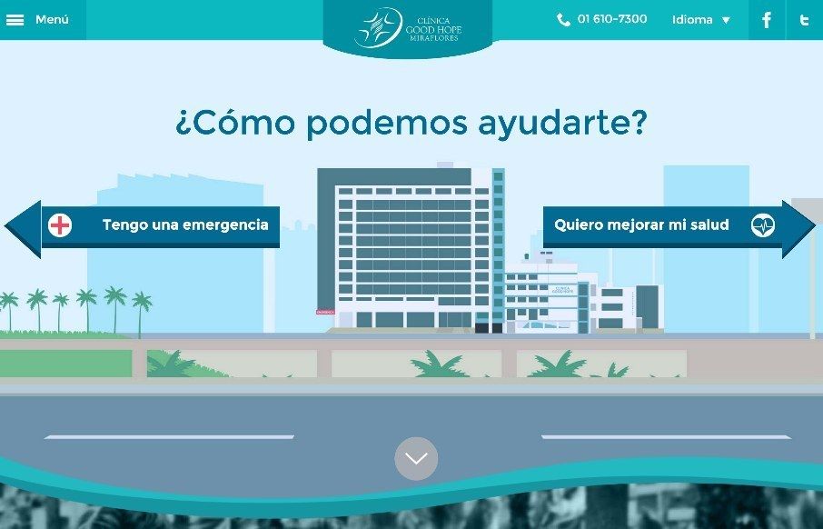
by Aaron Griswold | Jul 7, 2015 | Gallery, Medical
Really cool design for the Clínica Good Hope (out of Peru) – especially for a hospital. A lot of flat icon and illustration work here – and interesting points of navigation/sub-nav through out. It’s mobile friendly too – out pacing many...
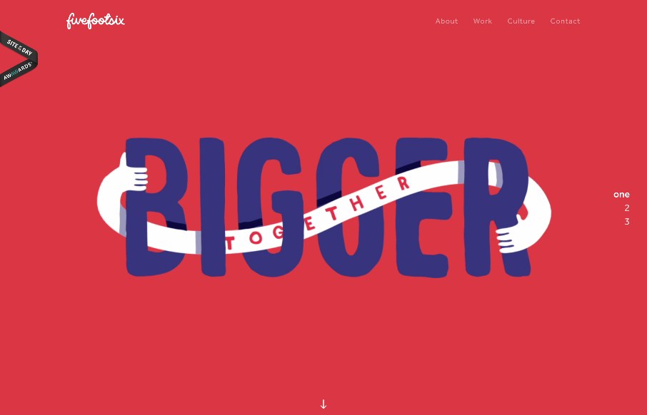
by Gene Crawford | Jul 6, 2015 | Gallery
Interesting twist on mixing a large hero/video area and a slider like interaction. The home page scrolls well into the about section, I think it works pretty well actually. Simply because they don’t hide the nav under a hamburger nav and just lay it out. I do...
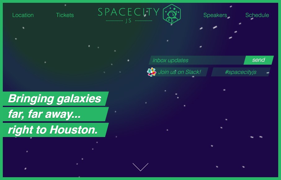
by Gene Crawford | Jul 6, 2015 | Gallery
Website for the Space City JS conference in Houston. I like the play between the name and Houston! This site isn’t like a traditional web conference site, it doesn’t do what you’d expect and put the images of the speakers front and center. I like...