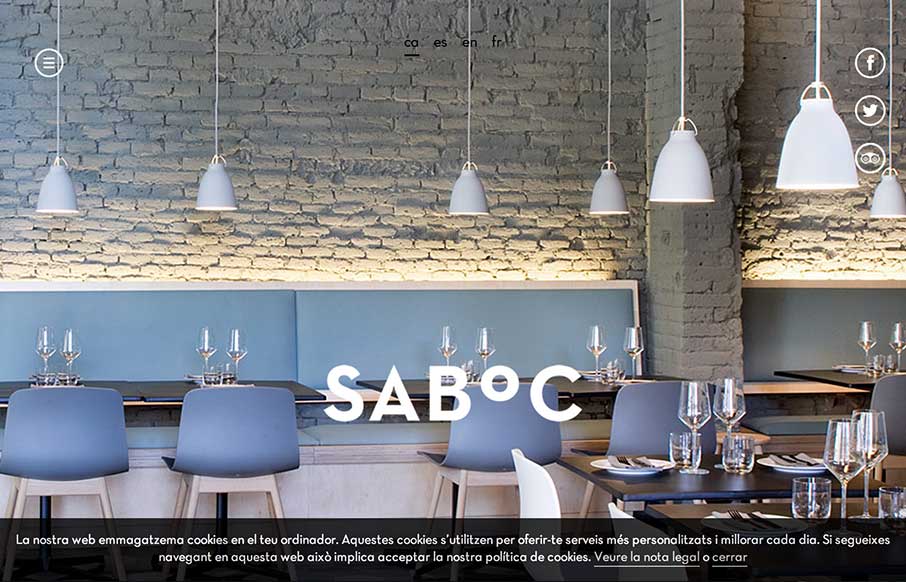
by Gene Crawford | Oct 10, 2014 | Food and Beverage, Gallery
Cool site design. I like the vibe of this single pager. The hamburger icon is in play here, but it’s really just for anchors along the page. Nice use of that in this instance IMHO.
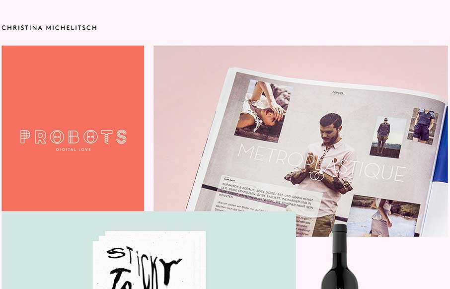
by Aaron Griswold | Oct 6, 2014 | Gallery, Portfolio
The beauty of this site is less in the home page, but more in the portfolio pages of Christina’s work. Each page has a different feel to go along with the different branding work she has done for her clients. Really like the work on Probots, and like the idea...
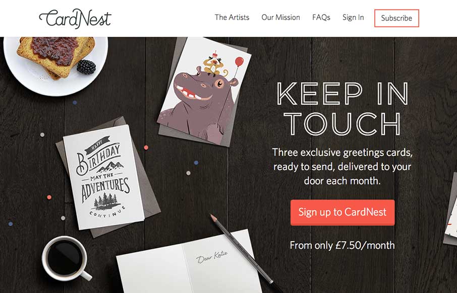
by Gene Crawford | Oct 3, 2014 | Gallery
Very nice all around design for CardNest. I love the simple approach but attention to detail. Great responsive design too. Submitted By: David Robinson @hypeandslippers Role: Designer & Developer The team at Hype & Slippers (www.hypeandslippers.com) have...
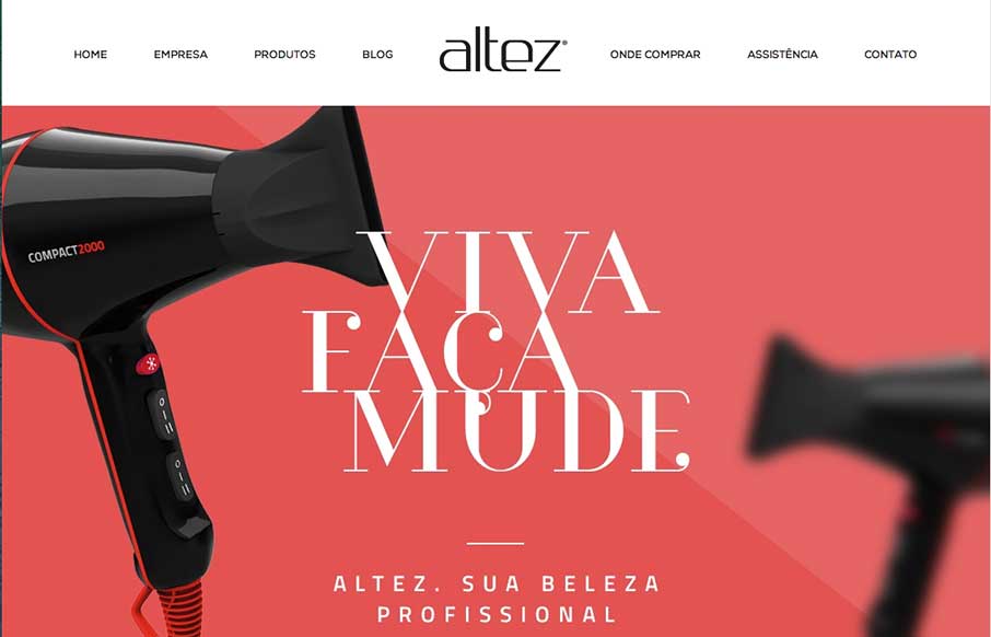
by Aaron Griswold | Oct 2, 2014 | Gallery
I like the trend that Altez follows – sites associated with the beauty industry have the hi-fidelity of slick industry magazines. It plays well for this site. My only suggestion is on the map – since the site is full-width (which adds to it’s...
by Gene Crawford | Oct 2, 2014 | Gallery
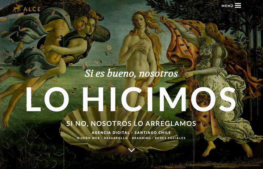
Super rich visual design. I love the slight movement on each section as you get to it based on how you’re scrolling. The nice big services list and descriptions is nice. You don’t typically see that and I like it here, it’ll help educate new people...
