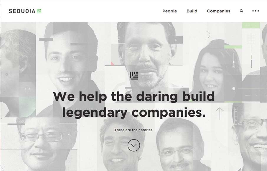
by Aaron Griswold | Oct 13, 2015 | Gallery
Sharp new site from Sequoia Capital out of Menlo Park. Like the intro image that leads down to the cool vertical slideshow, with great suped-up images, and a cool overlay on the left.
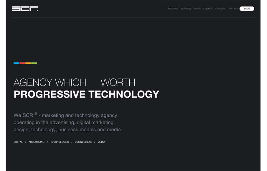
by Aaron Griswold | Oct 13, 2015 | Gallery
We usually don’t see many dark websites that really “work”, but the SCR agency site out of Slovakia makes a good case for it. Unlike other dark sites though, they have good, bold and bright colors to counter-balance everything. Like the collage /...
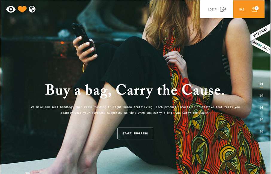
by Aaron Griswold | Oct 12, 2015 | Gallery, Shopping, Social Cause
Great looking site, with really good purpose – Eye Heart World, out of Tampa, Florida, is a non-profit dedicated to stopping human trafficking. Really good work on The Cause page too.
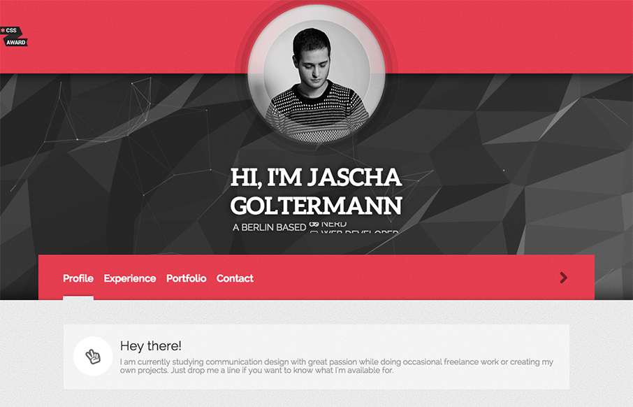
by Aaron Griswold | Oct 7, 2015 | Gallery, Portfolio
Looking at Berlin’s designer Jascha Goltermann’s portfolio site, I’m curious to see where he’ll be in 5 years. Reason being, this site has some elements that are totally different from other portfolio sites we see, with out being too out there....
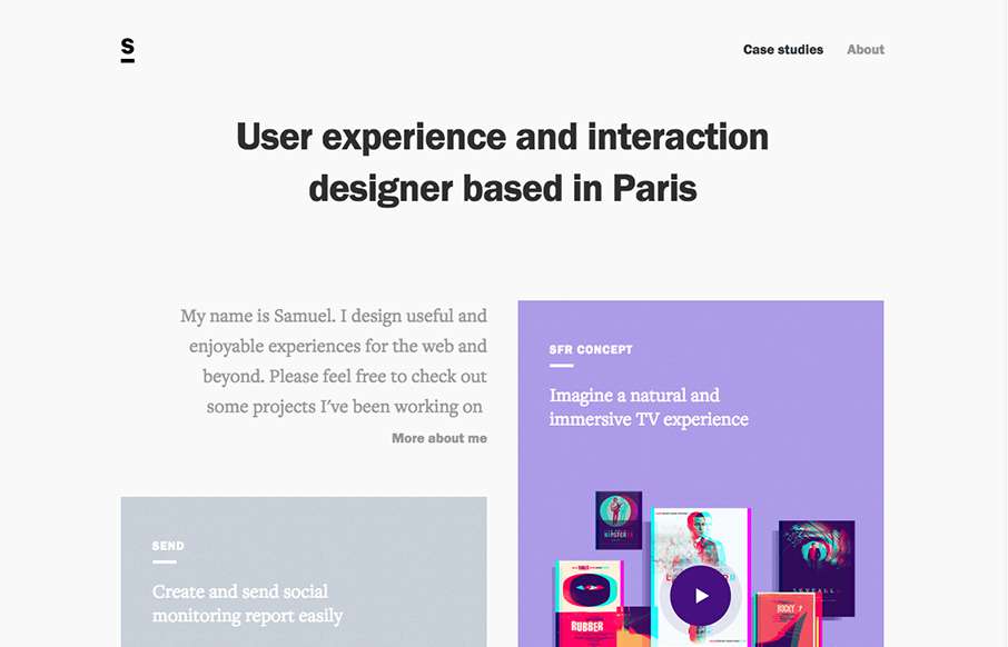
by Aaron Griswold | Oct 6, 2015 | Gallery, Portfolio
I really like how designers are putting some time into their portfolios, and especially the case study parts – like how Samuel Medvedowsky’s Work Portfolio pages use both full and “fixed” width to tell his stories. More so than that, it’s...