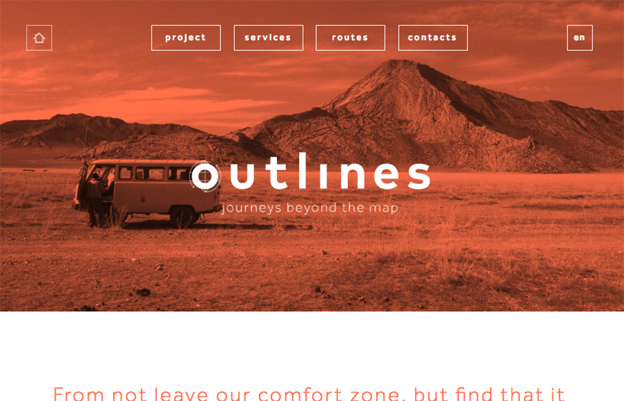
by Gene Crawford | Aug 2, 2016 | Gallery, Travel
Pretty cool use of the main image and the simplified navigation layout. I really like the visual interest in the layout as you scroll down the page. It generally keeps you eyes pulling down to get to more content.

by Gene Crawford | Jul 29, 2016 | Gallery
Rich looking work. I dig the simplicity of the site and elements. Straight forward and not complex content. Good looking stuff here. From the Designer: We started as a small group ( we are still small ) of designers helping business persons and normal humans to bring...

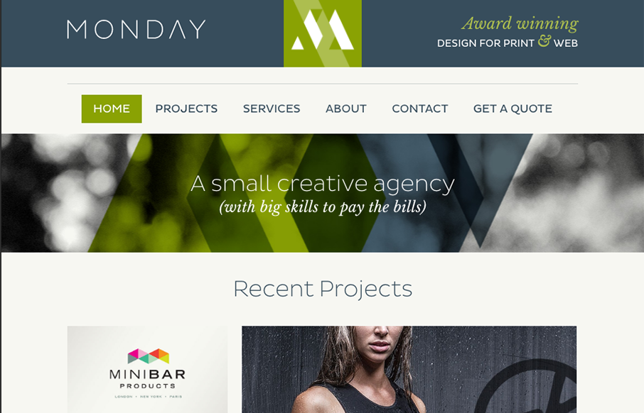
by Gene Crawford | Jul 28, 2016 | Gallery
It always amazes me when I see a portfolio site like this one for Peter Hol and it’s so simple and elegant and it just works. I love it. Brilliantly simple work always wins. From the Designer: HI, my name is Peter Hol I’m a Dutch graphic and interaction...
by Gene Crawford | Jul 22, 2016 | Fashion, Gallery
Just a solid straight forward website design. Everything is placed just right and works like it should. It’s beautiful visually and has strong color usage and branding. Just good work that deserves a second look.
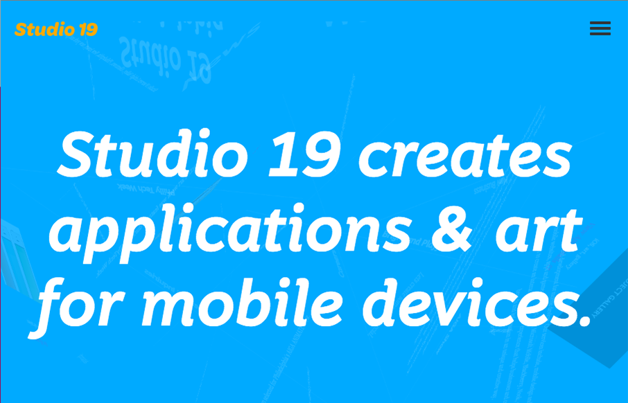
by Gene Crawford | Jul 11, 2016 | Gallery
This Studio 19 website is in the gallery because of the screen to screen transitions. Pretty sweet stuff there. I’m not sure it’ll work for a lot of generalized design usage but here it’s a cool tough.