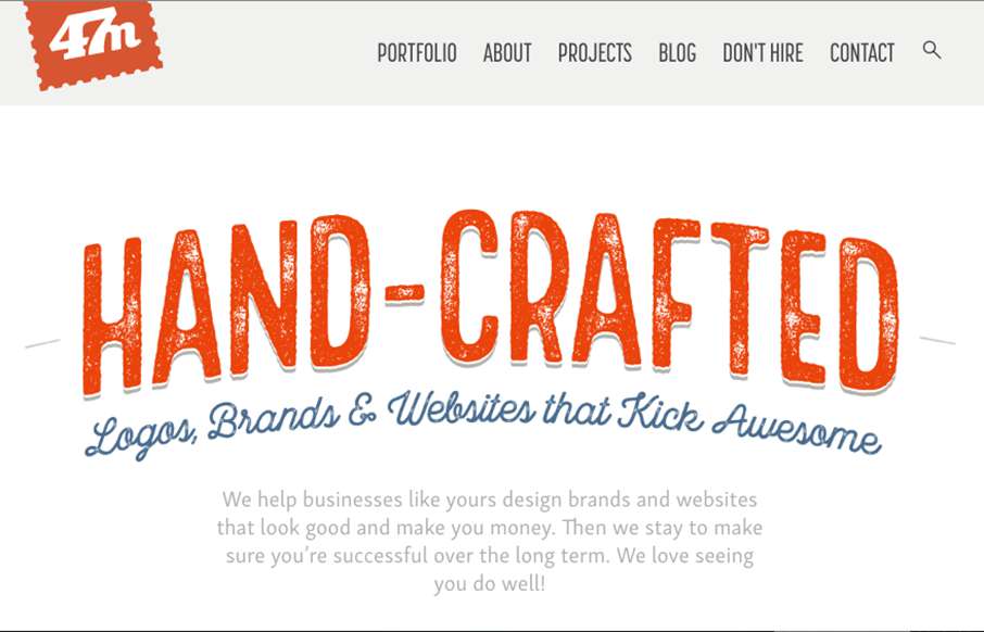
by Gene Crawford | Aug 15, 2016 | Gallery
Pretty stellar work on the 47media website. I love the brand’s tone and the way the visuals really support that first and foremost. The site’s content is really well done and thought through, all the way down to the customized photography. Bravo!
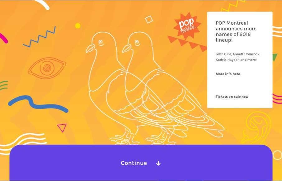
by Gene Crawford | Aug 12, 2016 | Gallery, Music
Pretty cool interactions on Pop Montreal. I like how the nav and the rest of the site sort of play off each other on the scroll like that. Then the big content areas and how they are broken up and made to look interactive by just layout is so cool.
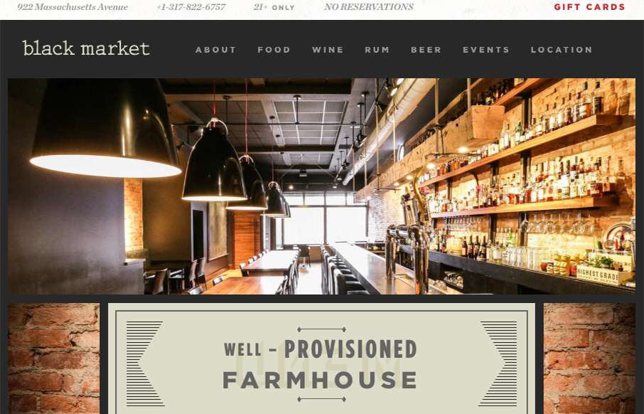
by Gene Crawford | Aug 11, 2016 | Food and Beverage, Gallery
Got some good looking bold graphic look here on Black Market. I dig it. It reminds me of print a great deal which is good in this instance. I really dig it.
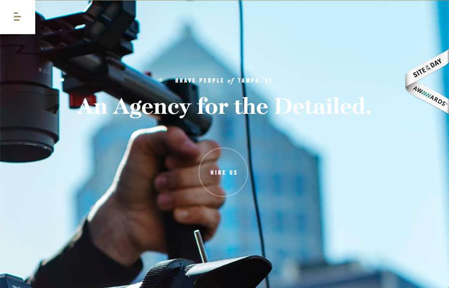
by Gene Crawford | Aug 11, 2016 | Gallery
Such solid layout. And that menu nav design is pretty rad. I love the off-kilter approach to the overall layout, it keeps the site feeling fresh, even to someone who looks at thousands of sites a month. 🙂
by Gene Crawford | Aug 10, 2016 | Gallery
Pretty rad asymmetrical layout for No-EE-KO. The layout is bold and paired perfectly with the bold photography to show it off almost perfectly.