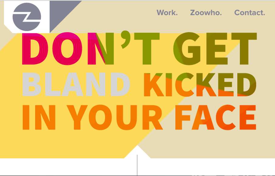
by Gene Crawford | Sep 12, 2016 | Gallery
Pretty cool, just mostly a single column layout. There’s some cool mouse-over type interaction on the large imagery that make up the case-study sections. Love it. From the Designer: Lovingly curated portfolio of Zoocreative, an Irish design studio that...
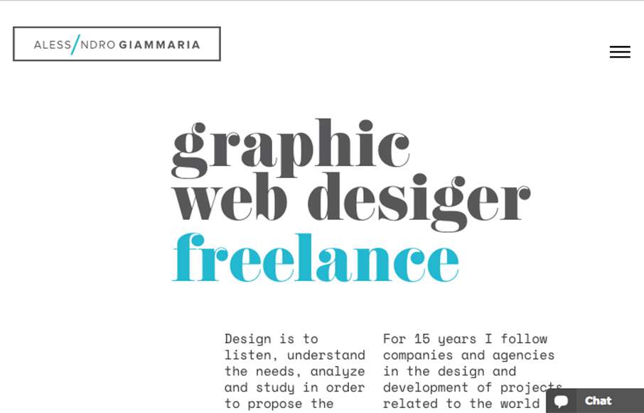
by Gene Crawford | Sep 9, 2016 | Gallery, Portfolio
I really like the openness of the website here for Alessandro Giammaria. It has a nice vertical rhythm and mostly minimal approach overall. ubmitted by: Alessandro Giammaria Twitter: @agiammaria Role: Designer & Developer Country:...
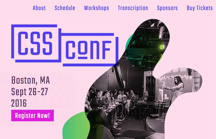
by Gene Crawford | Sep 8, 2016 | Gallery
Really smart looking site for the 2016 CSS Conf website. I love the shapes and how they layer as you scale the browser down. Something for us Frontenders to dig on. Overall straight forward layout too, dig it in a big way.
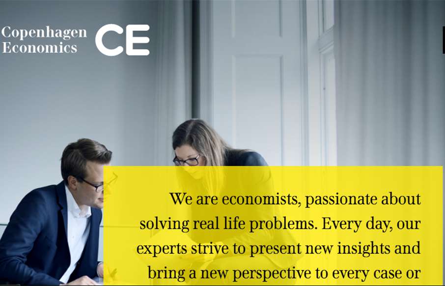
by Gene Crawford | Sep 6, 2016 | Gallery
Solid grid, solid typography and a really great vertical rhythm. The Copenhagen Economics website is beautiful from top to bottom. The mobile screen view is just as solid too. Check this one out for sure.

by Gene Crawford | Sep 2, 2016 | Gallery
Nothing earth shatteringly brilliant here, but it’s just a great example of simple and straightforward good working design. I love the illustration work and the overall approach. Solid.