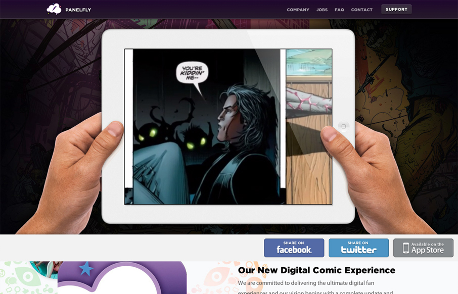
by Giovanni DiFeterici | Jun 21, 2012 | Entertainment, Gallery
Introducing the new Panelfly Website, this showcases the release of our new app! Submitted by: Clinton Halpin @clintonhalpin Role: Designer & Developer panelfly.com is a lushly colorful site, full of energy and movement. I love the panelfly’s palette;...
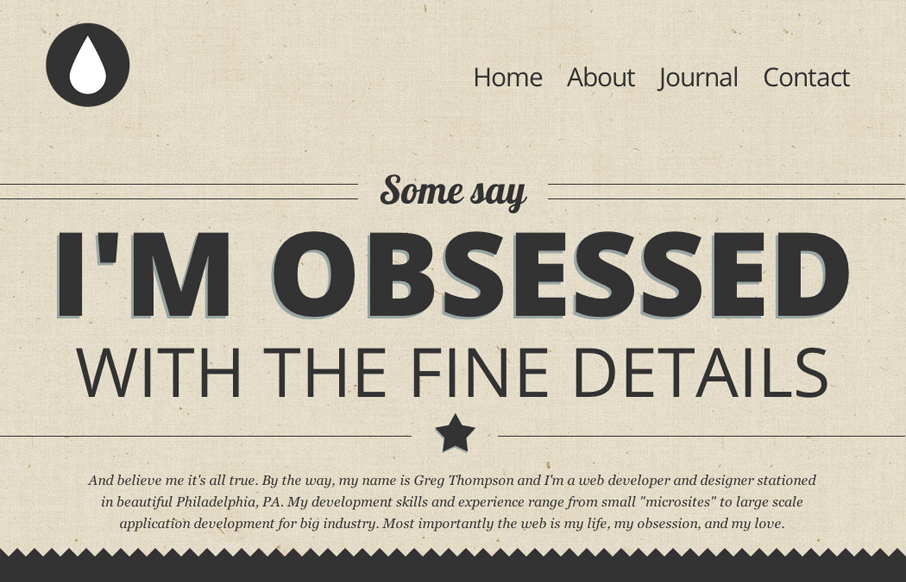
by Giovanni DiFeterici | Jun 21, 2012 | Gallery
This is my site, and I’d like to show it off. I’m very proud of it, it’s fully responsive and use HTML5/CSS3 framework. Submitted by: Gregory Thompson @thegregthomp Role: Designer & Developer This is a great type-based, responsive site. The copy...

by Gene Crawford | Jun 20, 2012 | Gallery, Travel
This is a very thorough responsive design solution. The main navigation changes alone are worth reviewing in some detail. Plus there is just a ton of info/elements on the home page that get handled well through each screen size transition.
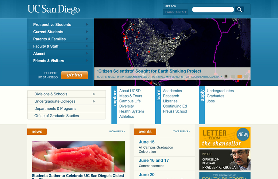
by Gene Crawford | Jun 20, 2012 | Education, Gallery
The UC San Diego website is very modular and square which is softened up a bit by the colors and a few slightly rounded corners here and there. There are a few sections of the home page that fall into a sort of “i’m just tired of designing” sort of...
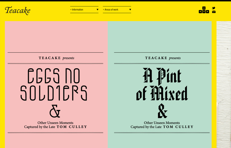
by Giovanni DiFeterici | Jun 20, 2012 | Gallery
I really enjoy teacakedesign.com because, while the layout and design present the work beautifully, the main thrust of the design revolves around making it easy for a visitor to navigate through the work. On teacakedesign.com, I enjoyed the ability to move through the...