
by Gene Crawford | May 8, 2013 | Gallery
There’s a lot going on with this website design. There are so many different nav items and little things that you can click on, in a lot of ways it suffers the same issues that most big product websites do: too much stuff. They do a good job with keeping the...

by Gene Crawford | Apr 19, 2013 | Gallery
Yes, it’s not often we feature a ‘coming soon’ page here on UMS but this one is very well done. I love how they’ve taken the product and the RWD building process and just told the story of the app around that. Both visually and copy wise that...

by Gene Crawford | Apr 18, 2013 | Gallery
What a nice slick design. The content of the blog is tied into the main slideshow imagery which also matches up with the purpose of the product. Dang, that’s some meta design thinking there fellas. I love it. I also love the well timed animation of the content...
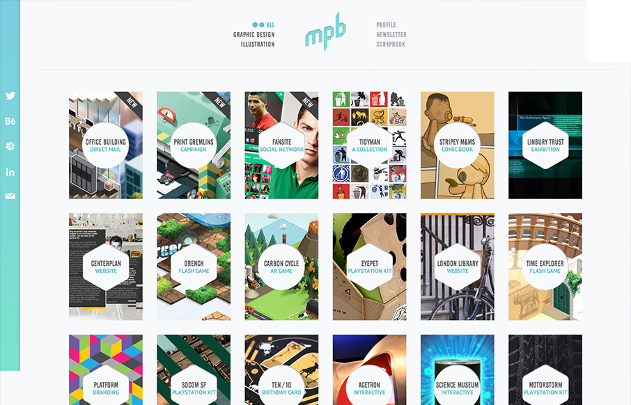
by Gene Crawford | Apr 16, 2013 | Gallery, Portfolio
Nice simple display of the artist’s work with a clean grid and minimal color palette. But it’s the little details, the RWD and the interactions on the title shapes that complete the design and make it feel so finished and polished. Great work here....

by Gene Crawford | Apr 9, 2013 | Gallery
I love the start graphic feel to this site and the minimal color palette is just great. The lead in animation with the logo and slide up to the fixed navigation give this site a nice vibe of technical sophistication. I also like the clearly differentiated sections of...