by Gene Crawford | May 22, 2013 | Gallery
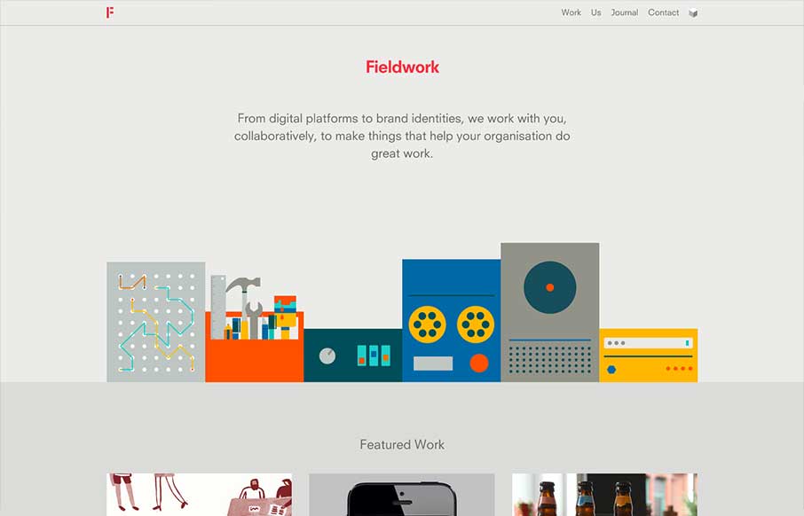
What a beautiful site Fieldwork is. It’s so simple yet full of detail. I love the soft transition between pages, which I can’t see working on another site as well as here. Then each page while similar is just a bit different enough to show it’s all...

by Gene Crawford | May 22, 2013 | Gallery
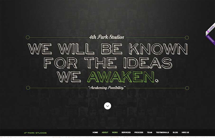
The 4th Park Studios site is a great design. There’s a great feeling for timing as you scroll down the page, which makes it feel very complete. The site looks like it’s based on this theme, but they’ve changed it out and used it as a base. Overall...

by Gene Crawford | May 17, 2013 | Gallery
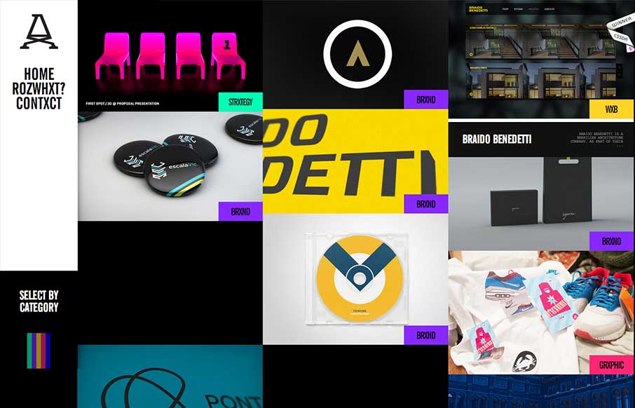
Submitted by: Advan Shumiski @shumiski We are a creative studio based on Sao Paulo, Brazil. Here we think that all is about people. Design is just a tool, humans are the subject. Really interesting interactions for this website. I like how the categories sort the art...

by Giovanni DiFeterici | May 16, 2013 | Education, Gallery
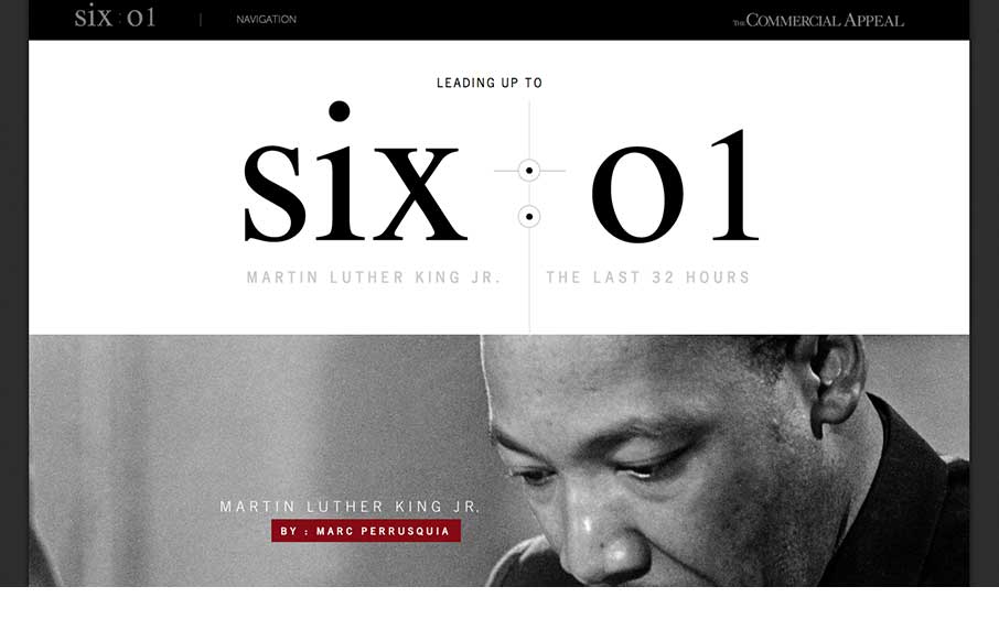
This is about as beautiful a timeline as I’ve ever seen. The content is presented clearly and concisely. It’s linear presentation is perfect for telling a story and the mix of images, video, and text creates a rhythm that punctuates the high points of...

by Giovanni DiFeterici | May 15, 2013 | Gallery
Hopskoch is joyful and simple. It’s subtle animations are perfectly appropriate for selling the brand and pair nicely with the easter color palette. I really dig how the main product image scrolls up a little and fades out as you scroll down the page and the...
